Variance in Data: Understanding the Spread Beyond the Average 🌐📈
Embarking on a Journey Through the Landscape of Variance
Variance in statistics is like the unsung melody in the symphony of data analysis. It plays a crucial role, often unnoticed, in how we understand and interpret data. Let’s navigate through the concept of variance, its significance, and its real-world implications, uncovering its pivotal role in the data universe. 🚀
The Essence of Variance: What It Reveals About Data 🤔
Variance is a statistical measure that quantifies the extent to which data points in a set deviate from the mean. It’s akin to understanding the range of flavors in a dish beyond just its predominant taste.
Calculating Variance: The Method Behind the Measure 💃🕺
Variance is calculated by taking the average of the squared differences from the Mean. For a population (denoted as \( \sigma^2 \)) and a sample (denoted as \( s^2 \)), the formulas are slightly different:
Population Variance: \[ \sigma^2 = \frac{\sum (x_i – \mu)^2}{N} \]
Where \( x_i \) are the individual data points, \( \mu \) is the population mean, \( \bar{x} \) is the sample mean, \( N \) is the size of the population, and \( n \) is the size of the sample.
Variance in Everyday Scenarios: From Classrooms to Markets 🌍
Variance is not confined to textbooks; it’s evident in various aspects of everyday life:
Educational Settings: The variance in students’ test scores can highlight the diversity in learning and understanding within a class.
Financial Markets: Investors assess the variance in stock prices to gauge market volatility and risk.
Visualizing Variance: A Picture Speaks a Thousand Numbers 📊
Graphs and charts bring variance to life, translating complex numerical concepts into visually intuitive information. Tools like variance plots help in making data-driven decisions more accessible.
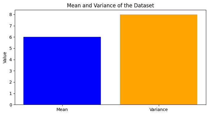
Here is how to calculate and visualize variance in plots using python, here is the code:
					import numpy as np
import matplotlib.pyplot as plt

# Example dataset
data = np.array([2, 4, 6, 8, 10])

# Calculate the mean and variance
mean = np.mean(data)
variance = np.var(data)

# Plotting
plt.figure(figsize=(8, 4))
plt.title("Mean and Variance of the Dataset")
plt.bar(['Mean', 'Variance'], [mean, variance], color=['blue', 'orange'])
plt.ylabel('Value')
plt.show()
Here’s the plot showing both the mean and variance of the dataset. In this chart, the blue bar represents the mean of the dataset, and the orange bar represents its variance. This visual representation allows for an easy comparison of these two important statistical measures for the given dataset.
The Role of Variance in Comprehensive Data Analysis 🔍
Variance complements other statistical measures, offering a broader view of data. It helps identify if data points are tightly clustered or widely spread, providing insights into the consistency and reliability of the data.
Beyond Variance: The Broader Spectrum of Data Analysis 🌈
While variance is a key tool in statistics, it’s part of a larger toolkit needed to fully understand data. Incorporating measures like standard deviation and mean adds depth and context, enriching our overall data interpretation.
Conclusion: Embracing Variance in the World of Data 🚀
Variance is a window into the diversity and dynamics of data. It challenges us to look beyond the surface and explore the depth of data variability. As we continue our journey in the realm of data analysis, let’s appreciate the rich insights that variance provides.