The Median: Finding the Middle Ground in Data Analysis 🌐📊
Hello Data Enthusiasts! Today, let’s take a closer dive into the world of the Median, a concept often overshadowed by its cousin, the Mean, but equally fascinating and crucial in the realm of statistics and data science. 🚀
What is the Median? 🤔
The Median is the middle number in a sorted list of numbers. It’s like standing in the middle of a bridge, equidistant from both ends. In the world of data, it slices your dataset in half: 50% of the values lie below the median and 50% above it.
Why the Median Matters in Statistics 🌟
Robustness to Outliers: Unlike the mean, the median is not swayed by outliers or extremely skewed data. It stands firm, offering a more accurate ‘central’ value in such cases.
Reflecting the Typical Value: In skewed distributions, the median provides a better sense of the ‘typical’ value than the mean.
Easy to Understand and Explain: The concept of the median is intuitive, making it a handy tool for communicating data insights to non-technical audiences.
Real-Life Examples of Median 🏡💼
Real Estate: When real estate agents say, “The median home price is $300,000,” they mean that half of the homes are priced below $300,000 and half above. It gives a better sense of the market, especially if a few mansions are skewing the average.
Income Data: Median income is often used in socio-economic reports because it’s less affected by extremely high or low incomes and better represents the standard of living.
Calculating the Median: A Step-by-Step Guide 🧮
Order Your Data: Line up all your numbers from the smallest to the largest.
Find the Middle: If you have an odd number of values, the median is the one right in the middle. With an even number, it’s the average of the two middle numbers.
For example, in the data set [3, 5, 7, 9, 11], the median is 7. But for [3, 5, 7, 9], it’s (5 + 7) / 2, which is 6.
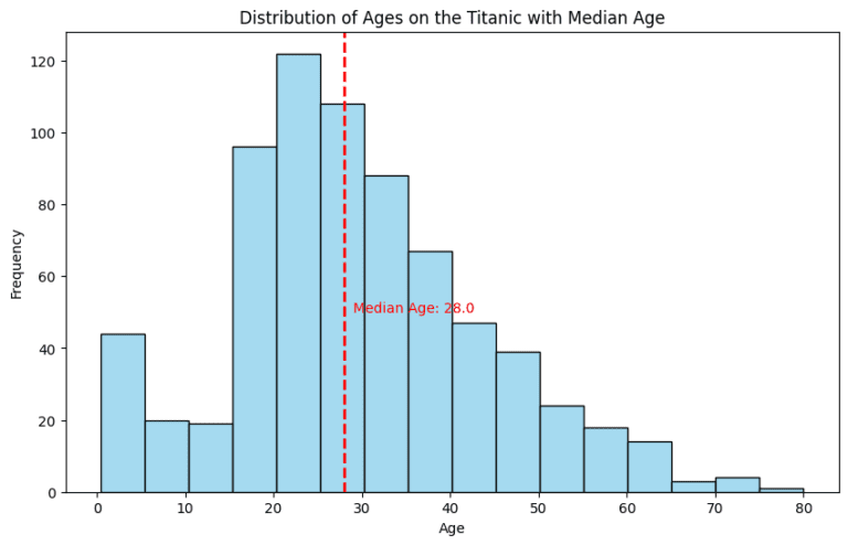
The Median in Graphs 📊
In a histogram, the median is the point where the area is split into two equal halves. It’s a visual representation of the balance the median brings to a dataset.
Here is the code to plot Titanic data:
					import seaborn as sns
import matplotlib.pyplot as plt

# Load the Titanic dataset
titanic = sns.load_dataset("titanic")

# Calculating the median age
median_age = titanic['age'].median()

# Plotting the distribution of ages and the median
plt.figure(figsize=(10, 6))
sns.histplot(titanic['age'], kde=False, color='skyblue', binwidth=5)
plt.axvline(median_age, color='red', linestyle='dashed', linewidth=2)
plt.title('Distribution of Ages on the Titanic with Median Age')
plt.xlabel('Age')
plt.ylabel('Frequency')
plt.text(median_age + 1, 50, f'Median Age: {median_age}', color='red')
plt.show()
Embracing the Median in Your Data Journey 🚀
The median, often unsung yet powerful, is a cornerstone in the world of statistics. It offers clarity and insight, especially in datasets where the average might be misleading. So, as you navigate the complex seas of data analysis, remember the median – your reliable guide to the center of your data universe.
Conclusion: Embracing the Median in Data Analysis 🚀
The Median might not always be in the spotlight, but its role in providing a clear, undistorted sense of the center is invaluable. In the world of skewed distributions and outliers, it often becomes the hero, offering a reliable and truthful portrayal of the central tendency.
So, the next time you’re navigating through a sea of data, remember the power of the Median – it’s your reliable guide to the heart of your dataset! 🌟📈