The Mode: Deciphering the Most Frequent Tale in Data 📊🔍
Welcome to the Intriguing World of the Mode!
In the diverse landscape of statistics and data science, the Mode stands out as a unique and insightful tool. Often overshadowed by the mean and median, the mode has its own story to tell – one of frequency and commonality. Join me as we explore this often-underappreciated gem in the world of data. 🌟
What is the Mode? 🤔
Imagine walking into a room and noticing that most people are wearing blue. In that room, blue is the mode – the most frequently occurring value. In statistics, the mode refers to the value or values that appear most often in a dataset. It is the crowd favorite, the trendsetter of the data world.
The Significance of the Mode in Data Analysis 💡
A Peek into Popularity: The mode reveals the most common occurrence, offering insight into what’s popular or typical.
Crucial for Categorical Data: In categorical datasets (like surveys or polls), the mode is often the most informative measure of central tendency.
Understanding Distribution: The presence of one, multiple, or no modes can tell us a lot about the distribution of our data.
Real-Life Applications of the Mode 🌍
Market Trends: In retail, the mode can identify the most popular product color or size, helping businesses tailor their inventory.
Mode in Surveys: In survey responses, the mode tells us the most common opinion or preference among participants.
Education: The mode can highlight the most frequent score in a test, indicating the level at which most students perform.
Calculating the Mode: Unveiling the Favorite 🧮
Finding the mode is straightforward – it’s simply the value that occurs most frequently. Unlike the mean or median, the mode can be non-numeric, making it versatile across different types of data.
For example, in a dataset of pet preferences: [Dog, Cat, Dog, Bird, Dog, Cat], the mode is ‘Dog’ as it appears the most.
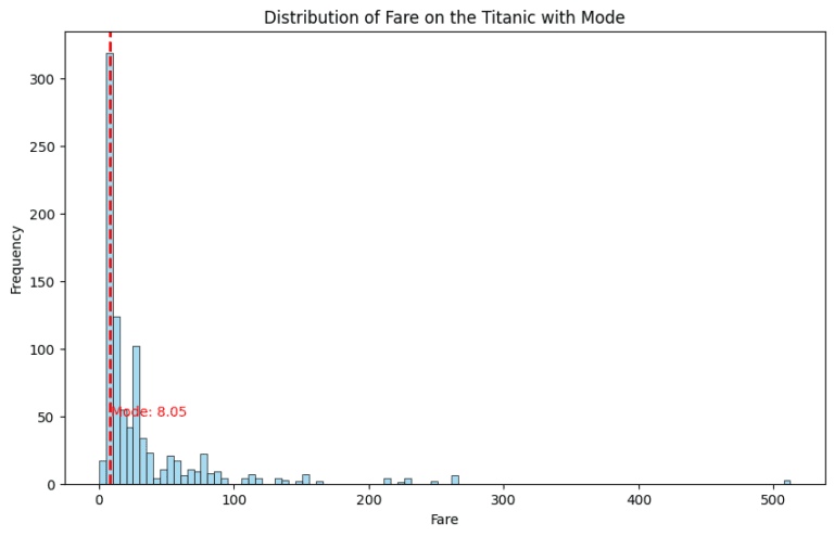
Visualizing the Mode: A Graphical View 📊
A bar chart or histogram is perfect for visually identifying the mode. The highest bar represents the modal value, clearly showing which value dominates the dataset.
					import seaborn as sns
import matplotlib.pyplot as plt
from scipy import stats

# Load the Titanic dataset
titanic = sns.load_dataset("titanic")

# Calculate the mode of the 'Age' column
mode = stats.mode(titanic['fare'])

print(f'The mode of the \'fare\' column is {mode[0]}.')

# plot the mode and the distribution of 'fare'
plt.figure(figsize=(10, 6))
sns.histplot(titanic['fare'], kde=False, color='skyblue', binwidth=5)
plt.axvline(mode[0], color='red', linestyle='dashed', linewidth=2)
plt.title('Distribution of Fare on the Titanic with Mode')
plt.xlabel('Fare')
plt.ylabel('Frequency')
plt.text(mode[0] + 1, 50, f'Mode: {mode[0]}', color='red')
plt.show()
The Story of Multiple Modes: Bimodal and Multimodal Distributions 📈
Some datasets can have more than one mode (bimodal or multimodal), indicating multiple peaks in frequency. This often points to a diverse dataset with several popular choices.
Embracing the Mode in Data Analysis 🚀
The mode, with its focus on frequency, adds a unique perspective in data analysis. It allows us to understand the most common occurrences, providing valuable insights, especially in non-numeric and categorical data.
Conclusion: The Mode – Your Lens to Frequency in Data 🌐
As we navigate the vast ocean of data, the mode serves as a lens, focusing on the most frequent occurrences and commonalities. It’s a crucial part of our statistical toolkit, offering a different yet equally important perspective compared to the mean and median.
So, the next time you delve into a dataset, remember to consider the mode. It might just be the key to unlocking the most common trends and preferences hidden in your data. Happy data exploring! 📚🔍📈