Is chapter main ham statistics of us ki types dekhen gay or sirf Descriptive statistics per focus karen gay.
5.1What is Statistics?
Angrez kehta hai ka:
“Statistics is the science of collecting, organizing, presenting, analyzing and interpreting numerical data to assist in making more effective decisions.”
Asan alfaz main:
“Statistics is the science of data.”
Us se b asan alfaz main:
“Statistics data ka wo ilm hai jo data ko collect karna, usay organize karna, analyse karna, aur phir us se conclusions nikalne mein madad karta hai.”
Sochiye, aap Lahore ke traffic patterns ya Karachi ke weather trends ko samajhne ke liye data collect kar rahe hain; statistics yahan par aapko yeh samajhne mein madad karega ke data kya keh raha hai.
5.1.1 Statistics Ke Types 📚
Broadly, statistics do main types mein divided hai:
Descriptive Statistics (Tafseeli Shumariyat): Ye data ko summarize karta hai, jaise mean (average), median, aur mode. Yeh aapko batata hai ke aapka data overall kaisa dikhta hai.
Inferential Statistics (Istakhraji Shumariyat): Ye larger populations ke bare mein conclusions draw karne ke liye sample data ka use karta hai. Iska istemal hypotheses testing, predictions, aur estimates banane ke liye kiya jata hai.
5.2 Descriptive Statistics
Descriptive Statistics data ko samajhne aur present karne ka aik asaan aur effective tareeqa hai. Is mein hum data ke basic features ko describe karte hain aur is se simple summaries about the sample and the measures banate hain. Yeh typically numbers ya graphs ke zariye kiya jata hai. Descriptive statistics mein shamil hain:
Measures of Central Tendency (Markazi Rujhan Ke Pemaane): Ye batata hai ke data ka central point kya hai. Is mein shamil hain:
Mean (Ausat): Tamam values ka average.
Median (Wasti Qiymat): Data set ki beech wali value jab values ko order mein rakha jaye.
Mode (Aksar Aane Wali Qiymat): Sab se zyada bar bar aane wali value.
Measures of Variability (Tabdeeli Ke Pemaane): Ye batata hai ke aapke data points kitne diverse hain. Is mein shamil hain:
Range (Hudood): Sab se kam aur zyada value ke beech ka farq.
Interquartile Range (IQR): Data set ki beech wali 50% values ka range.
Variance (Ikhtilaaf): Average se har value ke farq ka square.
Standard Deviation (Mayaar Ki Hera-Phairi): Ye batata hai ke data points mean se kitna door hain.
Standard Error (Mayaar Ki Hera-Phairi Ki Khaata): Ye batata hai ke sample mean population mean se kitna door hai.
Graphs and Charts (Graphs aur Chart): Data ko visually summarize karte hain, jaise bar charts, histograms, aur pie charts.
Descriptive statistics se aapko fori aur clear understanding milti hai ke aapka data kya keh raha hai, bina kisi complex analysis ke. Ye Lahore ke temperature patterns se le kar Karachi ke shopping trends tak, har tarah ke data ko samajhne mein pehla qadam hota hai. 📊✨📘
5.3 Population and Samples
Bilkul population and samples asan hy aik dam. chaliye iss concept ko detail se samajhte hain! 📘📈
Population vs. Sample: Ek Hi Data Set, Do Mukhtalif Tawajjuh 🌍🔍
Ek hi data set ko kabhi population aur kabhi sample ke taur par dekha ja sakta hai, ye depend karta hai ke aap data ko kyun aur kaise analyze kar rahe hain.
Misal: Farz karein, aap ke pass ek class ke final exam ke grades hain. Agar aapka maqsad sirf is class ke scores ka distribution describe karna hai, toh ye grades aapke liye ek population ban jate hain. Lekin, agar aap in grades se koi inference nikalna chahte hain, maslan, dusre classes ya schools ke students ke scores ke bare mein, toh ye grades aapke liye ek sample ke tor par kaam aate hain.
5.3.1 Population Analysis 📚🌟
Jab aap population ko analyze karte hain, iska matlab hai ke aapki data set mein poori population of interest shamil hai. Aap is group ke tamam members par apne calculations kar rahe hote hain, aur aap seedhe taur par iss group ke characteristics ke bare mein statements kar sakte hain.
5.3.2 Sample Analysis 📊🔍
Is ke baraks, jab aap sample ko analyze karte hain, toh aap ek bade population se liye gaye chhote hisse par kaam kar rahe hote hain. Yahan jo statements aap bade group ke bare mein karte hain, woh probabilistic hote hain, yani ke yeh poore group par bilkul sahi na bhi ho sakte.
Descriptive vs. Inferential Statistics:
Parameters (Population ke Liye): Population ko describe karne wale numbers ko parameters kehte hain, aur inhe Greek letters jaise \(\mu\) (population mean ke liye) aur \(\sigma\) (population standard deviation ke liye) se signify kiya jata hai.
Statistics (Sample ke Liye): Sample ko describe karne wale numbers ko statistics kehte hain, aur inhe Latin letters jaise \(\bar{x}\) (sample mean ke liye) aur \(s\) (sample standard deviation ke liye) se signify kiya jata hai.
Practical wajah se, aksar population ki bajaye samples ka analysis kiya jata hai, kyunki puri population ko direct study karna mumkin nahi ho sakta ya phir bohot mehnga pad sakta hai.
Is distinction ko samajhna statistics mein fundamental hai aur iske liye notational conventions aur terminology develop ki gayi hain. Har author ke yahan thoda farq ho sakta hai, lekin generally, yehi conventions follow kiye jate hain. 📖✨📉
5.3.3 Notations for Descriptive Statistics
ImportantNotations
Statistics main mathematical notations ka bohot istemal hota hai. Is liye, aapko in notations ko samajhna bohot zaroori hai. Yeh rahi descriptive statistics mein istemal hone wali kuch common notations ki list, unke ek line mein explanations ke saath:
\(\bar{x}\) - Sample Mean: Sample data points ka average.
\(\mu\) - Population Mean: Puri population ke data points ka average.
\(s\) - Sample Standard Deviation: Sample data ke variation ya spread ko measure karta hai.
\(\sigma\) - Population Standard Deviation: Puri population ke data ke variation ya spread ko measure karta hai.
\(s^2\) - Sample Variance: Sample data points ke beech ke differences ka square.
\(\sigma^2\) - Population Variance: Population data points ke beech ke differences ka square.
\(n\) - Sample Size: Sample mein total data points ki taadad.
\(N\) - Population Size: Population mein total data points ki taadad.
\(\text{min}\) - Minimum Value: Data set mein sab se kam value.
\(\text{max}\) - Maximum Value: Data set mein sab se zyada value.
\(Q1, Q2, Q3\) - Quartiles: Data set ko char hisson mein taqseem karne wale points, Q2 median bhi hai.
\(IQR\) - Interquartile Range: Q3 aur Q1 ke beech ka farq, jo data spread ki central tendency ko batata hai.
Ye notations descriptive statistics mein data ko samajhne aur uski interpretation mein madadgar hoti hain. Har notation ka apna specific maqsad aur use hota hai. 📊✨📘
Yehi nahi abhi or suneay!
Descriptive statistics mein kuch aur bhi notations hote hain jo data ko samajhne aur analyze karne mein madadgar hote hain. Yahan kuch aur examples hain:
\(\text{Median}\) - Median: Data set ki beech wali value jab values ko order mein rakha jaye.
\(\text{Mode}\) - Mode: Data set mein sab se zyada bar bar aane wali value.
\(\Sigma\) - Summation: Kisi series ya sequence ke tamam elements ka total.
\(r\) - Correlation Coefficient: Do variables ke beech ke relationship ki strength aur direction ko measure karta hai.
\(\text{Skewness}\) - Skewness: Data distribution ki asymmetry ko measure karta hai, yani ke data kis taraf zyada jhuka hua hai.
\(\text{Kurtosis}\) - Kurtosis: Data distribution ke “peakedness” ya “flatness” ko measure karta hai.
\(\text{Range}\) - Range: Data set mein sab se zyada aur sab se kam values ke beech ka farq.
\(p\) - Proportion: Kisi khaas category ya class mein falling observations ka proportion.
\(\text{Frequency} (f)\) - Frequency: Kisi value ya class ki frequency, yani ke kitni dafa woh value ya class data set mein aati hai.
Ye additional notations aur bhi insight provide karte hain jab hum kisi data set ko descriptive statistics ke zariye analyze karte hain. Inka istemal data ke various aspects ko better samajhne aur interpret karne mein kiya jata hai. 📈📉📘✨
5.4 Meaure of Central Tendency
Angrez kehta hy:
Measures of central tendency, also known as measures of location, are descriptive statistics that describe the central position of a numeric data set.
Measure of central tendency are typically among the first computation or calculation you do for a data set, specifically for the quantitative (continuous) data.
Bilkul, chaliye baat karte hain “Central Tendency” ke baare mein, Roman Urdu aur emojis ke saath! 🌟📊
Central Tendency - Markazi Rujhan 🎯
“Central Tendency” ek statistical term hai jo describe karti hai ke ek data set ke andar values kis jagah concentrate hote hain ya jama hote hain. Yeh basically aapko batati hai ke aapke data ke “markaz” ya “centre” mein kya hota hai. Central Tendency ke measures data ke typical ya average behavior ko samajhne mein madad karte hain.
Central Tendency Ke Teen Main Measures 📐📊🎯
5.4.1 The Mean
Mean (Ausat): Yeh sab values ka average hota hai. Misal ke taur par, agar aap Lahore ke kisi college ke students ki umar ka average nikalna chahte hain, toh aap sab students ki age ka total le ke unki taadad se divide karenge.
TipMean-Misal k tor per
Average Income 💰: Farz karein, aap Karachi ke ek mohalle mein rehne walon ki average monthly income janna chahte hain. Aap mohalle ke har ghar se income collect karte hain aur un sab ko jamaa kar ke total gharon ki taadad se divide karte hain. Jo number aata hai, woh is mohalle ki average monthly income hogi. Ye mean ya ausat kehlata hai.
5.4.1.1 Methematical Equation
Mean (Ausat) 📊
Formula: \(\bar{x} = \frac{\sum{x_i}}{n}\)
Jahan: \(\bar{x}\) mean ya ausat hai, \(\sum{x_i}\) tamam values ka sum hai, \(n\) values ki total taadad hai.
Example: Agar aapke paas 5 students ki marks hain [60, 70, 80, 90, 100], to mean hoga: \[\frac{60 + 70 + 80 + 90 + 100}{5} = 80\]
Mean in python can be calculated as show in Figure 5.2
5.4.1.2 Mean (Ausat) Ki Types
Arithmetic Mean (Riyazi Ausat) 🧮
Definition: Tamam values ka total sum divided by values ki total taadad. Ye sab se common type hai.
Formula: \[\bar{x} = \frac{\sum{x_i}}{n}\]
Jahan: \(\bar{x}\) mean hai, \(\sum{x_i}\) tamam values ka sum hai, \(n\) values ki total taadad hai.
Example: Agar aap Lahore ke ek school ke har class ke students ki height ka average nikalna chahte hain, to aap sab heights ko jama karein aur phir unki taadad se taqseem karein. Maan lijiye heights hain [150cm, 160cm, 140cm], to mean hoga: \[\frac{150 + 160 + 140}{3} = 150cm\]
Geometric Mean (Jyamiti Ausat) 🔢
Definition: Tamam values ke product ka nth root, jahan n values ki taadad hai. Ye rates of change ya percentages jaise data ke liye use hota hai.
Jahan: \(G\) geometric mean hai, \(\prod_{i=1}^{n} x_i\) tamam values ka product hai, \(n\) values ki taadad hai.
Example: Agar aap Karachi mein property prices ke annual growth rate ka average nikalna chahte hain aur rates hain [10%, 15%, 20%], to geometric mean hoga: \[\sqrt[3]{1.10 \times 1.15 \times 1.20} \approx 1.148\] ya 14.8%.
Harmonic Mean (Moseeqi Ausat) 🎵
Definition: Ye rates ya ratios ke reciprocal ke average ke reciprocal hota hai. Ye speed ya rates jaise data ke liye use hota hai.
Formula: \[H = \frac{n}{\sum{\frac{1}{x_i}}}\]
Jahan: \(H\) harmonic mean hai, \(n\) values ki taadad hai, \(\frac{1}{x_i}\) har value ka reciprocal hai.
Example: Agar aap Islamabad to Rawalpindi ke safar ke different speeds ko measure kar rahe hain aur speeds hain [40km/h, 60km/h], to harmonic mean hoga: \[\frac{2}{\frac{1}{40} + \frac{1}{60}} = 48km/h\]
5.4.1.3 Mean Ki Importance
Mean, ya arithmetic mean, data science aur everyday analysis mein sab se zyada istemal hone wala measure hai. Ye aapko data set ke general trend ko samajhne mein madad karta hai. Business decisions se le kar scientific research tak, mean ka istemal data ke average behaviour ko samajhne aur us par mabni decisions lene ke liye kiya jata hai. Ye simple hai, lekin powerful tool hai jo data ke central tendency ko capture karta hai. 📈✨📘
5.4.2 The Median
Median (Wasti Qeemat): Jab values ko order mein arrange kiya jaye, toh jo value beech mein aati hai, woh median hoti hai. Jaise, agar aap Islamabad mein ghar ki prices ko order mein lagaen, toh jo price beech mein hogi, woh median hogi.
TipMedian-Misal k tor per
Property Rates 🏠: Lahore ke DHA mein property rates ki range bohot zyada hoti hai. Agar aap sab properties ki values ko order mein arrange karein aur phir beech ki value dekhein, toh woh median property rate hogi. Ye aapko batayega ke aam taur par DHA mein property ki qiymat kya hogi, is se high aur low extremes ka asar kam ho jata hai.
5.4.2.1 Methematical Equation
Median (Wasti Qiymat) 📐 - Odd Number of Values: Median woh middle value hai jab values ko ascending order mein arrange kiya jata hai. - Even Number of Values: Middle do values ka average. - Example: Agar aapke paas values hain [10, 20, 30, 40, 50], to median 30 hoga (middle value). Agar values hain [10, 20, 30, 40], to median hoga: \[\frac{20 + 30}{2} = 25\]
Median in python can be calculated as show in Figure 5.2
5.4.2.2 Examples
Odd Number of Values
Situation: Aap Karachi ke ek school ke class mein students ki heights record kar rahe hain aur unki taadad odd hai, jaise [150cm, 155cm, 160cm, 165cm, 170cm].
Median: Heights ko order mein arrange karne ke baad, beech ki value, yani 160cm, median hogi.
Even Number of Values
Situation: Islamabad ke ek hospital mein aane wale patients ki daily count record ki ja rahi hai aur ek haftay mein counts hain [30, 35, 40, 45].
Median: Yahan do middle values hain, 35 aur 40, to median hoga \(\frac{35 + 40}{2} = 37.5\).
5.4.2.3 Median Ka Importance 📌
Median, khaas taur par us waqt ahem ho jata hai jab data skewed ho ya outliers contain karta ho. Jaise, agar aap Lahore mein property prices dekhein aur kuch bahut hi high ya low prices hon, to mean distorted ho sakta hai, lekin median aapko zyada reliable picture deta hai.
Median data ke distribution ko beech se cut karta hai, jis se humein pata chalta hai ke data set ke aadhe values is value se kam hain aur aadhe zyada. Ye especially helpful hota hai market analysis, income surveys, ya real estate prices jaise situations mein, jahan outliers mean ko affect kar sakte hain. 📈✨📘
5.4.3 The Mode
Mode (Aksar Aane Wali Qiymat): Wo value jo data set mein sab se zyada bar repeat hoti hai. Maan lijiye, Karachi ke ek area mein agar aap dekhein ke zyadatar log konsi car drive kar rahe hain, toh jo car model sab se zyada nazar aaye, woh mode hoga.
TipMode-Misal k tor per
Most Common Car 🚗: Islamabad ke F-10 sector mein, agar aap notice karein ke zyadatar log Honda Civic drive kar rahe hain, to Honda Civic is sector ka mode hoga. Yani yeh woh car hai jo is area mein sab se zyada common hai.
5.4.3.1 Methematical Equation
Mode (Aksar Aane Wali Qiymat) 🎯 - Formula: Mode woh value hai jo data set mein sab se zyada bar aati hai. - Example: Agar aapke paas values hain [1, 2, 2, 3, 4], to mode 2 hoga (kyunki 2 do dafa aaya hai aur baaki sab ek ek bar).
Mode in python can be calculated as follows:
Code
# Import librariesimport numpy as npimport matplotlib.pyplot as pltimport pandas as pd# Create a dataset data = np.array([1, 2, 2, 3, 4, 4, 4, 5, 5, 6, 6, 6, 6, 7, 8, 9, 9, 9, 9, 9, 10])# Calculate the modemodes = pd.Series(data).mode()# Plot the dataset and modeplt.figure(figsize=(6, 5))plt.plot(data, 'ko', label='Data')for mode in modes: plt.axhline(mode, color='red', label=f'Mode {mode}')plt.legend()plt.title('Data with Multiple Modes')plt.show()
Figure 5.1: Mode of a data set
5.4.3.2 Mode Ke Types
Unimodal (Yak Mode) 📈
Definition: Jab ek hi data set mein sirf ek hi mode ho.
Example: Agar aap Islamabad ke ek school mein students ki pasandida ice cream flavors ki list banate hain aur sab se zyada “Chocolate” flavor aata hai, toh yeh unimodal hai - yani Chocolate yahan ka mode hai.
Bimodal (Do Mode) 📊
Definition: Jab ek data set mein do alag modes hote hain.
Example: Karachi ke ek shopping mall mein agar aap customers se unki age poochein aur sab se zyada do age groups, maan lijiye 25 aur 40, bar bar aate hain, to yeh bimodal hai - yani yahan ke do modes hain: 25 aur 40 years.
Multimodal (Kayi Modes) 📉
Definition: Jab ek data set mein do se zyada modes hote hain.
Example: Lahore ke ek music festival mein alag-alag music genres ki popularity check karte waqt, agar aapko pata chale ke “Pop”, “Rock”, aur “Classical” teeno genres equally popular hain, toh yeh multimodal hai - yani teen modes hain: Pop, Rock, aur Classical.
No Mode (Koi Mode Nahin) 🚫
Definition: Jab koi bhi value data set mein doosri values se zyada bar nahi aati.
Example: Agar aap Peshawar ke ek mohalle mein sabhi gharo ki construction dates dekhein aur har ghar ki construction date alag ho, toh is situation mein koi mode nahi hoga.
5.4.3.3 Mode ki Importance
Mode ka use data ke distribution aur uske most common ya repeated elements ko samajhne ke liye hota hai. Ye aksar categorical data, jaise favorite items, categories, ya classes ko analyze karne mein madadgar hota hai. Mode se humein yeh insight milta hai ke kis cheez ko log sab se zyada pasand karte hain ya sab se zyada istemal karte hain, jo ke market research, public opinion surveys, aur social sciences mein khaas taur par useful hota hai. 📚🔍✨🎯
5.4.4 Central Tendency Ki Importance 🔍
Central Tendency humein data sets ke baare mein aham insights deti hai. Yeh batata hai ke aam taur par data kis tarah distribute hua hai. Business decisions se le kar scientific research tak, har jagah Central Tendency ka analysis crucial hota hai. Is se hum data ke general pattern ko samajh sakte hain aur complex data sets ko asaan tareeqe se summarize kar sakte hain.
Central Tendency ka sahi istemal aapko aapke data ke markaz ya central point ki deep understanding provide karta hai, jo ke kisi bhi statistical analysis ya data science project ke liye foundation ka kaam karta hai. 📈✨📘
5.4.5 Median is Better than Mean
Median is Better than Mean: Jab data set mein outliers ya extreme values hain, toh median mean se zyada reliable hota hai. Is liye, jab aap data set ko analyze kar rahe hain aur aapko pata hai ke data mein extreme values hain, toh aap median ka istemal karen.
Let’s see an example to understand this better. 📈✨📘
Code
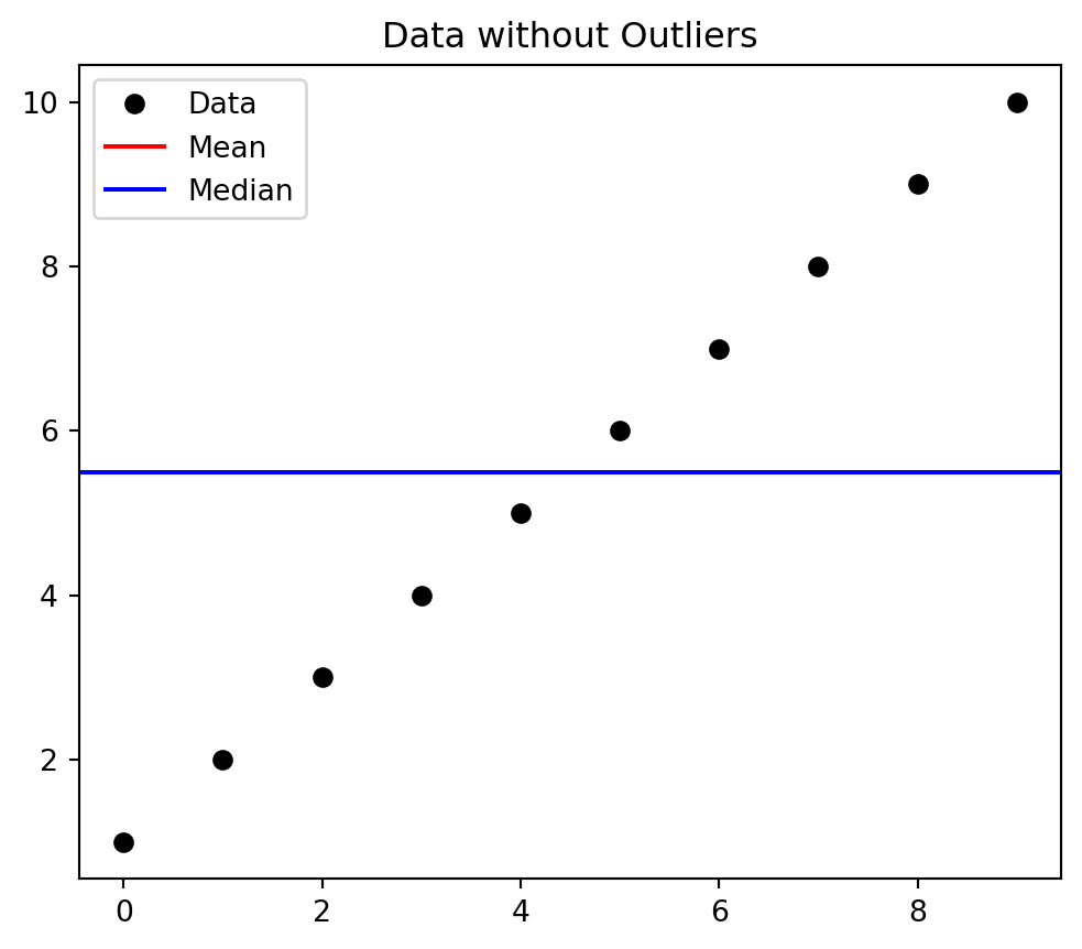
# Import librariesimport numpy as npimport matplotlib.pyplot as pltimport pandas as pd# Create a dataset with some outliersdata = np.array([1, 2, 3, 4, 5, 6, 7, 8, 9, 10])# Calculate the mean and median of the datasetmean = np.mean(data)median = np.median(data)# Plot the dataset, mean, and medianplt.figure(figsize=(6, 5))plt.plot(data, 'ko', label='Data')plt.axhline(mean, color='red', label='Mean')plt.axhline(median, color='blue', label='Median')plt.legend()plt.title('Data without Outliers')plt.show()
Figure 5.2: Figure without any Outlier (Meana and Median are same)
Code
# Import librariesimport numpy as npimport matplotlib.pyplot as pltimport pandas as pd# Create a dataset with some outliersdata = np.array([1, 2, 3, 4, 5, 6, 7, 8, 9, 10, 100])# Calculate the mean and median of the datasetmean = np.mean(data)median = np.median(data)# Plot the dataset, mean, and medianplt.figure(figsize=(6, 5))plt.plot(data, 'ko', label='Data')plt.axhline(mean, color='red', label='Mean')plt.axhline(median, color='blue', label='Median')plt.legend()plt.title('Data with Outlier')plt.show()
Figure 5.3: Figure with one Outlier (mean is affected more than median)
Code
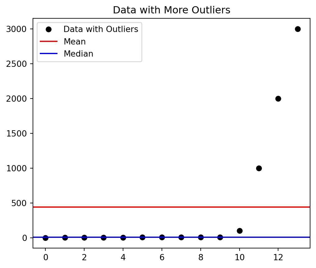
# Add some outliers to the datasetdata_with_outliers = np.append(data, [1000, 2000, 3000])# Calculate the new mean and mediannew_mean = np.mean(data_with_outliers)new_median = np.median(data_with_outliers)# Plot the updated dataset, mean, and medianplt.figure(figsize=(6, 5))plt.plot(data_with_outliers, 'ko', label='Data with Outliers')plt.axhline(new_mean, color='red', label='Mean')plt.axhline(new_median, color='blue', label='Median')plt.legend()plt.title('Data with More Outliers')plt.show()
Figure 5.4: Figure with more outliers added, this time the mean is even affected more than the median.
5.5 Measure of Variability
Variability ya Tabdeeli, statistics mein data points ke darmiyan hone wale ikhtilaaf ya farq ko bayan karta hai. Yeh aapko batata hai ke aapke data mein diversity ya inconsistency kitni hai. Iska matlab hai ke aapke data points kitne similar ya dissimilar hain ek dusre se.
Variability is also known as dispersion ya spread.
Variability Ke Main Measures 📏
5.5.1Range 📐
Definition: Ye simplest form hai variability ka, jo ke highest aur lowest values ke darmiyan ke farq ko show karta hai.
Example: Agar Quetta mein alag-alag dukaanon par ek jaisi cheez ki alag-alag qiymaten hain, to range sab se kam aur sab se zyada price ke beech ka farq hoga. ### Interquartile Range (IQR) 📊
Definition: Ye data set ki beech wali 50% values ka range hai. Ye data set ke extremes ko ignore karta hai.
Formula: \[\text{IQR} = Q3 - Q1\]
Where \(Q3\) third quartile hai aur \(Q1\) first quartile hai.
Example: Agar aap Lahore ke ek school ke students ke test scores ko analyze kar rahe hain, to IQR aapko batayega ke middle 50% students ke scores kitne hain.
5.5.2Variance 🔢
Definition: Ye batata hai ke average se har data point kitna door hai, square kiya hua.
Formula:
Population ke liye: \[\sigma^2 = \frac{\sum{(x_i - \bar{x})^2}}{n}\]
Sample ke liye: \[s^2 = \frac{\sum{(x_i - \bar{x})^2}}{n-1}\]
Where \(\sigma^2\) population variance hai, \(s^2\) sample variance hai, \(\sum{(x_i - \bar{x})^2}\) har value ke farq ka square hai, \(n\) values ki total taadad hai, aur \(\bar{x}\) mean hai.
Example: Agar Faisalabad ke kisi college ke students ke test scores hain [65, 70, 75], to variance un scores aur unke average ke beech ke farq ka square hoga.
5.5.3Standard Deviation 📊
Definition: Ye variance ka square root hai aur ye batata hai ke data mean se average kitna door hai.
Formula:
Population ke liye: \[\sigma = \sqrt{\sigma^2}\]
Sample ke liye: \[s = \sqrt{s^2}\]
Where \(\sigma\) population standard deviation hai, \(s\) sample standard deviation hai, \(\sigma^2\) population variance hai, \(s^2\) sample variance hai.
Example: Agar Karachi mein alag-alag schools ke matric ke result scores hain, to standard deviation se humein pata chalega ke average score se har school kitna vary karta hai.
5.5.4Standard Error 📈
Definition: Ye batata hai ke sample mean population mean se kitna door hai.
Where \(\sigma\) population standard deviation hai, \(n\) sample size hai.
Example: Agar aap Lahore ke ek school mein students ke test scores ko analyze kar rahe hain, to standard error aapko batayega ke aapke sample mean population mean se kitna door hai.
Bilkul, yeh raha ek aam zindagi se related example jis se “variability” ka concept samajh mein aayega, Roman Urdu aur emojis ke saath! 📊🌍
5.5.5Coefficient of Variation (CV)
Coefficient of Variation (CV), ya Tabdeeli Ka Coefficient, ek statistical measure hai jo data ke variability ko quantify karta hai, lekin isey standard deviation ke relative terms mein express kiya jata hai. Ye batata hai ke data ke standard deviation ka mean ke sath kya rishta hai.
5.5.5.1 CV Ka Formula 📐
CV ka formula hai: \[CV = \frac{\sigma}{\bar{x}} \times 100\%\] Jahan \(\sigma\) standard deviation hai aur \(\bar{x}\) mean hai.
5.5.5.2 CV Ka Istemal Aur Ahmiyat 🌟
Comparing Variability Between Different Datasets (Mukhtalif Data Sets Ke Variability Ka Mawazna):
CV ko especially tab istemal kiya jata hai jab hum alag-alag datasets ya groups ke variability ko compare karna chahte hain, jin ke means alag ho sakte hain.
Example: Agar aap Lahore aur Karachi ke schools ke students ke test scores ka mawazna karna chahte hain aur in dono cities ke average scores mein farq hai, to CV aapko batayega ke kis city mein variability zyada hai relative to their average.
Scaling Variability (Tabdeeli Ko Scale Karna):
Kyunki CV mean ke relative terms mein hota hai, ye kisi bhi size ya scale ke data ke liye applicable hota hai, yeh scale-independent measure hai.
Example: Agar aap different industries ke financial returns ko compare kar rahe hain, jahan revenues ka scale bohot alag ho sakta hai, CV aapko har industry ke returns ki relative variability ko samajhne mein madad karega.
Risk Assessment in Finance (Finance Mein Khatraat Ka Andaza):
Investment aur financial analysis mein, CV ko often risk assessment ke liye use kiya jata hai. High CV ka matlab hota hai zyada risk.
Example: Islamabad stock market mein alag-alag stocks ki investment risk ko measure karne ke liye, analysts CV ka use karte hain.
CV ek versatile tool hai jo data ke spread ya variability ko relative terms mein samajhne mein madad karta hai, aur ye kai fields mein, jaise finance, research, aur marketing mein, insights provide karne ke liye istemal hota hai. 📚🔬✨📉
5.5.6 Examples
School Ki Performance 🏫📚
Situation: Aap ek education board ke analyst hain aur aapko Lahore ke alag-alag schools ke matriculation ke exam results ka analysis karna hai. Aap dekh rahe hain ke har school ke students ke marks mein kitna farq hai.
Data Collection: Aap paanch different schools se students ke matric ke exam scores collect karte hain. Yeh scores kuch is tarah hain:
School A: [70%, 75%, 80%, 85%, 90%]
School B: [50%, 55%, 60%, 65%, 70%]
School C: [65%, 65%, 65%, 65%, 65%]
School D: [70%, 72%, 74%, 76%, 78%]
School E: [60%, 80%, 60%, 80%, 60%]
Analyzing Variability:
Range (Hudood): Aap pehle har school ke scores ka range dekhte hain. School A ka range hai 20% (90% - 70%), School B ka bhi 20%, School C ka 0% (sab scores same hain), School D ka 8%, aur School E ka 20%.
Standard Deviation (Mayaar Ki Hera-Phairi): Phir aap standard deviation calculate karte hain taake zyada precise understanding mile. Aapko pata chalta hai ke School C ka standard deviation sab se kam hai, jo indicate karta hai ke uske students ke marks mein kam variability hai.
Conclusion: Is analysis se aapko yeh insight milti hai ke kuch schools mein students ke marks mein zyada variability hai (jaise School A, B, aur E), jabke School C mein students ke performance mein kam variability hai. Is se education board ko yeh samajhne mein madad milti hai ke kis school mein teaching methods zyada consistent results la rahe hain aur kahan par student performance mein zyada variation hai.
Is tarah ke analysis se stakeholders ko valuable insights milte hain jo unhe policies aur interventions design karne mein madad karte hain. Variability ka yeh analysis business, health, sports, aur bhi bohot se fields mein useful hota hai. 📈🏫✨📘
5.5.7 Examples in Python
Code
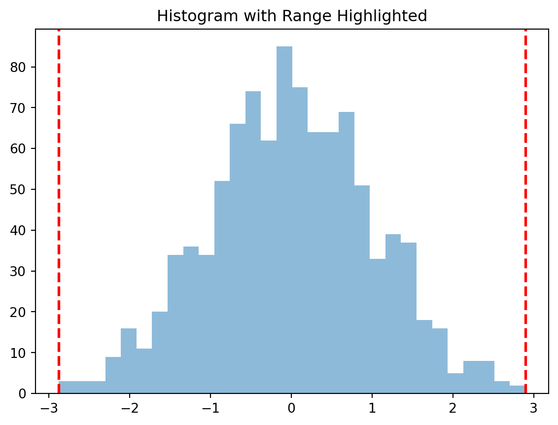
import numpy as npimport matplotlib.pyplot as plt# Step 2: Create a datasetdata = np.random.normal(loc=0, scale=1, size=1000)# Step 3: Calculate the range of the datasetdata_range = [np.min(data), np.max(data)]# Step 4: Plot the histogram of the datasetplt.hist(data, bins=30, alpha=0.5)# Step 5: Highlight the range on the histogramplt.axvline(data_range[0], color='red', linestyle='dashed', linewidth=2)plt.axvline(data_range[1], color='red', linestyle='dashed', linewidth=2)plt.title('Histogram with Range Highlighted')plt.show()
Figure 5.5: Figure showing the range of a data set
Code
# Step-1: Import librariesimport numpy as npimport matplotlib.pyplot as plt# Step 2: Create a datasetdata = np.random.normal(loc=0, scale=1, size=1000)# Step 3: Calculate the Interquartile Range (IQR) of the datasetQ1 = np.percentile(data, 25)Q3 = np.percentile(data, 75)IQR = Q3 - Q1# Step 4: Plot the boxplot of the datasetplt.figure(figsize=(6, 4))plt.boxplot(data, vert=False)plt.title('Boxplot with IQR')# Annotate Q1, Q3, and IQRplt.annotate(f'Q1\n{Q1:.2f}', (Q1, 1.1), textcoords="data", va='center', ha='center', fontsize=10, color='blue')plt.annotate(f'Q3\n{Q3:.2f}', (Q3, 1.1), textcoords="data", va='center', ha='center', fontsize=10, color='blue')plt.annotate(f'IQR\n{IQR:.2f}', ((Q1+Q3)/2, 1.2), textcoords="data", va='center', ha='center', fontsize=10, color='red')plt.show()print(f"The Interquartile Range (IQR) is: {IQR}")print("")
Figure 5.6: Figure showing the interquartile range of a data set (The box represents the IQR, the whiskers represent the range, and the red line represents the median).
The Interquartile Range (IQR) is: 1.3881045732711281
Code
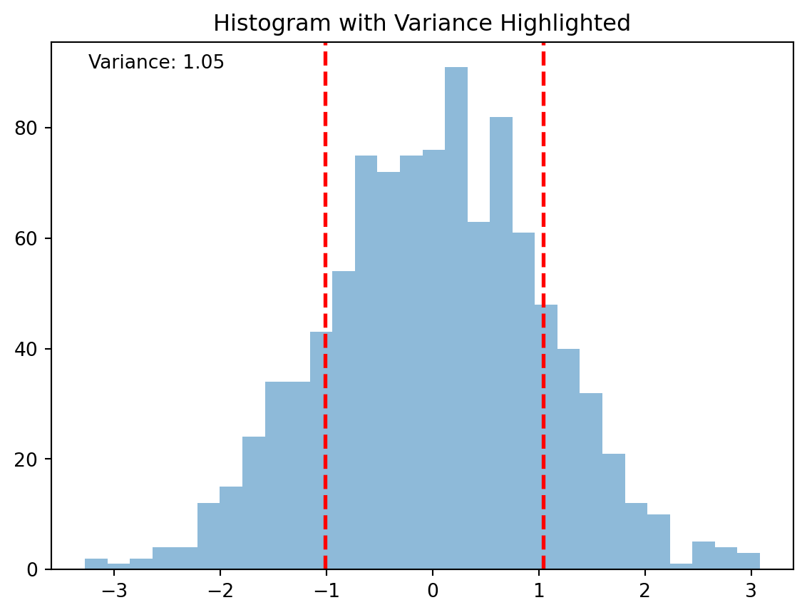
# Step-1: Import librariesimport numpy as npimport matplotlib.pyplot as plt# Step 2: Create a dataset following a normal distributiondata = np.random.normal(loc=0, scale=1, size=1000)# Step 3: Calculate the variance and standard deviation of the datasetvariance = np.var(data)std_dev = np.sqrt(variance)mean = np.mean(data)# Step 4: Plot the histogram of the datasetplt.hist(data, bins=30, alpha=0.5)# Step 5: Highlight the variance on the histogramplt.axvline(mean - std_dev, color='red', linestyle='dashed', linewidth=2)plt.axvline(mean + std_dev, color='red', linestyle='dashed', linewidth=2)plt.title('Histogram with Variance Highlighted')plt.annotate(f'Variance: {variance:.2f}', xy=(0.05, 0.95), xycoords='axes fraction')plt.show()print(f"The variance is: {variance}")
Figure 5.7: Figure showing the variance of a data set. (In the histogram, the dashed red lines represent one standard deviation away from the mean, which gives a visual representation of the variance.)
The variance is: 1.0757774768048798
Code
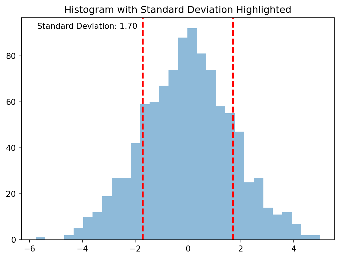
# Step-1: Import librariesimport numpy as npimport matplotlib.pyplot as plt# Step 2: Create a dataset following a normal distributiondata = np.random.normal(loc=0, scale=1.70, size=1000)# Step 3: Calculate the standard deviation and mean of the datasetstd_dev = np.std(data)mean = np.mean(data)# Step 4: Plot the histogram of the datasetplt.hist(data, bins=30, alpha=0.5)# Step 5: Highlight the standard deviation on the histogramplt.axvline(mean - std_dev, color='red', linestyle='dashed', linewidth=2)plt.axvline(mean + std_dev, color='red', linestyle='dashed', linewidth=2)plt.title('Histogram with Standard Deviation Highlighted')plt.annotate(f'Standard Deviation: {std_dev:.2f}', xy=(0.05, 0.95), xycoords='axes fraction')plt.show()print(f"The standard deviation is: {std_dev}")
Figure 5.8: Figure showing the standard deviation of a data set. In the histogram, the dashed red lines represent one standard deviation away from the mean, which gives a visual representation of the standard deviation.
The standard deviation is: 1.7003749257425895
Code
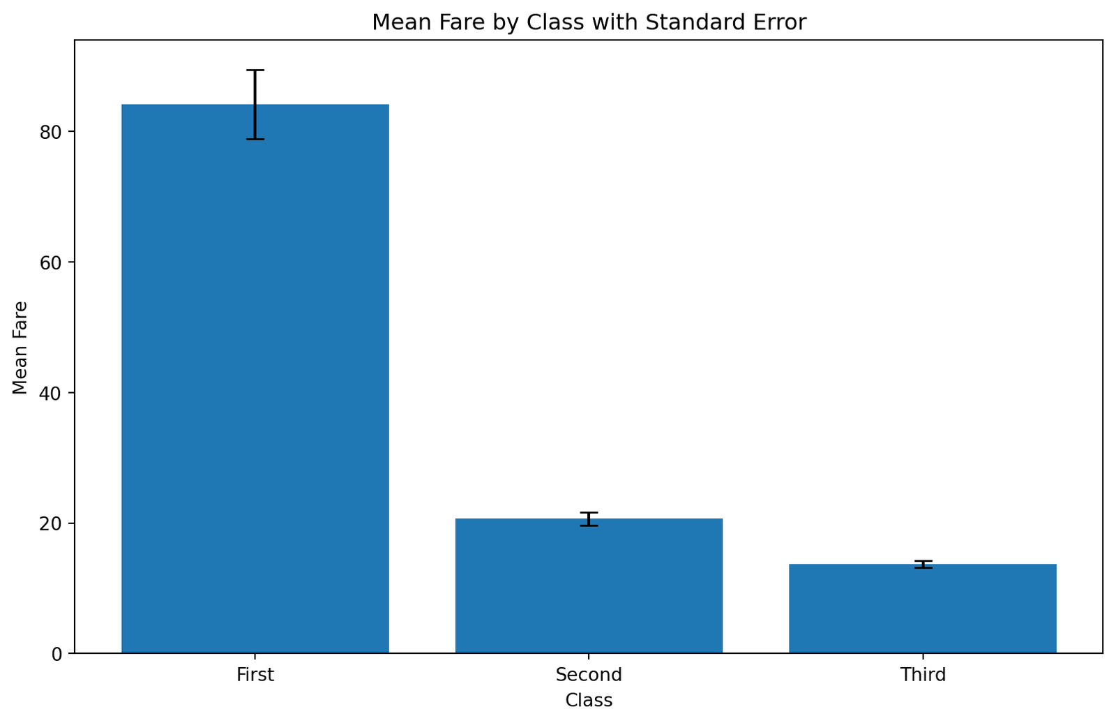
# Step 1: Import necessary librariesimport pandas as pdimport matplotlib.pyplot as pltimport seaborn as sns# Step 2: Load the Titanic datasettitanic = sns.load_dataset('titanic')# Step 3: Calculate the mean fare for each classmean_fare = titanic.groupby('class', observed =True)['fare'].mean()# Step 4: Calculate the standard error for each classstd_error = titanic.groupby('class', observed =True)['fare'].sem()# creata a dataframe from mean_fare and std_errordf = pd.DataFrame({'Mean Fare': mean_fare,'Standard Error': std_error}).reset_index()# Assuming fare_stats is already defined as per previous steps# Step 5: Plot a bar plot with error bars representing the standard errorplt.figure(figsize=(10, 6))# Create a bar plotplt.bar(df['class'], df['Mean Fare'], yerr=df['Standard Error'], capsize=5)# Adding labels and titleplt.xlabel('Class')plt.ylabel('Mean Fare')plt.title('Mean Fare by Class with Standard Error')# Show the plotplt.show()# silence all warningsimport warningswarnings.filterwarnings('ignore')
Figure 5.9: Figure showing the standard errorr in a bar plot of a titanic dataset.
5.5.8 Importance of Variability in Data Science and Machine Learning
Data Science mein, variability ya tabdeeli ka kirdar bohot ahem hota hai. Ye measure karta hai ke data points kitne alag hain ek dusre se aur ye insights provide karta hai ke data kis tarah distribute hua hai.
5.5.8.1 Variability Ka Importance 🌟
Data Understanding (Data Ki Samajh):
Variability se data scientists ko data sets ke structure aur spread ki deep understanding milti hai. Yeh unhe batata hai ke data mein kis tarah ke patterns ya anomalies hain.
Example: Karachi ke different areas mein air quality index (AQI) ki variability analyze kar ke, scientists pollution sources aur patterns ko better samajh sakte hain.
Model Accuracy (Model Ki Durusti):
Machine learning models mein, high variability ka matlab ho sakta hai ke model ko train karne ke liye zyada complex ya diverse data ki zarurat hogi.
Example: Lahore mein traffic flow predict karne wale model ke liye, road par different times mein hone wale traffic ki variability ko samajhna zaroori hai.
Risk Assessment (Khatraat Ka Andaza):
Businesses aur financial analysts variability ko use karte hain risks ko assess karne ke liye. High variability ka matlab hai zyada risk.
Example: Islamabad ke stock market mein investment ke decisions lene ke liye, different stocks ki price variability ka analysis karna crucial hota hai.
Quality Control (Mayaar Par Control):
Manufacturing ya production processes mein, variability ka kam hona quality control ki achhi indication hoti hai.
Example: Faisalabad ke textile mills mein cloth ki quality check karne ke liye, production line ke output mein variability ko monitor karna important hota hai.
Customer Insights (Grahak Ki Maloomat):
Marketing aur customer behavior analysis mein, variability ko samajhna helps karta hai different customer segments aur unki preferences ko samajhne mein.
Example: Multan mein ek retail store ke customer purchase patterns ki variability ko analyze kar ke, store apne products aur marketing strategies ko optimize kar sakta hai.
In sab examples se clear hota hai ke Data Science mein variability ko samajhna essential hai. Ye aapko data ke nature ko samajhne, risks ko manage karne, aur better decisions lene mein madad karta hai. 📊💡🔍✨👩💻
5.6 Outliers
Aaiye baat karte hain “Outliers” ke baare mein Data Science aur statistics mein! 📊🌟
Outliers, ya intehai qiymat, woh data points hote hain jo baqi data se bohot alag hote hain. Ye aise values hoti hain jo ya to bohot zyada bari ya chhoti hoti hain baqi data ke comparison mein. In points ko outliers kehte hain kyunki ye “normal” ya expected range se bahar hote hain.
5.6.0.1 Outliers Ki Importance 🌟
Data Cleaning (Data Saaf Karna):
Data science projects mein, outliers ko pehchanna aur unka proper handling zaroori hota hai. Kabhi-kabhi inhe remove karna better hota hai taake model ya analysis accurate ho.
Example: Karachi ke traffic data mein, agar kisi khaas din (jaise kisi badi event ke din) traffic unusually high ho, toh ye outlier consider kiya jaa sakta hai.
Error Detection (Ghalti Ka Pata Lagana):
Outliers kabhi-kabhi data collection ya processing ki ghaltiyon ki nishani bhi ho sakti hain. Inhe identify karna helps karta hai errors ko correct karne mein.
Example: Lahore ke hospital mein patient ki age galat entry ki gayi ho jaise 200 years, ye ek obvious outlier hoga.
Insights and Discoveries (Maloomat aur Daryaft):
Outliers se kabhi-kabhi new discoveries ya important insights mil sakte hain.
Example: Islamabad ke market research data mein, agar kisi product ki sales unexpectedly zyada ya kam ho, toh ye outlier kisi trend ya market change ki nishani ho sakti hai.
Statistical Analysis (Shumariyati Tahlil):
Outliers ka impact statistical measures jaise mean par hota hai, jo overall analysis ko affect kar sakte hain.
Example: Peshawar ke school mein test scores ke analysis mein, agar ek ya do students ne unusually high ya low score kiya ho, toh ye mean score ko distort kar sakta hai.
5.6.1 Outliers Ka Handling 🛠️
Outliers ko handle karna carefully kiya jana chahiye. Kabhi-kabhi inhe data set se hata diya jata hai, lekin kabhi-kabhi inhe analyze karna bhi zaroori hota hai, khas taur par jab ye kisi real phenomenon ya important information ko represent karte hain. Outliers ko identify karne ke liye various methods jaise scatter plots, box plots, aur statistical tests (e.g., Z-score, IQR) ka use kiya jata hai. 📊🔬✨📉
Detecting and removing outliers is a crucial step in data preprocessing, especially in data science and machine learning projects. Python, with its libraries like Pandas, NumPy, and SciPy, provides efficient tools to handle this task. Here’s a general approach to detect and remove outliers in Python:
5.6.2 Detecting Outliers
Using Statistical Methods:
Standard Deviation and Z-Score:
Calculate the Z-score for each data point. Z-score indicates how many standard deviations an element is from the mean.
Typically, data points with a Z-score greater than 3 or less than -3 are considered outliers.
The Z-score method is a statistical technique used to measure how far away a data point is from the mean, relative to the standard deviation of the dataset. The equation for calculating the Z-score of a data point is:
\[Z = \frac{(X - \mu)}{\sigma}\]
Where: \(Z\) is the Z-score. \(X\) is the value of the data point. \(\mu\) is the mean of the dataset. \(\sigma\) is the standard deviation of the dataset.
Explanation of the Z-score Formula:
\((X - \mu)\): This part of the formula calculates the difference between the data point and the mean of the dataset. It shows how far the data point is from the mean.
Division by \(\sigma\): This step normalizes the difference based on the standard deviation of the dataset. It essentially tells you how many standard deviations away from the mean your data point is.
Use of Z-score:
A Z-score can be positive or negative, indicating whether the data point is above or below the mean, respectively.
In most cases, a Z-score beyond +3 or below -3 is considered as an outlier, as it lies far from the mean (more than 3 standard deviations).
This method is widely used in statistics and data science to identify outliers and understand the distribution of data points within a dataset.
Example: Here is the code to find outliers in python.
Data points that fall outside of the whiskers (1.5 times the IQR) are outliers.
Example: Here is an example with code to find outliers in python using box plots.
::: {#cell-fig-boxplot without outliers .cell execution_count=12}
Code
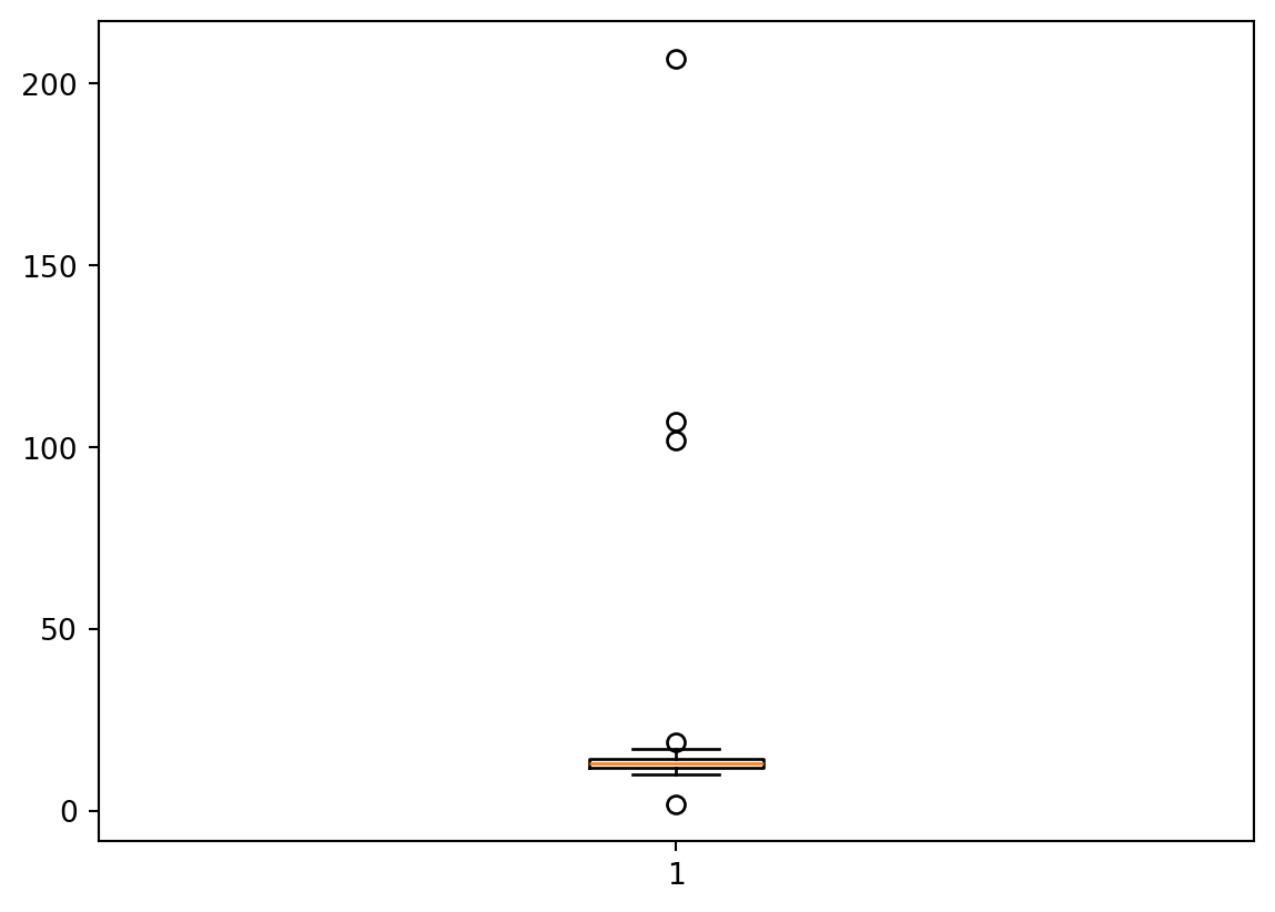
import numpy as npimport matplotlib.pyplot as pltdata = np.array([2, 10, 12, 12, 13, 12, 11, 14, 13, 15, 102, 12, 14, 14, 17, 19, 107, 10, 13, 12, 14, 12, 207]) # Your data arrayplt.boxplot(data)plt.show()
Figure 5.10: Figure showing box plot with outliers.
:::
5.6.3 Removing Outliers
Once outliers are identified, you can choose to remove them to clean your dataset. This can be done by filtering the data.
Using Conditions:
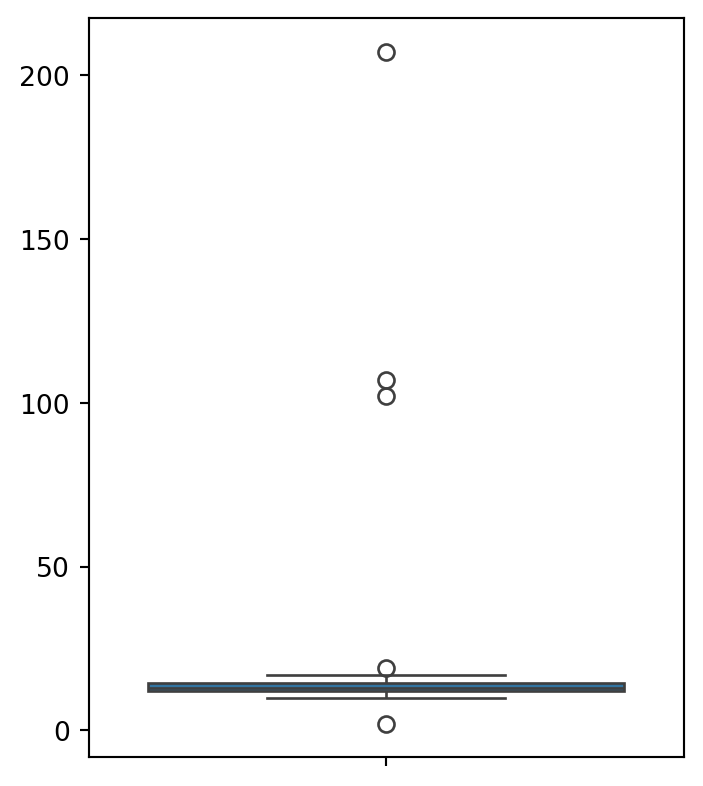
#import librariesimport pandas as pdimport numpy as npimport seaborn as snsdata = sns.load_dataset('titanic')# show the content of the 'age' columnprint(f"the length of age column in Data is {len(data['age'])}")# Remove outliers from the 'age' columnQ1 = data['age'].quantile(0.25)Q3 = data['age'].quantile(0.75)IQR = Q3 - Q1filtered_data = data[~((data['age'] < (Q1 -1.5* IQR)) |(data['age'] > (Q3 +1.5* IQR)))]# data without outliersprint(f"The length of age column in Data without outliers is {len(filtered_data['age'])}")
the length of age column in Data is 891
The length of age column in Data without outliers is 880
Here is an example before and after outliers are removed, you can also unfold the code to see the output.
Figure 5.11: Figure showing box plot with and without outliers.
5.6.3.1 Important Considerations
Context Matters: Before removing outliers, it’s important to understand the context. Sometimes, outliers carry important information.
Impact on Dataset: Removing outliers can significantly alter your results, especially in small datasets.
Using these methods in Python, you can effectively detect and handle outliers, ensuring that your data analysis or machine learning models are robust and reliable.
5.7 Graphical Methods
Graphical methods are a simple yet effective way to visualize the distribution of numerical variables. They show the number of observations in each category of a variable. Graphical methods are also known as graphical displays.
There are mny different types of graphical methods, including: 1. Frequency Tables 2. Bar Charts 3. Histograms 4. Box Plots 5. Scatter Plots 6. Line Plots 7. Pie Charts 8. Heat Maps 9. Venn Diagrams 10. Tree Maps 11. Word Clouds 12. Sankey Diagrams 13. Network Diagrams 14. Flow Charts 15. Cartograms 16. Choropleth Maps 17. Geographical Maps 18. and many more!
I would suggest you to explore the Andrew Abela’s Chart Suggestions to get a better understanding of which chart to use for which type of data.
5.7.1 Python libraries for data visualization
Python mein bohot se libraries hain jo data visualization ke liye use kiye jate hain. Kuch popular libraries hain:
Is section main ham kuch popular libraries ko use kar ke data visualization ke examples dekhenge. 📊🔍✨📚 or graphical methods se data ko understand karna seekhen gay.
5.7.2 Frequency Tables
Frequency tables are a simple way to visualize the distribution of categorical variables. They show the number of observations in each category of a variable. Frequency tables are also known as contingency tables.
5.7.2.1 Frequency Tables Ka Formula 📐
Frequency tables ka formula hai:
\[\text{Frequency} = \frac{\text{Number of Observations in a Category}}{\text{Total Number of Observations}} \times 100\%\]
Frequency Tables, ya Tadaad Ki Tables, aik aham tool hain statistics aur data analysis mein. Ye tables data ko organize aur summarize karne ke liye use kiye jate hain, khaas taur par jab aapko data ke distribution ya patterns ko quickly samajhna ho.
5.7.2.2 Frequency Table Ki Structure 📐
Categories (Zumray): Aapke data ke different groups ya classes.
Frequency (Tadaad): Har category mein kitni dafa woh value ya observation aayi hai.
Relative Frequency (Nisbi Tadaad): Ye batata hai ke har category ki frequency total observations ke hisse ke tor par kitni hai.
Cumulative Frequency (Jammi Tadaad): Ye batata hai ke kisi particular point tak total kitni frequencies accumulate ho chuki hain.
5.7.2.3 Frequency Tables Ki Misal 🌟
Example: Maan lijiye aap ek survey conduct kar rahe hain Islamabad ke ek school mein aur aapko yeh janna hai ke students rozana kitni dair TV dekhte hain. Aap categories bana sakte hain jaise “1 ghanta”, “2 ghante”, “3 ghante”, etc., aur phir count karte hain ke har category mein kitne students aate hain.
Frequency Tables in Python
import pandas as pd# Example dataset: student survey on hours spent on social media dailydata = {'Hours on Social Media': ['<1 hour', '1-2 hours', '2-3 hours', '3-4 hours', '>4 hours'],'Number of Students': [15, 30, 25, 10, 5]}# Creating a DataFramedf = pd.DataFrame(data)# Displaying the DataFrame as a Frequency Tabledf
Hours on Social Media
Number of Students
0
<1 hour
15
1
1-2 hours
30
2
2-3 hours
25
3
3-4 hours
10
4
>4 hours
5
Figure 5.12: Figure showing a frequency table in Python.
Let’s have another example of titanic dataset.
Code
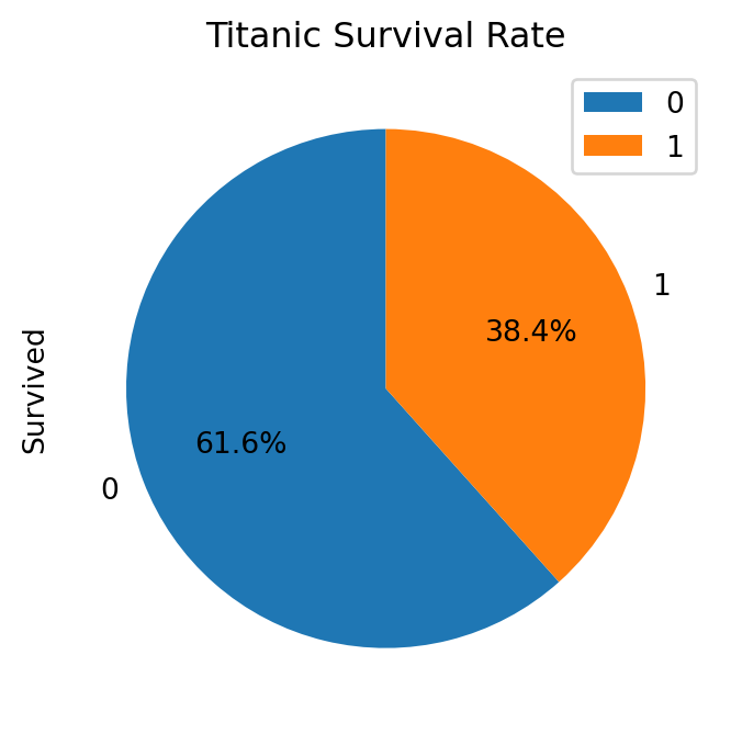
# Example dataset: titanic datasetimport seaborn as snsimport pandas as pdimport matplotlib.pyplot as plt# Load the titanic datasettitanic = sns.load_dataset('titanic')# Create a DataFrame with the frequency tabledf = pd.DataFrame({'Survived': titanic['survived'].value_counts(),'Percentage': titanic['survived'].value_counts(normalize=True) *100})# Display the DataFramedf
Survived
Percentage
survived
0
549
61.616162
1
342
38.383838
Figure 5.13: Figure showing a frequency table of Titanic dataset in Python.
NoteTitanic Dataset results
In this table you can see that 61.6% of the passengers did not survive the Titanic disaster, while 38.4% survived.
5.7.2.4 Frequency Tables Ka Use 🛠️
Data Organization (Data Ko Tarteeb Dena):
Aap complex ya badi matra mein data ko asaani se samajhne ke liye tarteeb de sakte hain.
Example: Karachi ke hospitals mein aane wale different types ke patients ka data organize karne ke liye.
Pattern Identification (Namoonay Ka Taayun):
Data mein mojood patterns ya trends ko pehchanne mein madad milti hai.
Example: Lahore mein kisi specific month mein hony wali traffic accidents ki frequency se traffic patterns ka analysis.
Decision Making (Faisla Sazi):
Business ya policy decisions lene mein insights provide karta hai.
Example: Peshawar ke ek retail store ke product sales data ko analyze kar ke inventory decisions lena.
Statistical Analysis (Shumariyati Tahlil):
Kisi bhi further statistical analysis ya visualizations banane ke liye base provide karta hai.
Example: Multan mein students ki examination performance analysis ke liye.
Frequency tables simple yet powerful tools hain jo data ko samajhne aur us par based decisions lene mein bohot madadgar sabit hote hain. Ye especially tab useful hote hain jab data sets bade hote hain ya jab aapko quick insights chahiye hote hain. 📊🔍✨📚
5.7.3 Bar Charts
Bar charts are a simple yet effective way to visualize the distribution of categorical variables. They show the number of observations in each category of a variable. Bar charts are also known as bar graphs.
The bar chart is particularly appropriate for displaying discrete data with only a few categories. The bars can be plotted vertically or horizontally. The height or length of each bar is proportional to the number of observations in the category.
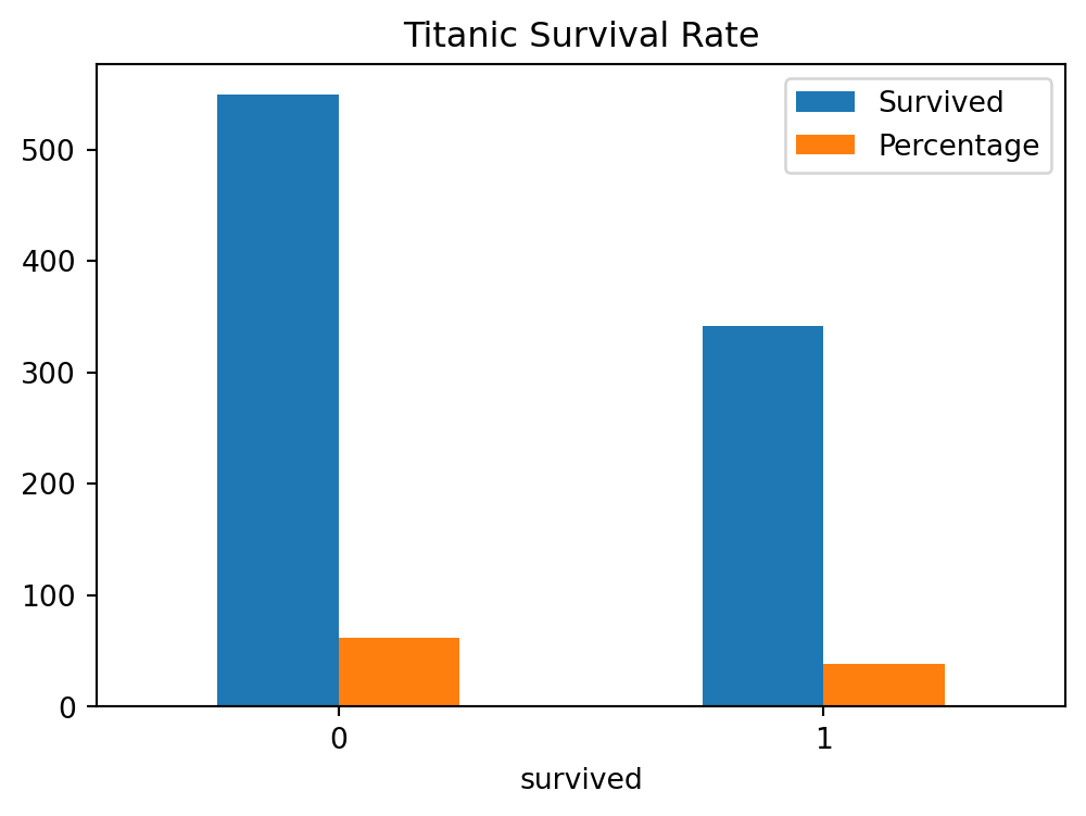
The Figure 5.14 shows the bar chart of the Titanic dataset, you can also unfold the code to see the output. The barchart shows the number of passengers who survived and who did not survive the Titanic disaster.
Code
# Example dataset: titanic datasetimport seaborn as snsimport pandas as pdimport matplotlib.pyplot as plt# Load the titanic datasettitanic = sns.load_dataset('titanic')# Create a DataFrame with the frequency tabledf = pd.DataFrame({'Survived': titanic['survived'].value_counts(),'Percentage': titanic['survived'].value_counts(normalize=True) *100})# Plot the bar chartdf.plot(kind='bar', rot=0, title='Titanic Survival Rate', figsize=(6, 4))# Show the plotplt.show()
Figure 5.14: Figure showing a bar chart of Titanic dataset in Python.
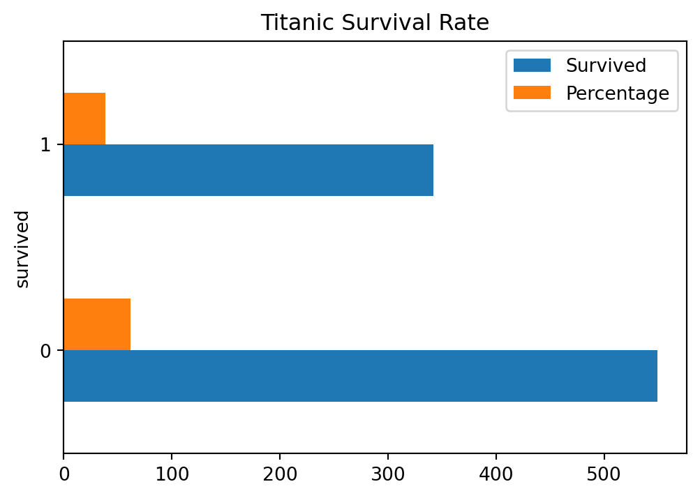
Ap bar chart ko horizontal bhi bana sakte hain, jaisa ke Figure 5.15 mein dikhaya gaya hai.
Code
# Example dataset: titanic datasetimport seaborn as snsimport pandas as pdimport matplotlib.pyplot as plt# Load the titanic datasettitanic = sns.load_dataset('titanic')# Create a DataFrame with the frequency tabledf = pd.DataFrame({'Survived': titanic['survived'].value_counts(),'Percentage': titanic['survived'].value_counts(normalize=True) *100})# Plot the bar chartdf.plot(kind='barh', rot=0, title='Titanic Survival Rate', figsize=(6, 4))# Show the plotplt.show()
Figure 5.15: Figure showing a horizontal bar chart of Titanic dataset in Python.
5.7.3.1 Bar Charts Ka Formula 📐
Bar charts ka formula hai:
\[\text{Bar Height} = \frac{\text{Number of Observations in a Category}}{\text{Total Number of Observations}} \times 100\%\]
Bar Charts, ya Bar Graphs, aik aham tool hain statistics aur data analysis mein. Ye graphs data ko organize aur summarize karne ke liye use kiye jate hain, khaas taur par jab aapko data ke distribution ya patterns ko quickly samajhna ho.
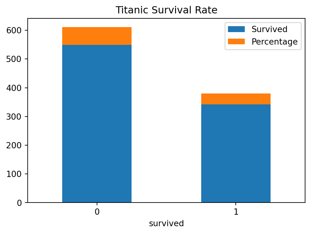
You can also make stacked bar charts in Python. Stacked bar charts are used to show how a larger category is divided into smaller categories and what the relationship of each part has on the total amount. The Figure 5.16 shows the stacked bar chart of the Titanic dataset, you can also unfold the code to see the output.
Code
# Example dataset: titanic datasetimport seaborn as snsimport pandas as pdimport matplotlib.pyplot as plt# Load the titanic datasettitanic = sns.load_dataset('titanic')# Create a DataFrame with the frequency tabledf = pd.DataFrame({'Survived': titanic['survived'].value_counts(),'Percentage': titanic['survived'].value_counts(normalize=True) *100})# Plot the bar chartdf.plot(kind='bar', rot=0, title='Titanic Survival Rate', stacked=True, figsize=(6, 4))# Show the plotplt.show()
Figure 5.16: Figure showing a stacked bar chart of Titanic dataset in Python.
We can also draw bar charts using plotly library. The Figure 5.17 shows the bar chart of the Titanic dataset using plotly library, you can also unfold the code to see the output.
Code
# Example dataset: titanic datasetimport seaborn as snsimport pandas as pdimport matplotlib.pyplot as pltimport plotly.express as px# Load the titanic datasettitanic = sns.load_dataset('titanic')# Create a DataFrame with the frequency tabledf = pd.DataFrame({'Survived': titanic['survived'].value_counts(),'Percentage': titanic['survived'].value_counts(normalize=True) *100})# Plot the bar chart for both the columns Survived and Percentagefig = px.bar(df, x=df.index, y=['Survived', 'Percentage'], title='Titanic Survival Rate')fig.show()
Figure 5.17: Figure showing a bar chart of Titanic dataset in Python using plotly library.
5.7.4 Histograms
Histograms are a simple yet effective way to visualize the distribution of numerical variables. They show the number of observations in each category of a variable. Histograms are also known as frequency histograms.
The histogram is a graphical representation of the distribution of numerical data. It is an estimate of the probability distribution of a continuous variable. To construct a histogram, the first step is to “bin” (or “bucket”) the range of values—that is, divide the entire range of values into a series of intervals—and then count how many values fall into each interval. The bins are usually specified as consecutive, non-overlapping intervals of a variable. The bins (intervals) must be adjacent, and are often (but are not required to be) of equal size.
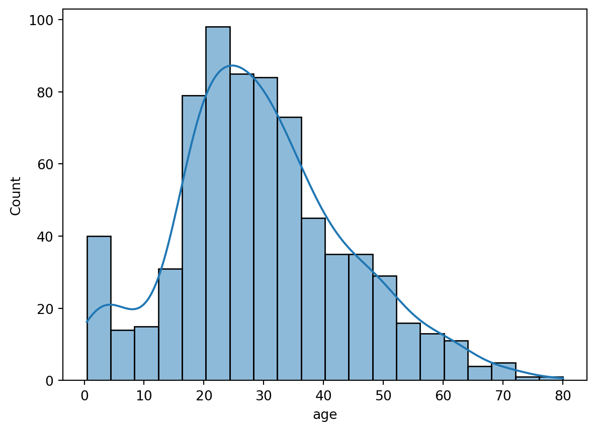
The Figure 5.18 shows the histogram of the Titanic dataset, you can also unfold the code to see the output. The histogram shows the number of passengers who survived and who did not survive the Titanic disaster based on their age.
Code
# Example dataset: titanic datasetimport seaborn as snsimport pandas as pdimport matplotlib.pyplot as plt# Load the titanic datasettitanic = sns.load_dataset('titanic')sns.histplot(data=titanic, x='age', kde=True)plt.show()# Plot the histogramsns.histplot(data=titanic, x='age', hue='survived', multiple='stack', kde=True)# Show the plotplt.show()
(a) Histogram of age column
(b) Histogram of Age column grouped by Survived column
Figure 5.18: Figure showing a histogram of Titanic dataset in Python.
5.7.5 Pie Charts
Pie charts are a simple yet effective way to visualize the distribution of categorical variables. They show the number of observations in each category of a variable. Pie charts are also known as pie graphs.
The pie chart is a circular statistical graphic, which is divided into slices to illustrate numerical proportion. In a pie chart, the arc length of each slice (and consequently its central angle and area), is proportional to the quantity it represents. While it is named for its resemblance to a pie which has been sliced, there are variations on the way it can be presented. The earliest known pie chart is generally credited to William Playfair’s Statistical Breviary of 1801.
The Figure 5.19 shows the pie chart of the Titanic dataset, you can also unfold the code to see the output. The pie chart shows the number of passengers who survived and who did not survive the Titanic disaster.
Code
# Example dataset: titanic datasetimport seaborn as snsimport pandas as pdimport matplotlib.pyplot as plt# Load the titanic datasettitanic = sns.load_dataset('titanic')# Create a DataFrame with the frequency tabledf = pd.DataFrame({'Survived': titanic['survived'].value_counts(),'Percentage': titanic['survived'].value_counts(normalize=True) *100})# Plot the pie chartdf.plot(kind='pie', y='Survived', figsize=(6, 4), autopct='%1.1f%%', startangle=90, title='Titanic Survival Rate')# Show the plotplt.show()
Figure 5.19: Figure showing a pie chart of Titanic dataset in Python.
We can also create pie chart using plotly to show the rate of survival of passengers in the Titanic disaster. The Figure 5.20 shows the pie chart of the Titanic dataset using plotly library where data was grouped based on the class of travelling on titanic dataset.You can also unfold the code to see the output.
Code
# Example dataset: titanic datasetimport seaborn as snsimport pandas as pdimport plotly.express as px# Load the titanic datasettitanic = sns.load_dataset('titanic')# Group the data by 'class' and count the number of survivorsclass_survived = titanic.groupby('class')['survived'].sum().reset_index()# Create a pie chartfig = px.pie(class_survived, values='survived', names='class', title='Titanic Survival Rate by Class')fig.show()
Figure 5.20: Figure showing a pie chart of Titanic dataset in Python using plotly library.
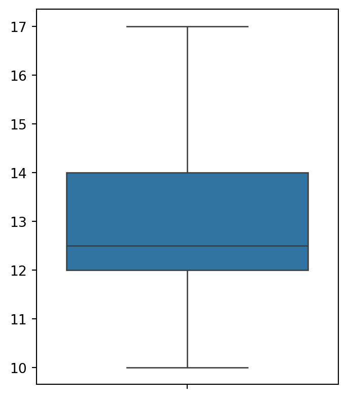
5.7.6 Box Plots
Box plots are a simple yet effective way to visualize the distribution of numerical variables. They show the number of observations in each category of a variable. Box plots are also known as box and whisker plots.
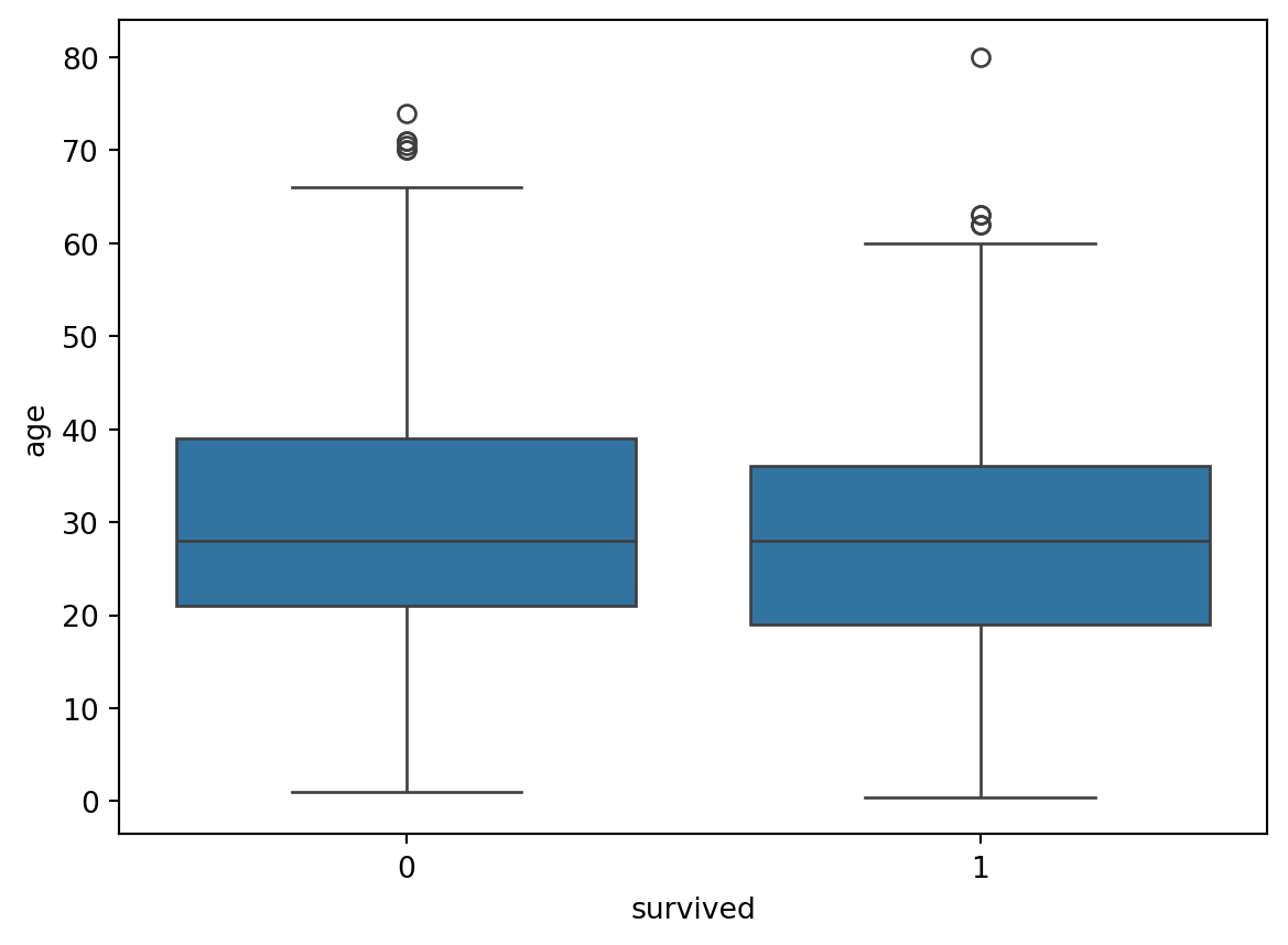
The box plot is a standardized way of displaying the distribution of data based on the five number summary: minimum, first quartile, median, third quartile, and maximum. It is also known as a box and whisker plot. The box plot is compact and efficient, displaying only the most important summary statistics. It also allows for easy identification of any outliers and a visual representation of the data symmetry and skewness.
The Figure 5.21 shows the box plot of the Titanic dataset, you can also unfold the code to see the output. The box plot shows the number of passengers who survived and who did not survive the Titanic disaster based on their age.
Code
# Example dataset: titanic datasetimport seaborn as snsimport pandas as pdimport matplotlib.pyplot as plt# Load the titanic datasettitanic = sns.load_dataset('titanic')# Plot the box plotsns.boxplot(data=titanic, x='survived', y='age')# Show the plotplt.show()
Figure 5.21: Figure showing a box plot of Titanic dataset in Python.
We can also show the box plot using plotly library. The Figure 5.22 shows the box plot of the Titanic dataset using plotly library, you can also unfold the code to see the output. The box plot shows the number of passengers who survived and who did not survive the Titanic disaster based on their class.
Code
# Example dataset: titanic datasetimport seaborn as snsimport pandas as pdimport plotly.express as px# Load the titanic datasettitanic = sns.load_dataset('titanic')# Plot the box plotfig = px.box(titanic, x='survived', y="age", color='class', notched=True, title='Titanic Survival Rate by Class and Age')# Show the plotfig.show()
Figure 5.22: Figure showing a box plot of Titanic Survival Rate by Class and Age Python using plotly library.
5.7.7 Bi-variate Charts
Bi-variate charts are a simple yet effective way to visualize the relationship between two numerical variables. They show the number of observations in each category of a variable. Bi-variate charts are also known as scatter plots.
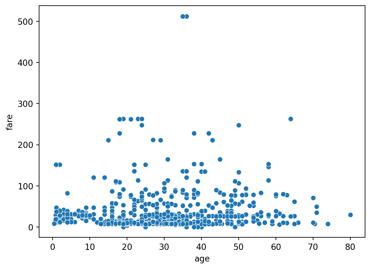
The scatter plot is a type of plot or mathematical diagram using Cartesian coordinates to display values for typically two variables for a set of data. If the points are color-coded, one additional variable can be displayed. The data is displayed as a collection of points, each having the value of one variable determining the position on the horizontal axis and the value of the other variable determining the position on the vertical axis.
The Figure 5.23 shows the scatter plot of the Titanic dataset, you can also unfold the code to see the output. The scatter plot shows the relationship between the age and fare of the passengers who survived and who did not survive the Titanic disaster.
Code
# Example dataset: titanic datasetimport seaborn as snsimport pandas as pdimport matplotlib.pyplot as plt# Load the titanic datasettitanic = sns.load_dataset('titanic')# Plot the scatter plotsns.scatterplot(data=titanic, x='age', y='fare')# Show the plotplt.show()
Figure 5.23: Figure showing a scatter plot of Titanic dataset in Python.
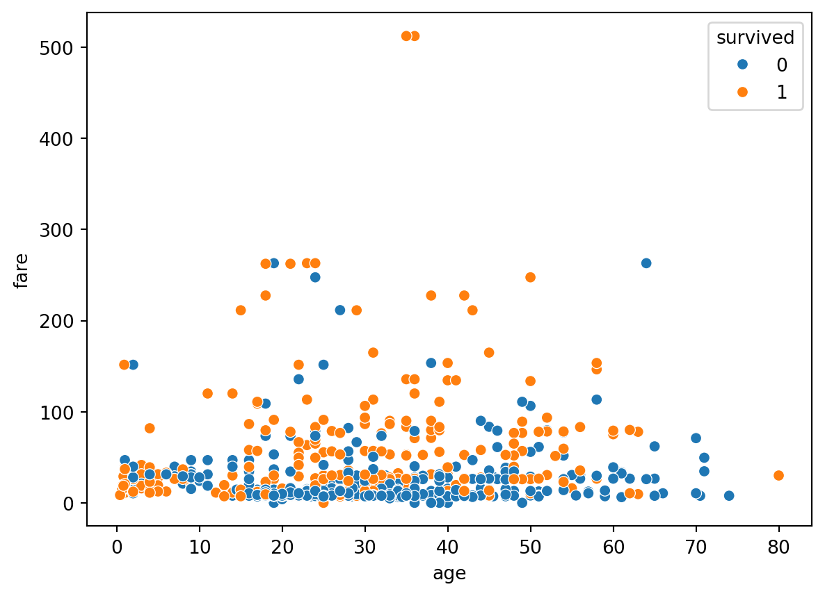
IN 2 variables ko ham further group kar sakte hain aur unke relationship ko visualize kar sakte hain. The Figure 5.24 shows the scatter plot of the Titanic dataset, you can also unfold the code to see the output. The scatter plot shows the relationship between the age and fare of the passengers who survived and who did not survive the Titanic disaster based on their class.
Code
# Example dataset: titanic datasetimport seaborn as snsimport pandas as pdimport matplotlib.pyplot as plt# Load the titanic datasettitanic = sns.load_dataset('titanic')# Plot the scatter plotsns.scatterplot(data=titanic, x='age', y='fare', hue='survived')# Show the plotplt.show()
Figure 5.24: Figure showing a scatter plot of Titanic dataset in Python.
We can also draw scatter plots using plotly library. The Figure 5.25 shows the scatter plot of the Titanic dataset using plotly library, you can also unfold the code to see the output. The scatter plot shows the relationship between the age and fare of the passengers who survived and who did not survive the Titanic disaster based on their class.
Code
# Example dataset: titanic datasetimport seaborn as snsimport pandas as pdimport plotly.express as px# Load the titanic datasettitanic = sns.load_dataset('titanic')# Plot the scatter plotfig = px.scatter(titanic, x='age', y='fare', color='class', title='Titanic Survival Rate by Class and Age')# Show the plotfig.show()
Figure 5.25: Figure showing a scatter plot of Titanic dataset in Python using plotly library.
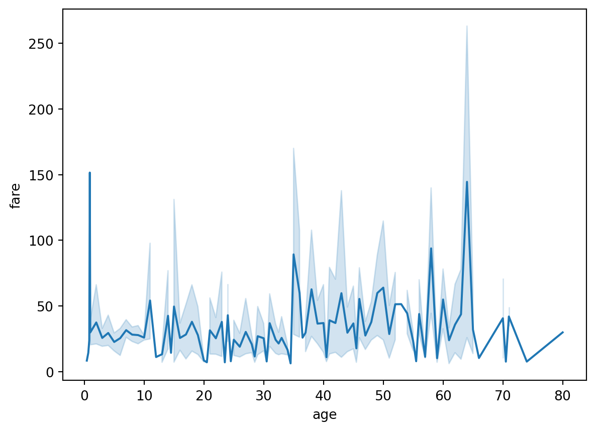
5.7.8 Line Plots
Line plots are a simple yet effective way to visualize the relationship between two numerical variables. They show the number of observations in each category of a variable. Line plots are also known as line graphs.
The line chart or line graph is a type of chart that displays information as a series of data points called ‘markers’ connected by straight line segments. It is a basic type of chart common in many fields. It is similar to a scatter plot except that the measurement points are ordered (typically by their x-axis value) and joined with straight line segments. A line chart is often used to visualize a trend in data over intervals of time – a time series – thus the line is often drawn chronologically.
The Figure 5.26 shows the line plot of the Titanic dataset, you can also unfold the code to see the output. The line plot shows the relationship between the age and fare of the passengers who survived and who did not survive the Titanic disaster.
Code
# Example dataset: titanic datasetimport seaborn as snsimport pandas as pdimport matplotlib.pyplot as plt# Load the titanic datasettitanic = sns.load_dataset('titanic')# Plot the line plotsns.lineplot(data=titanic, x='age', y='fare')# Show the plotplt.show()
Figure 5.26: Figure showing a line plot of Titanic dataset in Python.
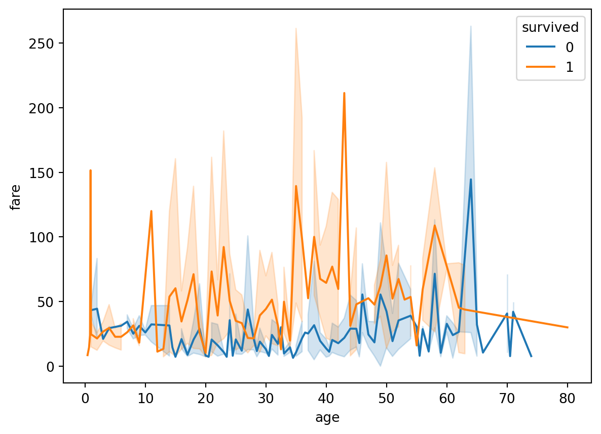
Ham line plot ko group kar ke bhi visualize kar sakte hain. The Figure 5.27 shows the line plot of the Titanic dataset, you can also unfold the code to see the output. The line plot shows the relationship between the age and fare of the passengers who survived and who did not survive the Titanic disaster based on their class.
Code
# Example dataset: titanic datasetimport seaborn as snsimport pandas as pdimport matplotlib.pyplot as plt# Load the titanic datasettitanic = sns.load_dataset('titanic')# Plot the line plotsns.lineplot(data=titanic, x='age', y='fare', hue='survived')# Show the plotplt.show()
Figure 5.27: Figure showing a line plot of Titanic dataset in Python.
flowchart LR
   A((Data)) --> B[Composition]
   A --> C[Distribution]
   A --> D[Relationship]
   A --> E[Comparison]
   B --> F[Bar Chart]
   B --> G[Pie Chart]
   B --> H[Tree Map]
   B --> I[Word Cloud]
   B --> K[Network Diagram]
   C --> L[Histogram]
   C --> M[Box Plot]
   C --> N[Scatter Plot]
   C --> O[Line Plot]
   D --> P[Scatter Plot]
   D --> Q[Bubule Chart]
   E --> R[Bar Chart]
   E --> S[Line Plot]
   E --> T[Box Plot]
Another Idea of Descriptive Statistics:
graph TD
    A[Start: Choose a Chart] --> B(Do you have time series data?)
    B -- Yes --> C[Use Line Chart]
    B -- No --> D(Do you need to compare parts to a whole?)
    D -- Yes --> E[Use Pie Chart or Bar Chart]
    D -- No --> F(Do you need to compare items?)
    F -- Yes --> G[Use Bar Chart or Column Chart]
    F -- No --> H(Do you have relational data?)
    H -- Yes --> I[Use Scatter Plot]
    H -- No --> J(Need to show distribution?)
    J -- Yes --> K[Use Histogram or Box Plot]
    J -- No --> L[Consider other types of charts or revise data presentation needs]
5.8 🎬 Video Tutorial
TipDescriptive Statistics - Complete Crash Course
Agar aap descriptive statistics aur central tendency ke concepts ko gehraai se samajhna chahte hain, to ye video dekhein:
Statistics for Data Analytics and Data Science Complete Crash course for beginners in urdu/hindi (14+ hours)
Is course mein aap seekhenge:
Measures of Central Tendency (Mean, Median, Mode)
Measures of Dispersion (Variance, Standard Deviation)
Data Distribution concepts
Practical examples in Python
5.9 Follow us
TipFollow us
Main umeed karta hun k ap ko ye chapter ne bht kuch seekhaya ho ga, or agar sach main seekhaya hy then please do support us by sharing this book with your friends and colleagues. Also, do share your feedback with us, so that we can improve our work in future.