graph LR
    A[EDA] --> B[📋 Data Composition]
    A --> C[📊 Distribution]
    A --> D[🔄 Comparison]
    A --> E[🔗 Relationship]

    B --> B1[Shape & Size]
    B --> B2[Data Types]
    B --> B3[Missing Values]
    B --> B4[Duplicates]

    C --> C1[Central Tendency]
    C --> C2[Spread/Variability]
    C --> C3[Skewness]
    C --> C4[Outliers]

    D --> D1[Group Comparisons]
    D --> D2[Category Analysis]
    D --> D3[Trends Over Time]

    E --> E1[Correlations]
    E --> E2[Dependencies]
    E --> E3[Interactions]
9 Exploratory Data Analysis (EDA) 📊🔍
9.1 EDA Kya Hai?
Exploratory Data Analysis (EDA) ek systematic approach hai jis mein hum apne data ko deeply explore karte hain taake uski characteristics, patterns, anomalies aur hidden insights ko samajh sakein.
Jaise ek detective crime scene ko carefully examine karta hai, waise hi ek data scientist EDA ke zariye data ko investigate karta hai. EDA ke through hum:
- 📋 Data ki structure aur composition samajhte hain
- 📈 Variables ki distribution dekhte hain
- 🔄 Different groups ko compare karte hain
- 🔗 Variables ke darmiyan relationships explore karte hain
TipJohn Tukey - Father of EDA
John Tukey ne 1977 mein EDA ka concept introduce kiya tha. Unhone kaha: “Exploratory data analysis is detective work—numerical detective work—or counting detective work—or graphical detective work.”
9.2 EDA Ki Chaar Dimensions 🎯
EDA ko hum chaar dimensions mein divide kar sakte hain. Ye chaar dimensions data ko completely samajhne ke liye essential hain:
| Dimension | Description | Key Questions | Analysis Type |
|---|---|---|---|
| Composition | Data ki structure aur makeup | Data mein kitni rows/columns hain? Data types kya hain? | Univariate |
| Distribution | Individual variables ka behavior | Values kaise spread hain? Outliers hain? | Univariate |
| Comparison | Groups ke beech differences | Kya groups different hain? | Bivariate |
| Relationship | Variables ke connections | Kya variables related hain? | Bi/Multivariate |
9.3 Univariate, Bivariate, aur Multivariate Analysis 📈
ImportantKab Kaunsa Analysis Karein?
- Univariate: Jab aap ek variable ko samajhna chahte hain
- Bivariate: Jab aap do variables ke beech connection dekhna chahte hain
- Multivariate: Jab aap multiple variables ke combined effect ko samajhna chahte hain
| Analysis Type | Variables | Purpose | Examples |
|---|---|---|---|
| Univariate | 1 | Single variable ki characteristics | Histogram, Box plot |
| Bivariate | 2 | Do variables ka relationship | Scatter plot, Correlation |
| Multivariate | 3+ | Multiple variables ka interaction | Pair plot, Heatmap |
9.4 📋 Dimension 1: Data Composition
Data Composition dimension mein hum dekhte hain ke humara data kaise bana hai - uski shape, size, types, aur quality.
9.4.1 Dataset Load Karein - Tips Dataset
Hum seaborn library ka famous tips dataset use karenge. Ye dataset restaurant tips ke baare mein hai.
# Import libraries
import pandas as pd
import numpy as np
import seaborn as sns
import matplotlib.pyplot as plt
import warnings
warnings.filterwarnings('ignore')

# Load tips dataset
tips = sns.load_dataset('tips')

# Display first 5 rows
tips.head()| total_bill | tip | sex | smoker | day | time | size | |
|---|---|---|---|---|---|---|---|
| 0 | 16.99 | 1.01 | Female | No | Sun | Dinner | 2 |
| 1 | 10.34 | 1.66 | Male | No | Sun | Dinner | 3 |
| 2 | 21.01 | 3.50 | Male | No | Sun | Dinner | 3 |
| 3 | 23.68 | 3.31 | Male | No | Sun | Dinner | 2 |
| 4 | 24.59 | 3.61 | Female | No | Sun | Dinner | 4 |
9.4.2 1.1 Data Shape aur Size
# Data dimensions
print("=" * 50)
print("📊 DATA SHAPE AUR SIZE")
print("=" * 50)
print(f"Total Rows: {tips.shape[0]}")
print(f"Total Columns: {tips.shape[1]}")
print(f"Total Elements: {tips.size}")
print("=" * 50)
==================================================
📊 DATA SHAPE AUR SIZE
==================================================
Total Rows: 244
Total Columns: 7
Total Elements: 1708
==================================================9.4.3 1.2 Data Types
# Data types
print("=" * 50)
print("📋 DATA TYPES")
print("=" * 50)
print(tips.dtypes)
print("=" * 50)
print(f"\n📊 Summary:")
print(f"Numerical Columns: {tips.select_dtypes(include=['number']).columns.tolist()}")
print(f"Categorical Columns: {tips.select_dtypes(include=['category', 'object']).columns.tolist()}")
==================================================
📋 DATA TYPES
==================================================
total_bill float64
tip float64
sex category
smoker category
day category
time category
size int64
dtype: object
==================================================
📊 Summary:
Numerical Columns: ['total_bill', 'tip', 'size']
Categorical Columns: ['sex', 'smoker', 'day', 'time']9.4.4 1.3 Column Information
# Detailed info
print("=" * 50)
print("📋 DETAILED COLUMN INFO")
print("=" * 50)
tips.info()
==================================================
📋 DETAILED COLUMN INFO
==================================================
<class 'pandas.core.frame.DataFrame'>
RangeIndex: 244 entries, 0 to 243
Data columns (total 7 columns):
# Column Non-Null Count Dtype
--- ------ -------------- -----
0 total_bill 244 non-null float64
1 tip 244 non-null float64
2 sex 244 non-null category
3 smoker 244 non-null category
4 day 244 non-null category
5 time 244 non-null category
6 size 244 non-null int64
dtypes: category(4), float64(2), int64(1)
memory usage: 7.4 KB9.4.5 1.4 Missing Values Check
Jaise hum ne Chapter 6 mein discuss kiya tha, missing values ko identify karna bohat zaroori hai.
# Missing values check
print("=" * 50)
print("❓ MISSING VALUES CHECK")
print("=" * 50)
missing = tips.isnull().sum()
missing_pct = (tips.isnull().sum() / len(tips) * 100).round(2)

missing_df = pd.DataFrame({
    'Missing Count': missing,
    'Missing %': missing_pct
})
print(missing_df)
print("=" * 50)
print(f"✅ Great! Is dataset mein koi missing values nahi hain!")
==================================================
❓ MISSING VALUES CHECK
==================================================
Missing Count Missing %
total_bill 0 0.0
tip 0 0.0
sex 0 0.0
smoker 0 0.0
day 0 0.0
time 0 0.0
size 0 0.0
==================================================
✅ Great! Is dataset mein koi missing values nahi hain!9.4.6 1.5 Duplicates Check
# Duplicates check
print("=" * 50)
print("🔄 DUPLICATES CHECK")
print("=" * 50)
duplicates = tips.duplicated().sum()
print(f"Total Duplicate Rows: {duplicates}")
if duplicates > 0:
    print("⚠️ Duplicate rows found!")
else:
    print("✅ No duplicate rows found!")
print("=" * 50)
==================================================
🔄 DUPLICATES CHECK
==================================================
Total Duplicate Rows: 1
⚠️ Duplicate rows found!
==================================================9.4.7 1.6 Memory Usage
# Memory usage
print("=" * 50)
print("💾 MEMORY USAGE")
print("=" * 50)
print(tips.memory_usage(deep=True))
print("=" * 50)
print(f"Total Memory: {tips.memory_usage(deep=True).sum() / 1024:.2f} KB")
==================================================
💾 MEMORY USAGE
==================================================
Index 132
total_bill 1952
tip 1952
sex 476
smoker 471
day 657
time 477
size 1952
dtype: int64
==================================================
Total Memory: 7.88 KB9.5 📊 Dimension 2: Distribution
Distribution dimension mein hum dekhte hain ke individual variables ki values kaise spread hain.
9.5.1 2.1 Descriptive Statistics
# Descriptive statistics for numerical columns
tips.describe()| total_bill | tip | size | |
|---|---|---|---|
| count | 244.000000 | 244.000000 | 244.000000 |
| mean | 19.785943 | 2.998279 | 2.569672 |
| std | 8.902412 | 1.383638 | 0.951100 |
| min | 3.070000 | 1.000000 | 1.000000 |
| 25% | 13.347500 | 2.000000 | 2.000000 |
| 50% | 17.795000 | 2.900000 | 2.000000 |
| 75% | 24.127500 | 3.562500 | 3.000000 |
| max | 50.810000 | 10.000000 | 6.000000 |
# Categorical columns statistics
print("=" * 50)
print("📊 CATEGORICAL COLUMNS STATISTICS")
print("=" * 50)
print(tips.describe(include=['category', 'object']))
==================================================
📊 CATEGORICAL COLUMNS STATISTICS
==================================================
sex smoker day time
count 244 244 244 244
unique 2 2 4 2
top Male No Sat Dinner
freq 157 151 87 1769.5.2 2.2 Central Tendency - Mean, Median, Mode
Jaise hum ne Chapter 4 mein discuss kiya tha, central tendency measures data ke center ko represent karte hain.
# Central tendency for 'total_bill'
print("=" * 50)
print("📊 CENTRAL TENDENCY - total_bill")
print("=" * 50)
print(f"Mean (Average): ${tips['total_bill'].mean():.2f}")
print(f"Median (Middle): ${tips['total_bill'].median():.2f}")
print(f"Mode (Most Frequent): ${tips['total_bill'].mode()[0]:.2f}")
print("=" * 50)

# Central tendency for 'tip'
print("📊 CENTRAL TENDENCY - tip")
print("=" * 50)
print(f"Mean (Average): ${tips['tip'].mean():.2f}")
print(f"Median (Middle): ${tips['tip'].median():.2f}")
print(f"Mode (Most Frequent): ${tips['tip'].mode()[0]:.2f}")
print("=" * 50)
==================================================
📊 CENTRAL TENDENCY - total_bill
==================================================
Mean (Average): $19.79
Median (Middle): $17.80
Mode (Most Frequent): $13.42
==================================================
📊 CENTRAL TENDENCY - tip
==================================================
Mean (Average): $3.00
Median (Middle): $2.90
Mode (Most Frequent): $2.00
==================================================9.5.3 2.3 Spread/Variability
# Spread measures
print("=" * 50)
print("📏 SPREAD MEASURES - total_bill")
print("=" * 50)
print(f"Range: ${tips['total_bill'].max() - tips['total_bill'].min():.2f}")
print(f"Variance: {tips['total_bill'].var():.2f}")
print(f"Standard Deviation: {tips['total_bill'].std():.2f}")
print(f"IQR: {tips['total_bill'].quantile(0.75) - tips['total_bill'].quantile(0.25):.2f}")
print("=" * 50)
==================================================
📏 SPREAD MEASURES - total_bill
==================================================
Range: $47.74
Variance: 79.25
Standard Deviation: 8.90
IQR: 10.78
==================================================9.5.4 2.4 Distribution Visualization - Histogram
import plotly.express as px

# Histogram with Plotly
fig = px.histogram(
    tips,
    x='total_bill',
    nbins=30,
    title='📊 Distribution of Total Bill',
    labels={'total_bill': 'Total Bill ($)'},
    color_discrete_sequence=['#2E86AB']
)
fig.update_layout(
    xaxis_title="Total Bill ($)",
    yaxis_title="Frequency",
    showlegend=False
)
fig.show()# Seaborn histogram with KDE
plt.figure(figsize=(10, 5))
sns.histplot(
data=tips,
x='tip',
kde=True,
color='#E94560',
bins=20
)
plt.title('📊 Distribution of Tip Amount', fontsize=14)
plt.xlabel('Tip ($)')
plt.ylabel('Frequency')
plt.show()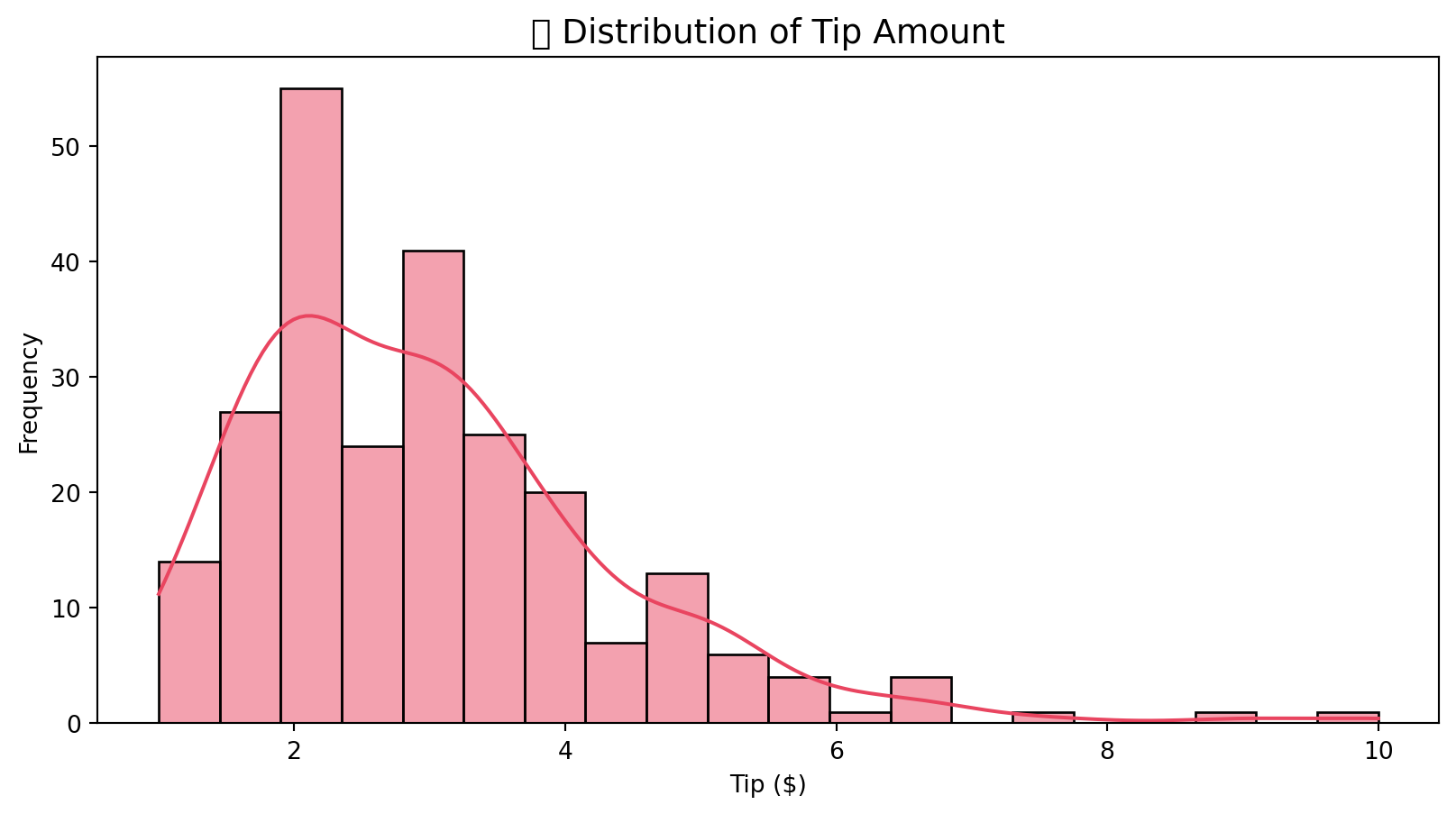
9.5.5 2.5 Box Plot - Outliers Detection
Jaise hum ne Chapter 6 mein discuss kiya tha, box plots outliers detect karne mein helpful hain.
# Box plots with Plotly
fig = px.box(
    tips,
    y=['total_bill', 'tip'],
    title='📦 Box Plots - Outlier Detection'
)
fig.show()# Seaborn box plot
plt.figure(figsize=(10, 5))
sns.boxplot(data=tips, y='total_bill', color='#00ADB5')
plt.title('📦 Box Plot - Total Bill', fontsize=14)
plt.ylabel('Total Bill ($)')
plt.show()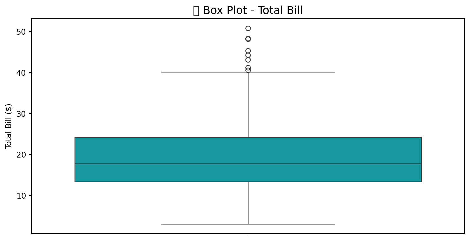
9.5.6 2.6 Skewness aur Kurtosis
# Skewness and Kurtosis
print("=" * 50)
print("📐 SKEWNESS AUR KURTOSIS")
print("=" * 50)
for col in ['total_bill', 'tip', 'size']:
    skew = tips[col].skew()
    kurt = tips[col].kurtosis()
    print(f"\n{col}:")
    print(f"  Skewness: {skew:.3f}", end=" ")
    if skew > 0:
        print("(Right skewed / Positively skewed)")
    elif skew < 0:
        print("(Left skewed / Negatively skewed)")
    else:
        print("(Symmetric)")
    print(f"  Kurtosis: {kurt:.3f}", end=" ")
    if kurt > 0:
        print("(Heavy tailed / Leptokurtic)")
    else:
        print("(Light tailed / Platykurtic)")
print("=" * 50)
==================================================
📐 SKEWNESS AUR KURTOSIS
==================================================
total_bill:
Skewness: 1.133 (Right skewed / Positively skewed)
Kurtosis: 1.218 (Heavy tailed / Leptokurtic)
tip:
Skewness: 1.465 (Right skewed / Positively skewed)
Kurtosis: 3.648 (Heavy tailed / Leptokurtic)
size:
Skewness: 1.448 (Right skewed / Positively skewed)
Kurtosis: 1.732 (Heavy tailed / Leptokurtic)
==================================================9.5.7 2.7 Value Counts - Categorical Variables
# Categorical distributions
fig, axes = plt.subplots(2, 2, figsize=(12, 10))

# Day distribution
sns.countplot(
    data=tips,
    x='day',
    ax=axes[0, 0],
    palette='viridis',
    order=['Thur', 'Fri', 'Sat', 'Sun']
)
axes[0, 0].set_title('📅 Distribution by Day')

# Time distribution
sns.countplot(
    data=tips,
    x='time',
    ax=axes[0, 1],
    palette='coolwarm'
)
axes[0, 1].set_title('⏰ Distribution by Time')

# Gender distribution
sns.countplot(
    data=tips,
    x='sex',
    ax=axes[1, 0],
    palette='Set2'
)
axes[1, 0].set_title('👥 Distribution by Gender')

# Smoker distribution
sns.countplot(
    data=tips,
    x='smoker',
    ax=axes[1, 1],
    palette='Pastel1'
)
axes[1, 1].set_title('🚬 Distribution by Smoker Status')

plt.tight_layout()
plt.show()
9.6 🔄 Dimension 3: Comparison
Comparison dimension mein hum different groups ko aapas mein compare karte hain.
9.6.1 3.1 Group-wise Statistics
# Group by day
day_stats = tips.groupby('day').agg({
    'total_bill': ['mean', 'median', 'std', 'count'],
    'tip': ['mean', 'median', 'std']
}).round(2)
day_stats| total_bill | tip | ||||||
|---|---|---|---|---|---|---|---|
| mean | median | std | count | mean | median | std | |
| day | |||||||
| Thur | 17.68 | 16.20 | 7.89 | 62 | 2.77 | 2.30 | 1.24 |
| Fri | 17.15 | 15.38 | 8.30 | 19 | 2.73 | 3.00 | 1.02 |
| Sat | 20.44 | 18.24 | 9.48 | 87 | 2.99 | 2.75 | 1.63 |
| Sun | 21.41 | 19.63 | 8.83 | 76 | 3.26 | 3.15 | 1.23 |
# Group by time
time_stats = tips.groupby('time').agg({
    'total_bill': ['mean', 'median', 'std', 'count'],
    'tip': ['mean', 'median', 'std']
}).round(2)
time_stats| total_bill | tip | ||||||
|---|---|---|---|---|---|---|---|
| mean | median | std | count | mean | median | std | |
| time | |||||||
| Lunch | 17.17 | 15.96 | 7.71 | 68 | 2.73 | 2.25 | 1.21 |
| Dinner | 20.80 | 18.39 | 9.14 | 176 | 3.10 | 3.00 | 1.44 |
9.6.2 3.2 Box Plot Comparison
# Box plot comparison by day
fig = px.box(
    tips,
    x='day',
    y='total_bill',
    color='day',
    title='📦 Total Bill Comparison by Day',
    category_orders={'day': ['Thur', 'Fri', 'Sat', 'Sun']}
)
fig.show()# Seaborn comparison
plt.figure(figsize=(10, 5))
sns.boxplot(
data=tips,
x='time',
y='tip',
hue='sex',
palette='Set2'
)
plt.title('💵 Tip Comparison: Time & Gender', fontsize=14)
plt.xlabel('Time')
plt.ylabel('Tip ($)')
plt.legend(title='Gender')
plt.show()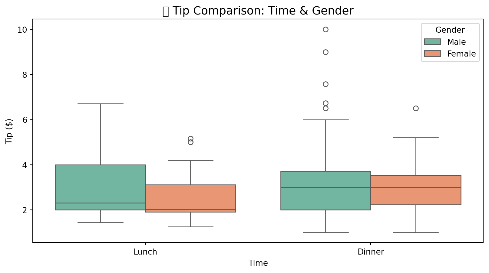
9.6.3 3.3 Bar Chart Comparison
# Grouped bar chart
avg_tip = tips.groupby(['day', 'time'])['tip'].mean().reset_index()
fig = px.bar(
    avg_tip,
    x='day',
    y='tip',
    color='time',
    barmode='group',
    title='📊 Average Tip by Day and Time',
    labels={'tip': 'Average Tip ($)'},
    category_orders={'day': ['Thur', 'Fri', 'Sat', 'Sun']}
)
fig.show()9.6.4 3.4 Violin Plot - Distribution Comparison
# Violin plot
plt.figure(figsize=(12, 6))
sns.violinplot(
    data=tips,
    x='day',
    y='total_bill',
    hue='sex',
    split=True,
    palette='husl',
    order=['Thur', 'Fri', 'Sat', 'Sun']
)
plt.title('🎻 Total Bill Distribution by Day & Gender', fontsize=14)
plt.xlabel('Day')
plt.ylabel('Total Bill ($)')
plt.show()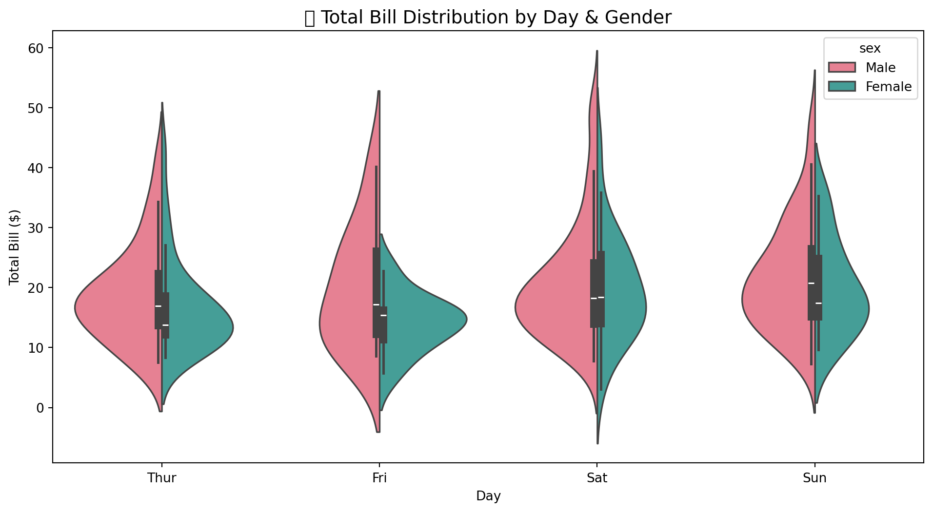
9.6.5 3.5 Pivot Table Analysis
# Pivot table
pivot_table = tips.pivot_table(
    values='tip',
    index='day',
    columns='time',
    aggfunc='mean'
).round(2)
pivot_table| time | Lunch | Dinner |
|---|---|---|
| day | ||
| Thur | 2.77 | 3.00 |
| Fri | 2.38 | 2.94 |
| Sat | NaN | 2.99 |
| Sun | NaN | 3.26 |
9.7 🔗 Dimension 4: Relationship
Relationship dimension mein hum variables ke darmiyan connections aur correlations explore karte hain.
9.7.1 4.1 Correlation Matrix
Jaise hum ne Chapter 7 mein discuss kiya tha, correlation do variables ke beech linear relationship ko measure karti hai.
# Correlation matrix
corr_matrix = tips[['total_bill', 'tip', 'size']].corr().round(3)
corr_matrix| total_bill | tip | size | |
|---|---|---|---|
| total_bill | 1.000 | 0.676 | 0.598 |
| tip | 0.676 | 1.000 | 0.489 |
| size | 0.598 | 0.489 | 1.000 |
9.7.2 4.2 Correlation Heatmap
# Correlation heatmap
plt.figure(figsize=(8, 6))
sns.heatmap(
    corr_matrix,
    annot=True,
    cmap='RdYlBu_r',
    center=0,
    square=True,
    linewidths=0.5,
    fmt='.3f'
)
plt.title('🔥 Correlation Heatmap', fontsize=14)
plt.show()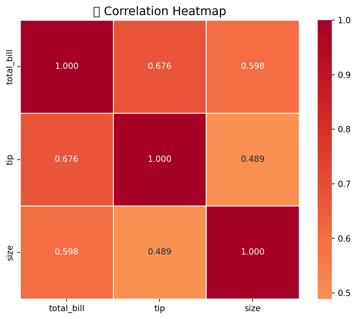
# Plotly heatmap
import plotly.figure_factory as ff

fig = ff.create_annotated_heatmap(
    z=corr_matrix.values,
    x=corr_matrix.columns.tolist(),
    y=corr_matrix.index.tolist(),
    colorscale='RdBu_r',
    showscale=True
)
fig.update_layout(title='🔥 Interactive Correlation Heatmap')
fig.show()9.7.3 4.3 Scatter Plot - Bivariate Relationship
# Scatter plot with Plotly
fig = px.scatter(
    tips,
    x='total_bill',
    y='tip',
    color='day',
    size='size',
    title='📈 Total Bill vs Tip',
    labels={
        'total_bill': 'Total Bill ($)',
        'tip': 'Tip ($)'
    },
    hover_data=['sex', 'time']
)
fig.show()# Seaborn regplot
plt.figure(figsize=(10, 6))
sns.regplot(
data=tips,
x='total_bill',
y='tip',
scatter_kws={'alpha': 0.5},
line_kws={'color': 'red'}
)
plt.title('📈 Total Bill vs Tip (with Trend Line)', fontsize=14)
plt.xlabel('Total Bill ($)')
plt.ylabel('Tip ($)')
plt.show()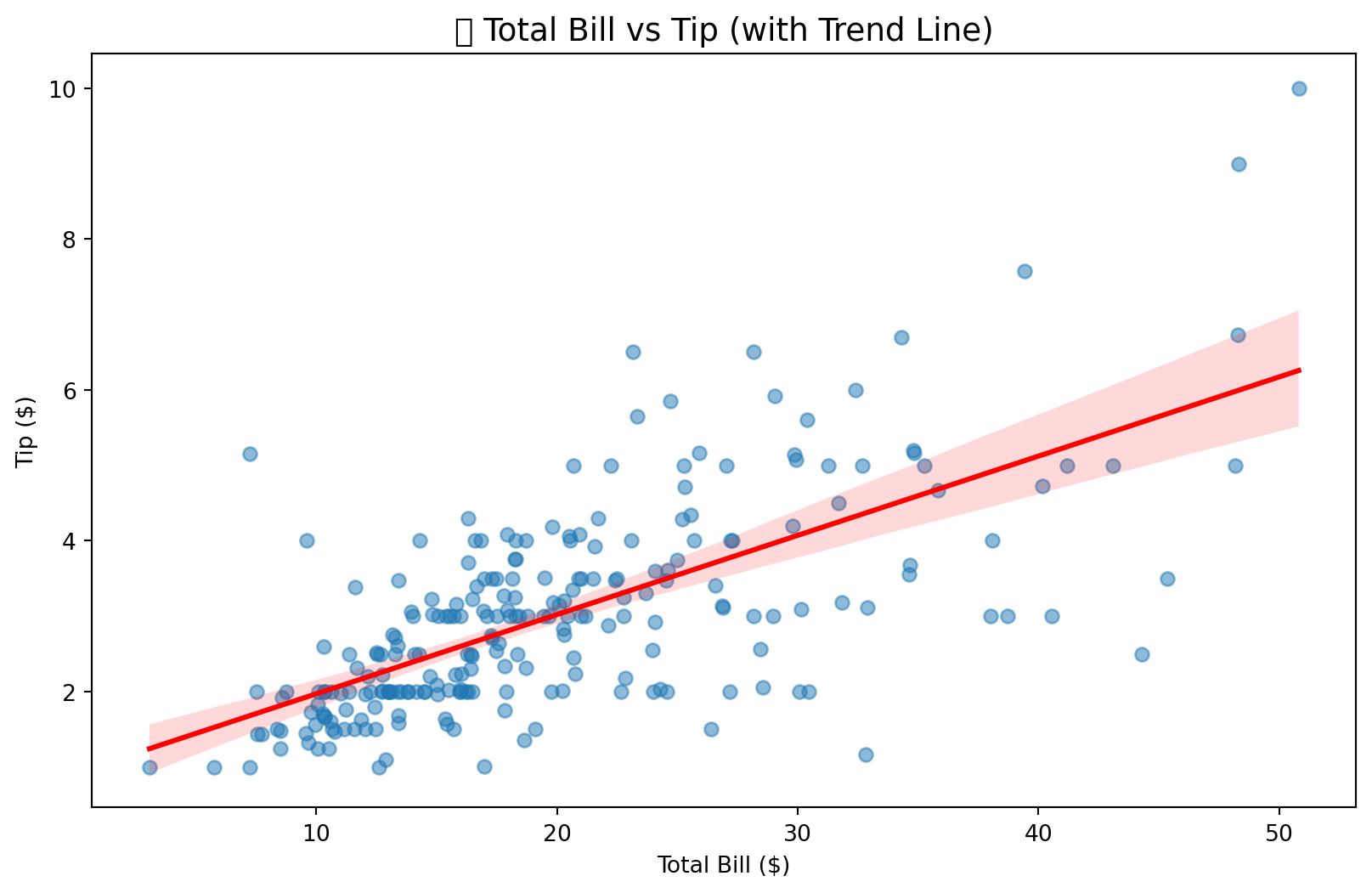
9.7.4 4.4 Pair Plot - Multivariate Relationships
# Pair plot
g = sns.pairplot(
    tips,
    vars=['total_bill', 'tip', 'size'],
    hue='time',
    palette='husl',
    diag_kind='kde',
    height=2.5
)
g.fig.suptitle('🔗 Pair Plot - Multivariate Relationships', y=1.02)
plt.show()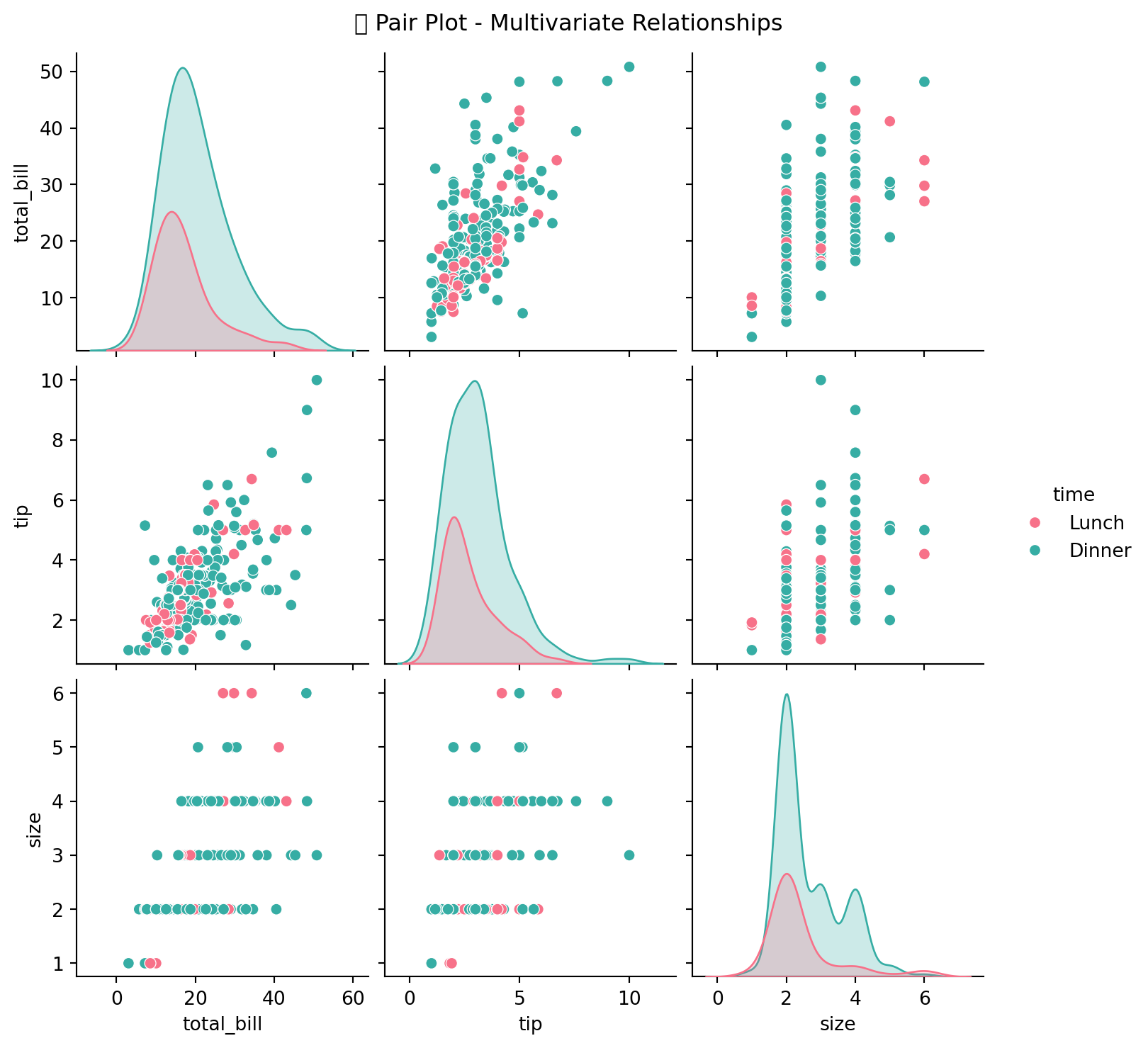
9.7.5 4.5 Joint Plot
# Joint plot
g = sns.jointplot(
    data=tips,
    x='total_bill',
    y='tip',
    kind='reg',
    height=8,
    color='#2E86AB'
)
g.fig.suptitle('📊 Joint Plot: Total Bill vs Tip', y=1.02)
plt.show()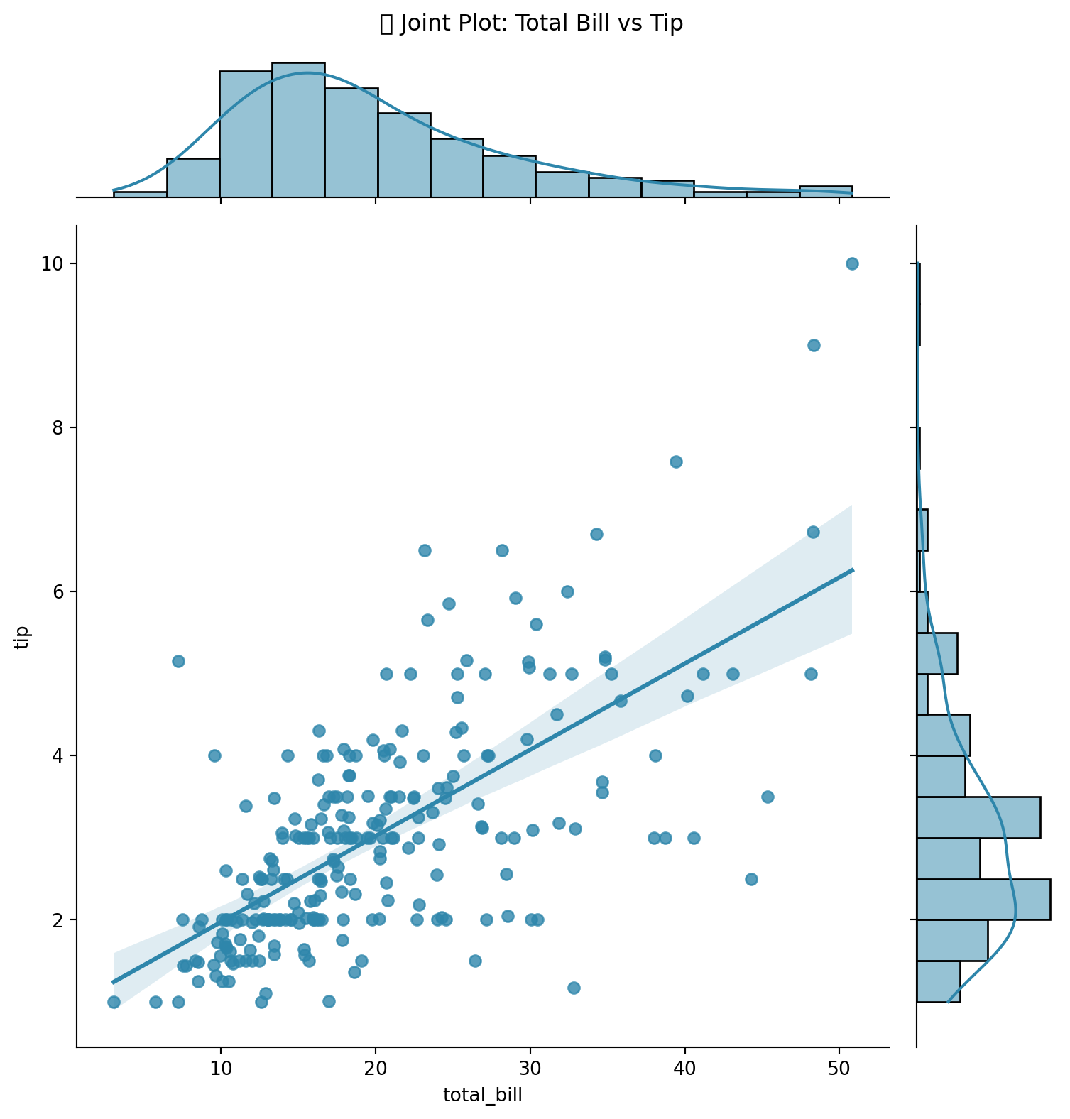
9.7.6 4.6 Categorical vs Numerical Relationship
# Catplot
g = sns.catplot(
    data=tips,
    x='day',
    y='tip',
    hue='smoker',
    kind='box',
    height=5,
    aspect=1.5,
    palette='Set2',
    order=['Thur', 'Fri', 'Sat', 'Sun']
)
g.fig.suptitle('💵 Tip by Day & Smoker Status', y=1.02)
plt.show()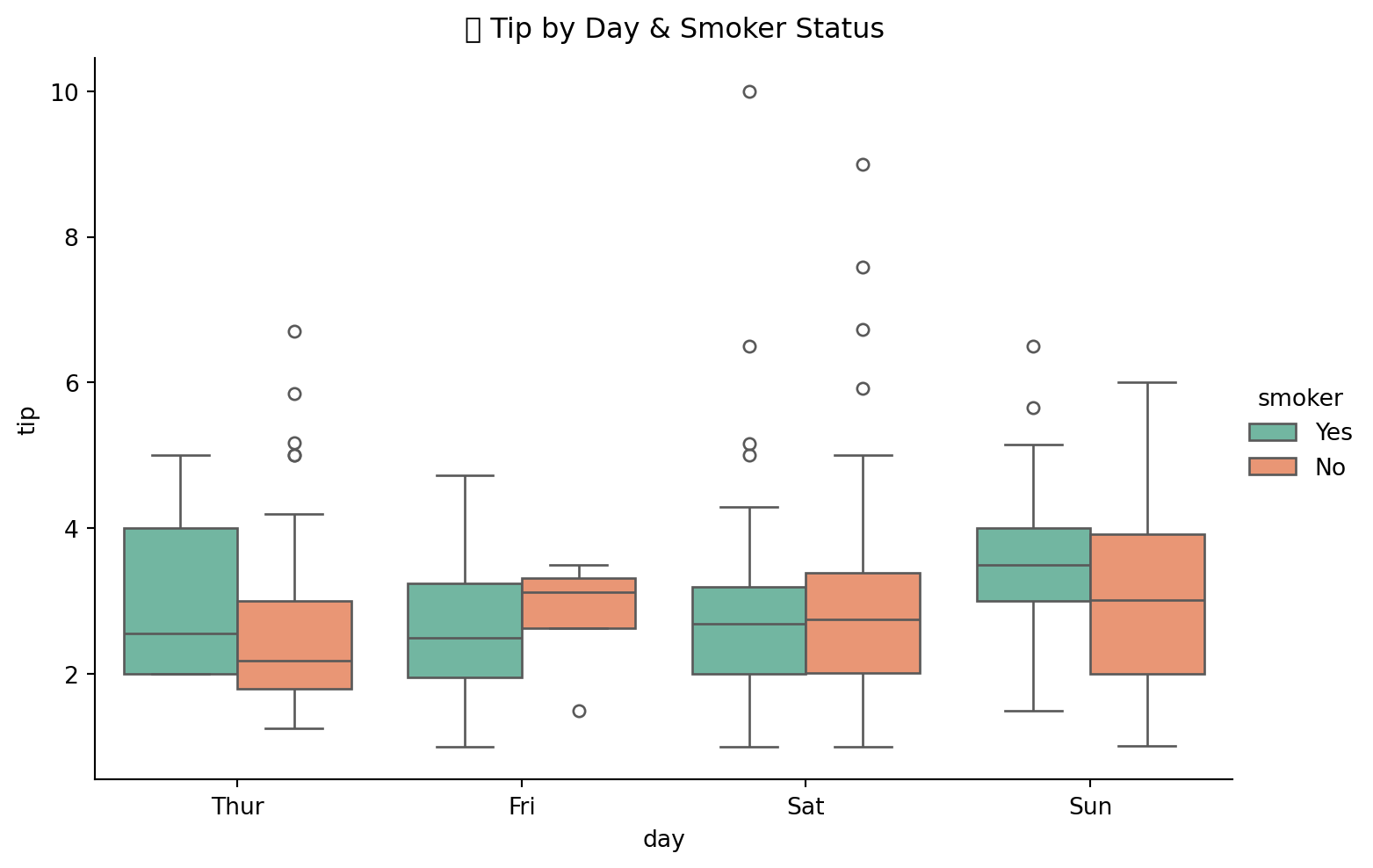
9.7.7 4.7 FacetGrid - Multiple Relationships
# FacetGrid
g = sns.FacetGrid(
    tips,
    col='time',
    row='smoker',
    height=4,
    aspect=1.2
)
g.map_dataframe(
    sns.scatterplot,
    x='total_bill',
    y='tip',
    alpha=0.7
)
g.fig.suptitle('📊 Total Bill vs Tip by Time & Smoker', y=1.02)
plt.show()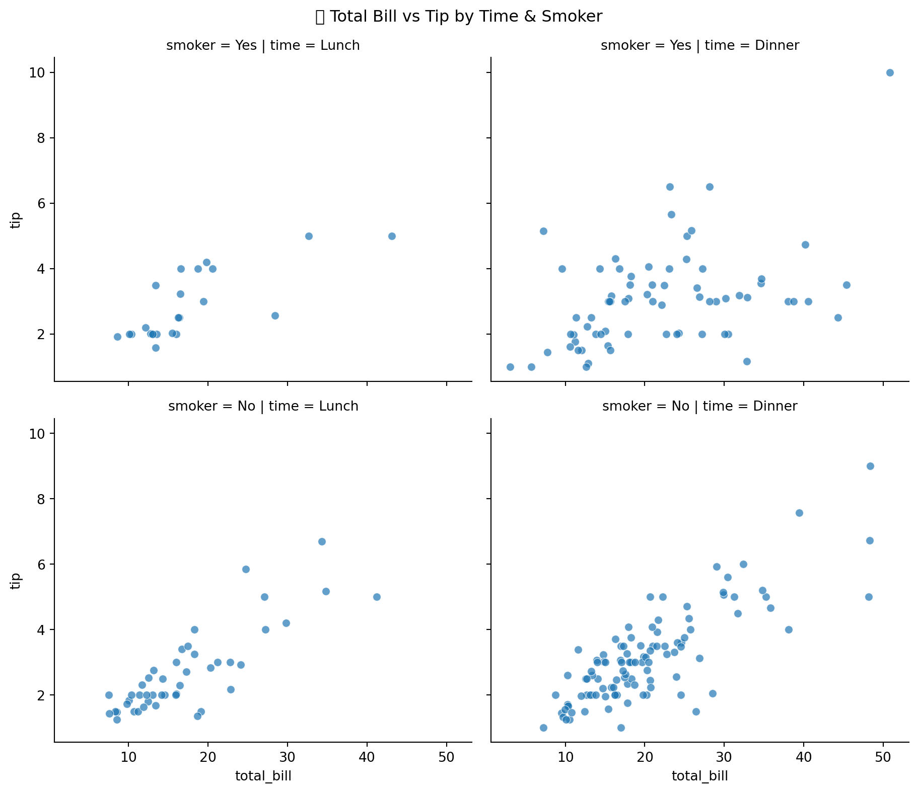
9.8 🎯 Complete EDA Summary
# Complete EDA Summary
print("=" * 60)
print("📊 COMPLETE EDA SUMMARY - TIPS DATASET")
print("=" * 60)

print("\n📋 COMPOSITION:")
print(f"   • Rows: {tips.shape[0]} | Columns: {tips.shape[1]}")
print(f"   • Missing Values: {tips.isnull().sum().sum()}")
print(f"   • Duplicates: {tips.duplicated().sum()}")

print("\n📊 DISTRIBUTION:")
print(f"   • Average Total Bill: ${tips['total_bill'].mean():.2f}")
print(f"   • Average Tip: ${tips['tip'].mean():.2f}")
print(f"   • Tip Range: ${tips['tip'].min():.2f} - ${tips['tip'].max():.2f}")

print("\n🔄 COMPARISON:")
print(f"   • Most Busy Day: {tips['day'].value_counts().idxmax()}")
print(f"   • Highest Avg Tip Day: {tips.groupby('day')['tip'].mean().idxmax()}")

print("\n🔗 RELATIONSHIP:")
corr = tips['total_bill'].corr(tips['tip'])
print(f"   • Correlation (Bill vs Tip): {corr:.3f}")
print(f"   • Interpretation: Strong Positive Relationship")

print("\n" + "=" * 60)
============================================================
📊 COMPLETE EDA SUMMARY - TIPS DATASET
============================================================
📋 COMPOSITION:
• Rows: 244 | Columns: 7
• Missing Values: 0
• Duplicates: 1
📊 DISTRIBUTION:
• Average Total Bill: $19.79
• Average Tip: $3.00
• Tip Range: $1.00 - $10.00
🔄 COMPARISON:
• Most Busy Day: Sat
• Highest Avg Tip Day: Sun
🔗 RELATIONSHIP:
• Correlation (Bill vs Tip): 0.676
• Interpretation: Strong Positive Relationship
============================================================9.9 🤖 Automatic EDA Tools
Data scientists ke kaam ko asaan banane ke liye, Python mein kaafi libraries hain jo automatically EDA perform kar sakti hain. Ye tools time aur effort bachate hain aur comprehensive reports generate karte hain.
NoteInstallation Note
Ye libraries install karne ke liye, aapko pehle apna conda environment create aur activate karna hoga or koshish karen har tool ka separate conda environment create karna hoga.
9.9.1 Available Auto-EDA Libraries
| Library | Best For | Installation | URL |
|---|---|---|---|
| YData Profiling | Complete EDA + Time Series | pip install ydata-profiling |
Docs |
| D-Tale | Interactive Web UI | pip install dtale |
PyPI |
| PyGWalker | Tableau-like Interface | pip install pygwalker |
PyPI |
| Sweetviz | Beautiful Reports | pip install sweetviz |
PyPI |
| Skimpy | Quick Summary | pip install skimpy |
PyPI |
| DataPrep | Fast EDA | pip install dataprep |
PyPI |
| LIDA | AI-Powered Viz | pip install lida |
PyPI |
| PandasAI | Natural Language Queries | pip install pandasai |
GitHub |
9.9.2 Installation Commands
# Install all auto-EDA libraries using conda/pip
# YData Profiling (formerly pandas-profiling)
conda create -n ydata-profiling python=3.12 -y
conda activate ydata-profiling
pip install ydata-profiling

# D-Tale - Interactive EDA
conda create -n dtale python=3.12 -y
conda activate dtale
pip install dtale

# PyGWalker - Tableau-like interface
conda create -n pygwalker python=3.12 -y
conda activate pygwalker
pip install pygwalker

# Sweetviz - Beautiful reports
conda create -n sweetviz python=3.12 -y
conda activate sweetviz
pip install sweetviz

# Skimpy - Quick summaries
conda create -n skimpy python=3.12 -y
conda activate skimpy
pip install skimpy

# DataPrep - Fast EDA
conda create -n dataprep python=3.12 -y
conda activate dataprep
pip install dataprep

# LIDA - AI-powered visualization
    conda create -n lida python=3.12 -y
conda activate lida
pip install lida

# PandasAI - Natural language queries
conda create -n pandasai python=3.12 -y
conda activate pandasai
pip install pandasai
9.9.3 1. YData Profiling (Pandas Profiling)
TipBest For
Complete automated EDA reports with minimal code. Supports both tabular and time series data.
# YData Profiling - Basic Usage
from ydata_profiling import ProfileReport

# Generate report
profile = ProfileReport(
    tips,
    title="Tips Dataset EDA Report",
    explorative=True
)

# Save as HTML
profile.to_file("tips_eda_report.html")

# For Time Series Data
profile_ts = ProfileReport(
    df,
    tsmode=True,
    sortby="date_column"
)
9.9.4 2. D-Tale
TipBest For
Interactive web-based data exploration with point-and-click interface.
# D-Tale - Interactive EDA
import dtale

# Launch interactive session
d = dtale.show(tips)

# Opens in browser automatically
# Access at: http://localhost:40000
9.9.5 3. PyGWalker
TipBest For
Tableau-like drag-and-drop visualization interface in Jupyter notebooks.
# PyGWalker - Tableau-like Interface
import pygwalker as pyg

# Create interactive visualization
walker = pyg.walk(tips)
9.9.6 4. Sweetviz
TipBest For
Beautiful HTML reports with comparison capabilities between datasets.
# Sweetviz - Beautiful Reports
import sweetviz as sv

# Create EDA report
report = sv.analyze(tips)

# Show in notebook or save
report.show_html("sweetviz_report.html")

# Compare two datasets
# report = sv.compare([train_df, "Train"], [test_df, "Test"])
9.9.7 5. Skimpy
TipBest For
Quick, console-friendly data summaries similar to R’s skimr package.
# Skimpy - Quick Summaries
from skimpy import skim

# Quick summary
skim(tips)
9.9.8 6. DataPrep
TipBest For
Fast exploratory data analysis with blazing fast performance on large datasets.
# DataPrep - Fast EDA
from dataprep.eda import create_report, plot

# Create complete report
report = create_report(tips)
report.show_browser()

# Individual plots
plot(tips)
plot(tips, "total_bill")
plot(tips, "total_bill", "tip")
9.9.9 7. LIDA
TipBest For
AI-powered automatic visualization generation using natural language.
# LIDA - AI-Powered Visualization
from lida import Manager, TextGenerationConfig

# Initialize LIDA
lida = Manager()

# Generate visualizations automatically
summary = lida.summarize(tips)
goals = lida.goals(summary, n=5)
charts = lida.visualize(
    summary=summary,
    goal=goals[0]
)
9.9.10 8. PandasAI
TipBest For
Ask questions about your data in natural language (requires API key).
# PandasAI - Natural Language Queries
from pandasai import SmartDataframe

# Initialize with OpenAI API key
df = SmartDataframe(
    tips,
    config={"llm": your_llm}
)

# Ask questions in natural language
response = df.chat("What is the average tip by day?")
print(response)

response = df.chat("Show me a bar chart of tips by gender")
9.10 Data Cleaning vs EDA
Data Cleaning aur EDA dono data science ke essential steps hain, lekin inka purpose aur focus alag hota hai. | Aspect | Data Cleaning | EDA | |——–|—————|—–| | Purpose | Data ko analysis ke liye ready karna | Data ko samaj hna aur insights nikalna | | Focus | Missing values, duplicates, inconsistencies | Data distribution, relationships, patterns | Techniques | Imputation, normalization, encoding | Visualization, statistical analysis | | Outcome | Cleaned dataset | Understanding of data characteristics |
Tip
Here you can see a comple understanding about outliers in this figure.
Code
from IPython.display import Image
Image("data_cleaning.png")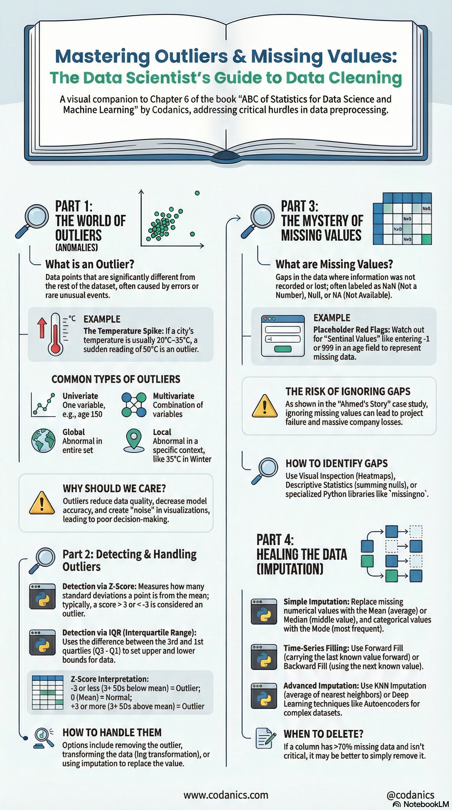
9.11 EDA Best Practices 🎯
ImportantKey Takeaways
- Always start with Data Composition - Know your data structure first
- Check for data quality issues - Missing values, duplicates, outliers
- Use both statistics AND visualizations - Numbers aur graphs dono dekhein
- Document your findings - Notes likhte rahein
- Iterate - EDA ek continuous process hai
9.11.1 EDA Checklist ✅
| Step | Task | Done? |
|---|---|---|
| 1 | Data shape aur size check | ☐ |
| 2 | Data types verify | ☐ |
| 3 | Missing values identify | ☐ |
| 4 | Duplicates check | ☐ |
| 5 | Descriptive statistics calculate | ☐ |
| 6 | Distribution visualize | ☐ |
| 7 | Outliers detect | ☐ |
| 8 | Group comparisons | ☐ |
| 9 | Correlations analyze | ☐ |
| 10 | Relationships visualize | ☐ |
9.12 🎬 Video Tutorial
TipData Visualization Masterclass
Data visualization ko master karne ke liye ye complete course dekhein:
Data Visualization Masterclass in Python | Matplotlib, Seaborn & Plotly for Beginners to Advanced
Is course mein aap seekhenge:
- Matplotlib ki basics se advanced plotting
- Seaborn ke through statistical graphics
- Plotly ke sath interactive visualizations
- Professional dashboards creation
9.13 Automatic EDA in Python - Crash Course
Tip
Agar aap in automatic EDA tools ko action mein dekhna chahte hain, to ye video zaroor dekhein:
Automatic Exploratory Data Analysis in Python | Crash Course for Data Analysts & Scientists
Is video mein aap seekhenge:
- EDA hta kia hy?
- EDA ke through hum apne data ko deeply samajh sakte hain aur better decisions le sakte hain.
- Buhat kuch automatic EDA tools ko action mein dekhna zaroor hai.
9.14 Conclusion
Is chapter mein hum ne seekha ke EDA data science ki ek essential skill hai. Hum ne dekha ke:
- Data Composition - Data ki structure samajhna
- Distribution - Values ka spread analyze karna
- Comparison - Groups ko compare karna
- Relationship - Variables ke connections explore karna
EDA ke through hum apne data ko deeply samajh sakte hain aur better decisions le sakte hain. Automatic EDA tools jaise YData Profiling, D-Tale, aur others hamari is journey ko aur bhi asaan bana dete hain.
9.15 Follow us
TipFollow us
Main umeed karta hun k ap ko ye chapter ne bht kuch seekhaya ho ga, or agar sach main seekhaya hy then please do support us by sharing this book with your friends and colleagues. Also, do share your feedback with us, so that we can improve our work in future.
![]()
![]()
![]()
![]()
![]()
![]()