7 Visualization and Reporting
Phase 4 is like doing the lab experiment; Phase 5 is like writing the results section of the paper. A good viromics report should show what was detected, how good the viral contigs were, how abundant they were, what they may be, what they may do, and which hosts they may infect. In practice a report answers six questions:
- How good were the reads?
- How good was the assembly?
- How many viral contigs were recovered, and how complete were they?
- Which vOTUs were abundant?
- What can we say about taxonomy and function?
- What can we say about host prediction and diversity?
This chapter turns pipeline output tables into figures with R (ggplot2, pheatmap, vegan) and Python (pandas, matplotlib), and it pairs every figure with careful reporting language (Posit 2024).
Learning objectives — by the end of this chapter you will be able to:
- assemble the clean tables a viromics figure set is built from;
- generate the eight core result figures from example data with one script;
- read each figure and describe what it does and does not show;
- apply publication figure rules and write conservative figure legends; and
- structure an IMRaD virome report with defensible Methods and Results wording.
Every figure in this chapter is real: it was produced by the two ready-made scripts below from the small example tables in data/example/. Download either script, run it, and the exact PNGs shown here appear in visualization/figures. Point the same scripts at your own Phase 4 outputs to make publication figures from real data.
# R version (ggplot2 / pheatmap / vegan)
Rscript make_figures.R data/example visualization/figures

# Python version (pandas / matplotlib), same figures, no R needed
python make_figures.py data/example visualization/figures
Both scripts take two arguments: an input directory and an output directory. Swap data/example for your own Phase 4 folder to regenerate every figure from real results.
7.1 Expected input files
These are the Phase 4 outputs a full run consumes. Real tool paths vary, so always inspect a header before trusting a column position.
cd ~/viromics_course

ls checkv/checkv_samples/quality_summary.tsv          # CheckV quality
ls abundance/samples_manual_tpm.tsv                   # TPM abundance matrix
ls votus/cdhit_samples/samples_votus_95.fa            # dereplicated vOTUs
ls taxonomy/genomad_votu/                             # geNomad taxonomy
ls annotation/eggnog/samples_eggnog.emapper.annotations
ls host_prediction/iphop/                             # iPHoP host calls
Create a single tidy output folder so figures, tables, and scripts stay together:
cd ~/viromics_course
mkdir -p visualization/figures visualization/tables \
         visualization/scripts visualization/reports
7.2 Example input tables
Real tool tables are wide and messy. Here we derive small, clean tables first; these are the exact files in data/example/ that both scripts read. Match your figure text to these numbers.
CheckV quality summary (checkv_quality_summary.tsv) — eight vOTUs spanning complete genomes to short fragments; vOTU_05 is a provirus with some flanking host genes.
| contig_id | contig_length | provirus | checkv_quality | completeness |
|---|---|---|---|---|
| vOTU_01 | 48,213 | No | Complete | 100.0 |
| vOTU_02 | 39,187 | No | High-quality | 94.5 |
| vOTU_03 | 32,044 | No | High-quality | 91.2 |
| vOTU_04 | 18,992 | No | Medium-quality | 68.3 |
| vOTU_05 | 15,230 | Yes | Medium-quality | 61.0 |
| vOTU_06 | 9,877 | No | Medium-quality | 52.4 |
| vOTU_07 | 6,120 | No | Low-quality | 28.9 |
| vOTU_08 | 4,003 | No | Low-quality | 14.2 |
vOTU abundance (votu_abundance.tsv) — TPM across two controls and two fertilized-soil samples.
| votu | control_1 | control_2 | treatment_1 | treatment_2 |
|---|---|---|---|---|
| vOTU_01 | 120.4 | 98.7 | 540.2 | 612.9 |
| vOTU_02 | 88.1 | 102.5 | 310.7 | 288.4 |
| vOTU_04 | 210.6 | 198.3 | 96.4 | 88.0 |
| vOTU_05 | 12.3 | 9.8 | 140.5 | 155.2 |
Taxonomy (taxonomy.tsv) — mostly tailed phages (Caudoviricetes, phylum Uroviricota); three vOTUs stay unclassified at family level.
| votu | phylum | family |
|---|---|---|
| vOTU_01 | Uroviricota | Straboviridae |
| vOTU_02 | Uroviricota | Autographiviridae |
| vOTU_03 | Uroviricota | Peduoviridae |
| vOTU_06 | Phixviricota | Microviridae |
| vOTU_04 / 07 / 08 | unclassified | unclassified |
Sample metadata (sample_metadata.tsv) — the grouping used for heatmap annotation and diversity.
| sample | environment | treatment | nucleic_acid |
|---|---|---|---|
| control_1 | soil | control | DNA |
| control_2 | soil | control | DNA |
| treatment_1 | soil | fertilized | DNA |
| treatment_2 | soil | fertilized | DNA |
The functional (functional_summary.tsv, COG categories) and host (host_prediction.tsv, predicted host phylum) tables round out the set and drive figures 6 and 7.
7.3 The figures
Each script starts with a shared house style and reads the tables from the input directory. Every R snippet below assumes this preamble has run.
suppressMessages({ library(ggplot2); library(readr); library(dplyr); library(tidyr) })

IN  <- "data/example"
OUT <- "visualization/figures"
dir.create(OUT, showWarnings = FALSE, recursive = TRUE)

# Codanics house palette
teal <- "#008b8b"; navy <- "#05043b"; terra <- "#c0432a"; gold <- "#d9a521"
quality_cols <- c("Complete"=navy, "High-quality"=teal,
                  "Medium-quality"=gold, "Low-quality"="#8a97a0")

theme_codanics <- theme_minimal(base_size = 13) +
  theme(plot.title = element_text(face = "bold", colour = navy),
        panel.grid.minor = element_blank())
7.3.1 1. CheckV quality tiers
How many recovered genomes are complete versus fragmentary? This is the first thing a reviewer looks for.
checkv <- read_tsv(file.path(IN, "checkv_quality_summary.tsv"), show_col_types = FALSE)
checkv$checkv_quality <- factor(
  checkv$checkv_quality,
  levels = c("Complete","High-quality","Medium-quality","Low-quality"))

g1 <- ggplot(checkv, aes(checkv_quality, fill = checkv_quality)) +
  geom_bar() +
  scale_fill_manual(values = quality_cols, guide = "none") +
  labs(title = "CheckV quality of recovered viral genomes",
       x = NULL, y = "Number of vOTUs") + theme_codanics
ggsave(file.path(OUT, "fig-checkv-quality.png"), g1, width = 7, height = 4.2, dpi = 300)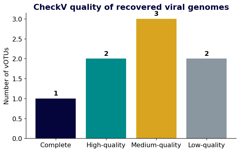
How to read it: the taller the left-hand bars, the more near-complete genomes you recovered; here only one genome is Complete, so most downstream claims rest on partial sequences.
7.3.2 2. Viral contig lengths
Length is a quick proxy for how much evidence each contig carries — short fragments are easy to over-interpret.
g2 <- ggplot(checkv, aes(reorder(contig_id, contig_length), contig_length / 1000)) +
  geom_col(fill = teal) + coord_flip() +
  labs(title = "Viral contig length", x = NULL, y = "Length (kb)") +
  theme_codanics
ggsave(file.path(OUT, "fig-contig-length.png"), g2, width = 7, height = 4.2, dpi = 300)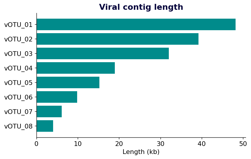
How to read it: longer bars (top) are near-complete genomes; the short bars at the bottom coincide with the Low-quality tier and deserve cautious wording.
7.3.3 3. Mean abundance per vOTU
Which viruses dominate the community once abundance is normalized to TPM?
ab <- read_tsv(file.path(IN, "votu_abundance.tsv"), show_col_types = FALSE)
ab_long <- pivot_longer(ab, -votu, names_to = "sample", values_to = "tpm")
mean_ab <- ab_long %>% group_by(votu) %>% summarise(mean_tpm = mean(tpm))

g3 <- ggplot(mean_ab, aes(reorder(votu, mean_tpm), mean_tpm)) +
  geom_col(fill = navy) + coord_flip() +
  labs(title = "Mean abundance per vOTU (TPM)", x = NULL, y = "Mean TPM") +
  theme_codanics
ggsave(file.path(OUT, "fig-top-abundance.png"), g3, width = 7, height = 4.2, dpi = 300)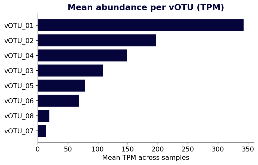
How to read it: the top bar (vOTU_01) is the most abundant virus on average; abundance rank does not track genome quality, so a dominant vOTU can still be only medium-quality.
7.3.4 4. Abundance heatmap with sample annotation
A heatmap shows where each vOTU is abundant. Values are log10(TPM + 1) so a few high-abundance viruses do not wash out the rest, and a colour bar marks the treatment groups.
mat <- as.matrix(ab[,-1]); rownames(mat) <- ab$votu
meta <- read_tsv(file.path(IN, "sample_metadata.tsv"), show_col_types = FALSE)
ann <- data.frame(treatment = meta$treatment, row.names = meta$sample)

pheatmap::pheatmap(log10(mat + 1), annotation_col = ann,
                   color = colorRampPalette(c("#f7fbfb", teal, navy))(50),
                   main = "vOTU abundance (log10 TPM+1)",
                   filename = file.path(OUT, "fig-abundance-heatmap.png"),
                   width = 6.5, height = 5)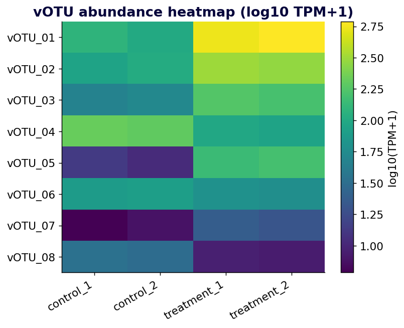
How to read it: darker cells are higher abundance; clustering that groups the two fertilized samples apart from the two controls is evidence of a treatment-associated shift, not proof of one.
7.3.5 5. Taxonomy by family
Which viral families are represented, and how much stays unclassified?
tax <- read_tsv(file.path(IN, "taxonomy.tsv"), show_col_types = FALSE)
g5 <- ggplot(tax, aes(forcats::fct_infreq(family))) +
  geom_bar(fill = teal) +
  labs(title = "vOTU taxonomy by family (geNomad)", x = NULL, y = "Number of vOTUs") +
  theme_codanics + theme(axis.text.x = element_text(angle = 30, hjust = 1))
ggsave(file.path(OUT, "fig-taxonomy.png"), g5, width = 7, height = 4.2, dpi = 300)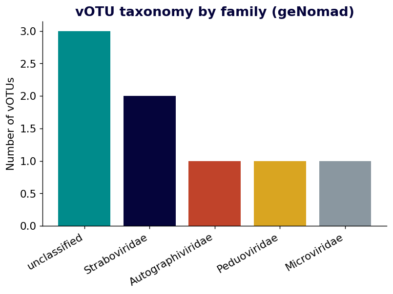
How to read it: most vOTUs are tailed phages (Straboviridae, Autographiviridae, Peduoviridae); a large unclassified bar is normal in viromics and should be reported, not hidden (Camargo et al. 2024).
7.3.6 6. Functional annotation by COG category
What functions do the predicted proteins fall into? eggNOG COG categories give a coarse but honest summary.
func <- read_tsv(file.path(IN, "functional_summary.tsv"), show_col_types = FALSE)
g6 <- ggplot(func, aes(reorder(description, count), count)) +
  geom_col(fill = teal) + coord_flip() +
  labs(title = "Functional annotation by COG category (eggNOG)",
       x = NULL, y = "Number of proteins") + theme_codanics
ggsave(file.path(OUT, "fig-function.png"), g6, width = 7, height = 4.6, dpi = 300)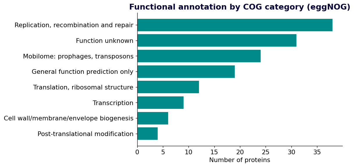
How to read it: replication, recombination and repair (L) dominates, but “Function unknown” (S) is the second largest bar — most viral proteins have no confident functional call.
7.3.7 7. Predicted host phylum
Which host phyla do the vOTUs likely associate with? Unassigned vOTUs are dropped before counting.
host <- read_tsv(file.path(IN, "host_prediction.tsv"), show_col_types = FALSE)
host <- dplyr::filter(host, predicted_host_phylum != "unassigned")
g7 <- ggplot(host, aes(forcats::fct_infreq(predicted_host_phylum))) +
  geom_bar(fill = navy) +
  labs(title = "Predicted host phylum", x = NULL, y = "Number of vOTUs") +
  theme_codanics + theme(axis.text.x = element_text(angle = 20, hjust = 1))
ggsave(file.path(OUT, "fig-host.png"), g7, width = 7, height = 4.2, dpi = 300)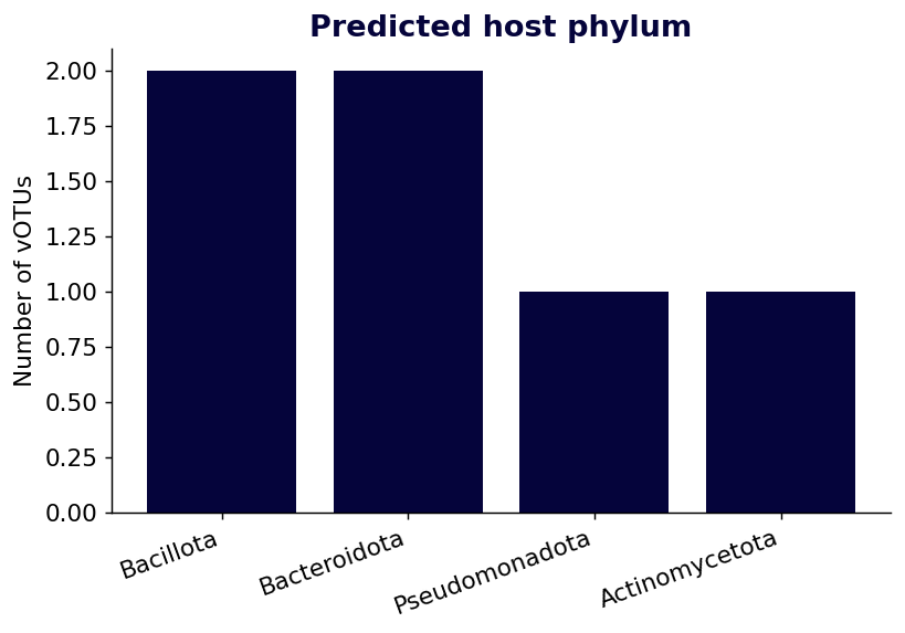
How to read it: the bars show candidate host phyla (Bacillota, Bacteroidota, Pseudomonadota, Actinomycetota); these are computational predictions, never confirmed infections.
7.3.8 8. Alpha diversity per sample
How rich is each sample? Observed vOTU richness is the simplest alpha-diversity metric.
comm <- t(as.matrix(ab[,-1])); colnames(comm) <- ab$votu
richness <- rowSums(comm > 0)
shannon  <- vegan::diversity(comm, index = "shannon")
div <- data.frame(sample = names(richness), richness, shannon)

g8 <- ggplot(div, aes(sample, richness)) + geom_col(fill = teal) +
  labs(title = "Observed vOTU richness per sample", x = NULL, y = "Observed vOTUs") +
  theme_codanics + theme(axis.text.x = element_text(angle = 20, hjust = 1))
ggsave(file.path(OUT, "fig-alpha-diversity.png"), g8, width = 6.5, height = 4.2, dpi = 300)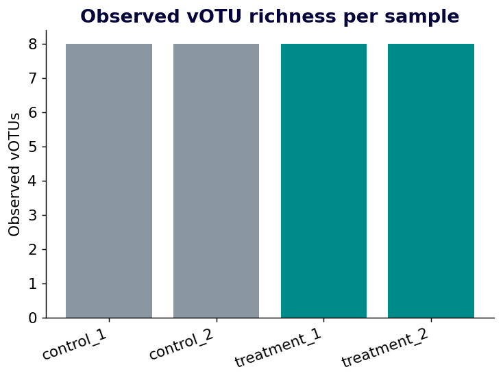
How to read it: every bar sits at eight because all vOTUs are detected in all four samples here; on real data unequal bars would flag samples with lower viral richness, and Shannon diversity (also computed above) would separate even samples with identical richness.
Estimated resources on 12 threads and 32 GB RAM: plotting takes seconds to a couple of minutes. Storage is small — usually under 500 MB for all figures and tables.
7.4 Publication figure rules
When these figures move from exploration to a manuscript, apply the following:
| Rule | Recommendation |
|---|---|
| File type | PDF/SVG for vector graphics; PNG/TIFF at 300 dpi for raster |
| Font size | 8–12 pt for journal figures |
| Labels | always label axes with units |
| Abundance | use TPM, RPKM, or coverage — not raw read counts alone |
| Heatmaps | use log10(TPM + 1) or row scaling |
| Taxonomy | do not overclassify unknown viruses |
| Host prediction | report as “predicted host”, not confirmed host |
| Color | keep treatment colors consistent across every figure |
| Reproducibility | save the scripts and the input tables |
| Statistics | never show a p-value without naming the test |
7.5 Figure legend template
A legend states what is plotted, how it was processed, and how to read it. Examples matched to the figures above:
Figure 1. CheckV quality of recovered viral genomes. Bar plot of the number of
vOTUs per CheckV category (Complete, High-quality, Medium-quality, Low-quality).

Figure 4. vOTU abundance heatmap. Heatmap of log10(TPM + 1)-transformed abundance
across samples; rows are vOTUs, columns are samples, and the top bar marks
treatment group.

Figure 7. Predicted viral host distribution. Bar plot of predicted host phyla
for vOTUs based on computational host prediction (iPHoP and CRISPR matching);
values are candidate associations, not confirmed infections.
7.6 Reporting language
The difference between a defensible report and an overclaim is almost always word choice. Prefer conservative phrasing, and never let software output masquerade as experimental proof.
| Instead of | Write |
|---|---|
| “All contigs are confirmed viruses.” | “Putative viral contigs were identified with VirSorter2 and geNomad, then quality-assessed with CheckV.” |
| “The host was confirmed by software.” | “Host prediction suggested candidate associations with bacterial phyla.” |
| “vOTU_07 is a novel species.” | “vOTU_07 remained unclassified and represents a candidate novel viral contig.” |
7.6.1 Methods wording template
Raw paired-end reads were quality-assessed with FastQC and summarized with
MultiQC, then trimmed with fastp. Clean reads were assembled de novo with
MEGAHIT (minimum contig length 1,000 bp) and assessed with QUAST. Viral
candidate contigs were identified with VirSorter2 and geNomad, and viral genome
quality was assessed with CheckV. Medium-quality, high-quality, and complete
contigs were dereplicated into viral operational taxonomic units (vOTUs) at 95%
nucleotide identity. Taxonomy was assigned with geNomad. Open reading frames
were predicted with Prodigal and annotated with eggNOG-mapper. Clean reads were
mapped back with Bowtie2 and TPM-normalized abundance computed with CoverM. Host
associations were predicted with iPHoP and CRISPR spacer matching. Figures were
produced in R (ggplot2, pheatmap, vegan) and Python (pandas, matplotlib).
7.6.2 Results wording examples
CheckV: The assembly yielded eight vOTUs after quality filtering. One was
complete, two high-quality, three medium-quality, and two low-quality,
indicating a mix of near-complete and fragmentary viral genomes.

Abundance: vOTU_01 and vOTU_02 were markedly more abundant in fertilized soil,
whereas vOTU_04 was enriched in the controls, suggesting a treatment-associated
shift in viral community composition.

Taxonomy: Most vOTUs were assigned to tailed bacteriophage families, while three
remained unclassified — a pattern expected given incomplete viral reference
databases.

Host prediction: Computational prediction suggested candidate associations with
Bacillota, Bacteroidota, Pseudomonadota, and Actinomycetota. These should be
read as predicted, not confirmed, host associations.
7.6.3 Report structure (IMRaD)
Title:  DNA virome analysis of paired-end metagenomic sequencing data

1. Introduction  — what viromics is, why viral communities matter, study aim
2. Methods       — sampling, sequencing, QC, assembly, viral prediction, CheckV,
                   vOTU clustering, taxonomy, annotation, abundance, host, diversity
3. Results       — read quality, assembly stats, viral recovery, CheckV quality,
                   vOTU abundance, taxonomy, function, host prediction, diversity
4. Discussion    — major patterns, novel/unclassified viruses, ecology, limitations
5. Conclusion    — main findings and future work
6. Supplementary — commands, software versions, output tables- Plotting raw read counts as abundance. Raw counts are biased by contig length and depth — use TPM, RPKM, or coverage.
- Heatmaps without transformation. One highly abundant vOTU can flatten all other colour; log-transform or row-scale first.
- Overinterpreting taxonomy and host prediction. Report unclassified contigs honestly and call host predictions candidate associations.
- Figures with no legend or units. A figure that cannot be traced to a table and a script is not reproducible.
7.7 Key takeaways
- A viromics report answers six questions in order — read quality, assembly quality, viral recovery and completeness, abundance, taxonomy and function, and host and diversity — and every figure should map to one of them.
- Build figures from small, tidy tables derived from Phase 4 outputs, and keep the scripts and input tables so any figure can be regenerated and traced.
- Normalize abundance (TPM, RPKM, or coverage) and log-transform heatmaps so a few dominant vOTUs do not mask the rest; never plot raw read counts as abundance.
- Report unclassified viral contigs honestly — a large “unclassified” share is normal in viromics and should be shown, not hidden (Camargo et al. 2024).
- Word choice carries the claim: describe host calls as candidate associations, quality-filter with CheckV before interpretation, and never present computational output as experimental proof (Nayfach et al. 2021).
- Follow publication figure rules — labelled axes with units, consistent treatment colours, vector formats, and legends that state what is plotted and how it was processed.
7.8 Further reading
- geNomad taxonomy and classification behaviour, including why unclassified fractions are expected (Camargo et al. 2024).
- CheckV completeness and contamination estimates that underpin defensible quality figures (Nayfach et al. 2021).
- ggplot2 documentation for building and styling the R figures in this chapter — https://ggplot2.tidyverse.org.
7.9 Chapter figure
Save as: images/ch05-figure-panels.png · Aspect ratio: 16:9 · Style: clean flat vector infographic, Codanics palette (teal #008b8b, navy #05043b, white background), no photorealism.
Prompt: Create a clean scientific figure-panel layout arranged as a 2-by-3 grid of small viromics charts, each with a bold short title and labelled axes. Panel A: a vertical bar chart of CheckV quality tiers (Complete, High-quality, Medium-quality, Low-quality). Panel B: a horizontal bar chart of mean vOTU abundance in TPM. Panel C: a clustered heatmap of log-transformed abundance across four samples with a small treatment colour bar on top. Panel D: a bar chart of viral families including an “unclassified” bar. Panel E: a bar chart of predicted host phyla. Panel F: a bar chart of observed vOTU richness per sample. Use teal and navy fills on a white background, thin grey axes, consistent typography, and a small “reproducible from table + script” caption ribbon along the bottom. Modern, uncluttered, journal-figure aesthetic with Codanics branding.
7.10 Quiz: Visualization and Reporting
Q1. Why use log10(TPM + 1) for heatmaps?
A. to reduce dominance of highly abundant vOTUs B. to remove all zeros only C. to convert DNA to RNA D. to calculate assembly N50
Answer: A. A log transform makes abundance patterns easier to see.
Q2. Which file type is good for editable vector figures?
A. PDF or SVG B. FASTQ C. BAM D. SRA
Answer: A. Vector formats are preferred for publication editing.
Q3. What should host predictions be called?
A. candidate associations B. confirmed infections C. library indexes D. assembly errors
Answer: A. Computational predictions are not experimental confirmation.
Q4. What should a figure legend include?
A. what is plotted and how it was processed B. only software logo C. only file size D. no methods
Answer: A. A legend should explain plotted data, transformations, and important interpretation.
Q5. Which package is used for heatmaps in this chapter?
A. pheatmap B. Bowtie2 C. CheckV D. MEGAHIT
Answer: A. pheatmap creates clustered heatmaps in R.
7.11 Interactive quiz: Visualization and reporting
1. Why is log10(TPM + 1) often used in heatmaps?
2. Which R package in this book is commonly used for clustered heatmaps?
3. What is a good practice when writing figure legends?
4. Which statement about reporting host prediction is best?
5. Why should raw read counts usually not be the final abundance measure in a report?