
In today’s data-driven world, we are overwhelmed with vast amounts of information. To make sense of this deluge, Data Visualization has emerged as a critical tool. It transforms complex datasets into intuitive visuals, enabling better comprehension, decision-making, and insights. Dive in with us as we explore the power and potential of visualizing data!
In this post,
- First we will learn what is Data Visualization and why do we need to be an expert in data visualization in order to jump into the field of Data Science/Analytic?
- Secondly, we will learn about popular data visualization tools
- Thirdly, we will see about the types of plots
- Lastly, we will learn how to make those plots on dummy dataset using python libraries (pandas, matplotlib, seaborn, plotly, etc.).
Let’s have a look into it:
What is Data Visualization?
Data Visualization is the representation of data in a graphical format. It allows users to see and understand patterns, trends, and insights in data. From simple bar charts to intricate 3D models, data visualization encompasses a wide range of techniques.
Why is Data Visualization Important?
- Quick Insights: A well-crafted visual can communicate complex data in seconds, saving time and effort.
- Informed Decision Making: Visual data aids in making evidence-based decisions, reducing risks.
- Engagement: Visuals are more engaging than spreadsheets, making it easier to present and share findings.
- Data Exploration: Visualization tools enable users to delve deep into data, uncovering hidden insights.
Key Principles of Effective Data Visualization:
- Simplicity: Less is more. Avoid clutter and focus on the essentials.
- Consistency: Use consistent colors, fonts, and symbols to avoid confusion.
- Accuracy: Ensure the visual accurately represents the data.
- Interactivity: Modern tools allow for interactive visuals, enhancing user engagement and understanding.
Popular Data Visualization Tools:
- Tableau: A powerful tool offering a wide range of visualization options.
- Power BI: Microsoft’s solution for data visualization and business intelligence.
- D3.js: A JavaScript library for creating custom, dynamic visuals.
- Python Libraries: Libraries like Matplotlib, Seaborn, and Plotly are popular among data scientists.
- R Programming: ggplot2, plotly
Data Visualization in Action:
Imagine you’re a retailer looking to understand sales trends. A spreadsheet with thousands of rows of sales data might be overwhelming. However, a heat map showing sales density or a line chart depicting monthly sales trends can provide clear insights in moments.
For our readers, here’s a glimpse of the kind of visuals we’re talking about:
The images above perfectly encapsulate the essence of data visualization. From analyzing pie charts to understanding sales trends through heat maps and line charts, these visuals demonstrate the power and versatility of data visualization tools. Moreover, the intricacy of a comprehensive dashboard showcases how various visualizations can come together to provide a holistic view of data.
Incorporating such visuals into your content not only enhances the reader’s experience but also solidifies their understanding of the topic. As the saying goes, “A picture is worth a thousand words,” and in the realm of data, a well-crafted visualization might be worth a million data points!
Harness the potential of data visualization, and let your data come alive. Happy visualizing! 🌟📊🖼️
Key Terms used in Data Visualization
Here’s a list of key terms in data visualization, along with explanations and examples for each:
Bar Chart:
- Explanation: A graphical representation of data using bars of varying heights or lengths.
- Example: Comparing the sales of different products in a month.
Pie Chart:
- Explanation: A circular chart divided into slices to illustrate numerical proportions.
- Example: Showing the market share of various smartphone brands.
Histogram:
- Explanation: A representation of the distribution of a dataset, similar to a bar chart but for frequency distribution.
- Example: Displaying the age distribution of employees in a company.
Scatter Plot:
- Explanation: A graph with points plotted to show the relationship between two sets of data.
- Example: Comparing advertising spend with sales revenue.
Line Chart:
- Explanation: A chart that displays information as a series of data points connected by straight line segments.
- Example: Tracking stock market prices over a week.
Heat Map:
- Explanation: A data visualization technique where values in a matrix are represented as colors.
- Example: Showing website activity, where darker colors represent more clicks.
Box Plot (or Whisker Plot):
- Explanation: A standardized way of displaying the dataset based on a five-number summary: minimum, first quartile, median, third quartile, and maximum.
- Example: Comparing exam scores of different classes.
Area Chart:
- Explanation: Similar to a line chart, but the area between the axis and the line is filled with color or shading.
- Example: Displaying the total revenue of a company over several years.
Radar (or Spider) Chart:
- Explanation: A chart that displays multivariate data on axes starting from the same point.
- Example: Comparing the features of different products.
Treemap:
- Explanation: A visualization of hierarchical data using nested rectangles.
- Example: Showing storage used by different types of files on a computer.
- Geographical Map:
- Explanation: A map that displays data based on geographical areas or locations.
- Example: Highlighting areas with high crime rates in a city.
- Time Series:
- Explanation: A sequence of data points indexed in time order.
- Example: Analyzing the daily temperature of a place over a year.
There are several other plots, such as bubble chart, violin plots and much more.
Plotting in Python
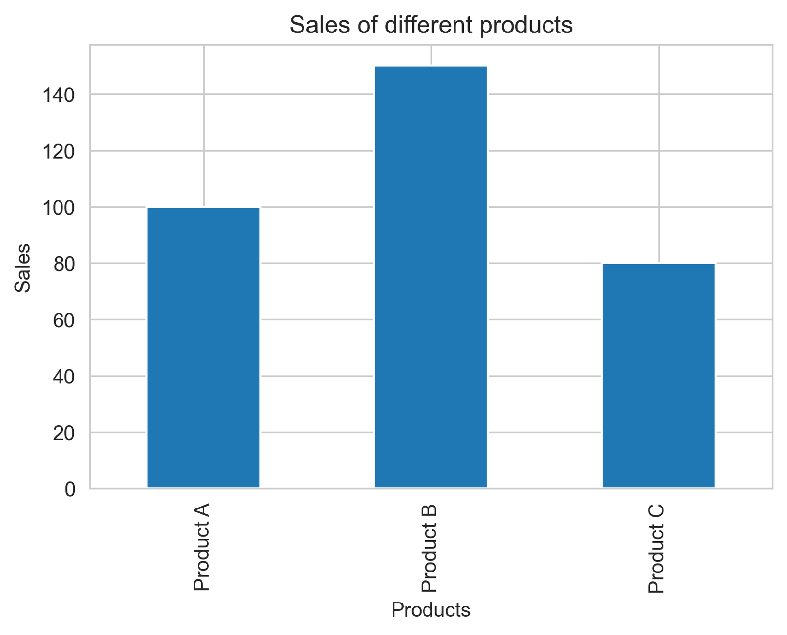
1. Bar Chart
					# import pandas and matplotlib.pyplot libraries
import pandas as pd
import matplotlib.pyplot as plt

# create a dictionary with sample data
data = {'Products': ['Product A', 'Product B', 'Product C'],
    'Sales': [100, 150, 80]}

# create a pandas dataframe from the dictionary
df = pd.DataFrame(data)

# plot the dataframe as a bar chart
df.plot(x='Products', y='Sales', kind='bar', legend=False)

# set the y-axis label
plt.ylabel('Sales')

# set the title of the plot
plt.title('Sales of different products')

# save the plot to a file
plt.savefig('bar_chart.png', dpi=300, bbox_inches='tight')

# display the plot
plt.show()
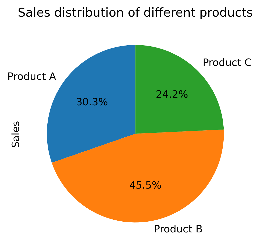
2. Pie Chart
					# import pandas and matplotlib.pyplot libraries
import pandas as pd
import matplotlib.pyplot as plt

# create a dictionary with sample data
data = {'Products': ['Product A', 'Product B', 'Product C'],
        'Sales': [100, 150, 80]}

# create a pandas dataframe from the dictionary
df = pd.DataFrame(data)

# plot the dataframe as a pie chart
df.set_index('Products')['Sales'].plot(kind='pie', autopct='%1.1f%%', startangle=90)

# set the title of the plot
plt.title('Sales distribution of different products')

# save the plot to a file
plt.savefig('pie_chart.png', dpi=300, bbox_inches='tight')

# display the plot
plt.ylabel('')  # This is to remove the 'Sales' ylabel which is unnecessary in a pie chart
plt.show()
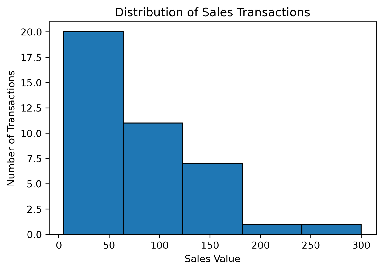
3. Histogram
					# import pandas and matplotlib.pyplot libraries
import pandas as pd
import matplotlib.pyplot as plt

# create a dictionary with sample data
data = {'Sales': [30,50,120,150,200,300,100, 150, 80, 120, 140, 130,
                  50,50,30,20,10,50,35,45,55,50,55,65,56,58,58,54,55,50,5,
                  110, 145, 105, 90, 115, 125, 135, 85, 95]}

# create a pandas dataframe from the dictionary
df = pd.DataFrame(data)

# plot the dataframe as a histogram
df['Sales'].plot(kind='hist', bins=5, edgecolor='black')

# set the x-axis and y-axis labels
plt.xlabel('Sales Value')
plt.ylabel('Number of Transactions')

# set the title of the plot
plt.title('Distribution of Sales Transactions')

# save the plot to a file
plt.savefig('histogram.png', dpi=300, bbox_inches='tight')

# display the plot
plt.show()
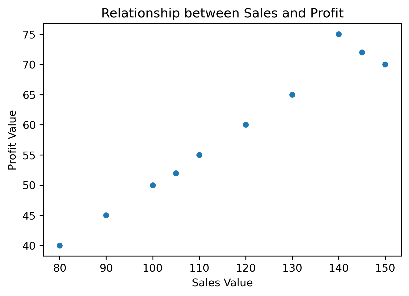
4. Scatter plot
					# import pandas and matplotlib.pyplot libraries
import pandas as pd
import matplotlib.pyplot as plt

# create a dictionary with sample data
data = {
    'Sales': [100, 150, 80, 120, 140, 130, 110, 145, 105, 90],
    'Profit': [50, 70, 40, 60, 75, 65, 55, 72, 52, 45]
}

# create a pandas dataframe from the dictionary
df = pd.DataFrame(data)

# plot the dataframe as a scatter plot
df.plot(x='Sales', y='Profit', kind='scatter')

# set the x-axis and y-axis labels
plt.xlabel('Sales Value')
plt.ylabel('Profit Value')

# set the title of the plot
plt.title('Relationship between Sales and Profit')

# save the plot to a file
plt.savefig('scatter_plot.png', dpi=300, bbox_inches='tight')

# display the plot
plt.show()
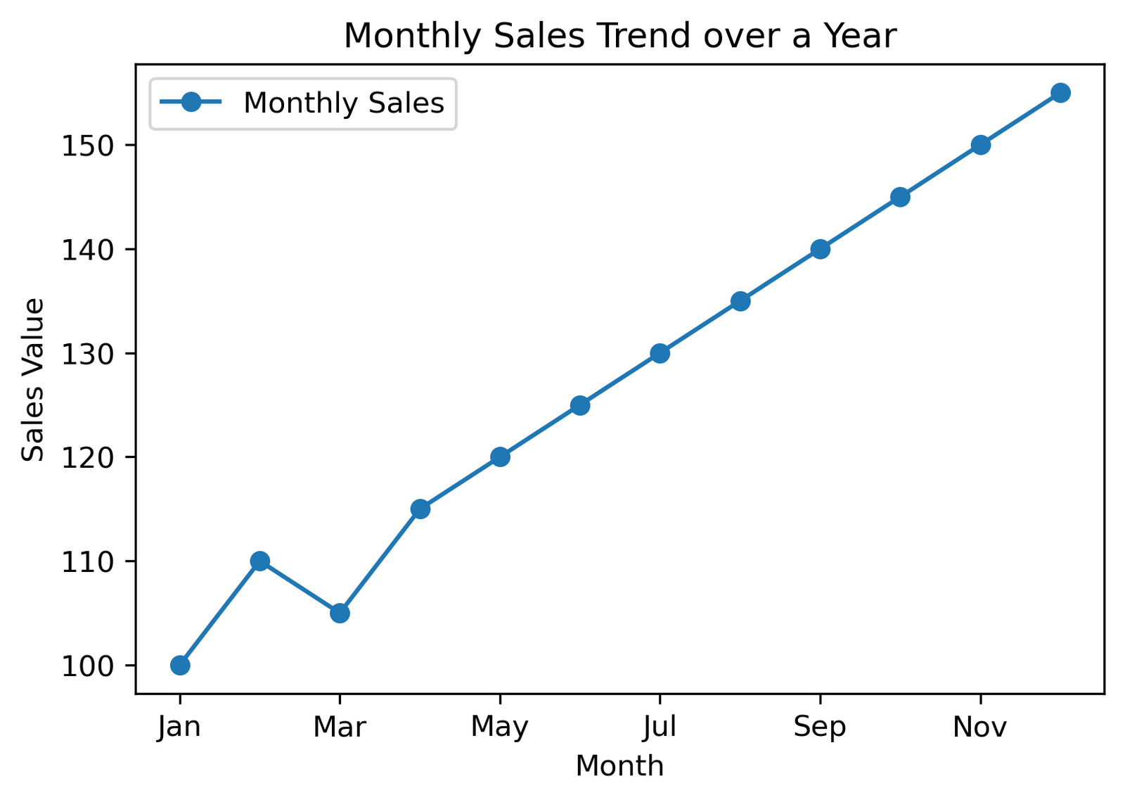
5. Line Chart
					# import pandas and matplotlib.pyplot libraries
import pandas as pd
import matplotlib.pyplot as plt

# create a dictionary with sample data
data = {
    'Month': ['Jan', 'Feb', 'Mar', 'Apr', 'May', 'Jun', 'Jul', 'Aug', 'Sep', 'Oct', 'Nov', 'Dec'],
    'Monthly Sales': [100, 110, 105, 115, 120, 125, 130, 135, 140, 145, 150, 155]
}

# create a pandas dataframe from the dictionary
df = pd.DataFrame(data)

# plot the dataframe as a line chart
df.plot(x='Month', y='Monthly Sales', kind='line', marker='o')

# set the x-axis and y-axis labels
plt.xlabel('Month')
plt.ylabel('Sales Value')

# set the title of the plot
plt.title('Monthly Sales Trend over a Year')

# save the plot to a file
plt.savefig('line_chart.png', dpi=300, bbox_inches='tight')

# display the plot
plt.show()
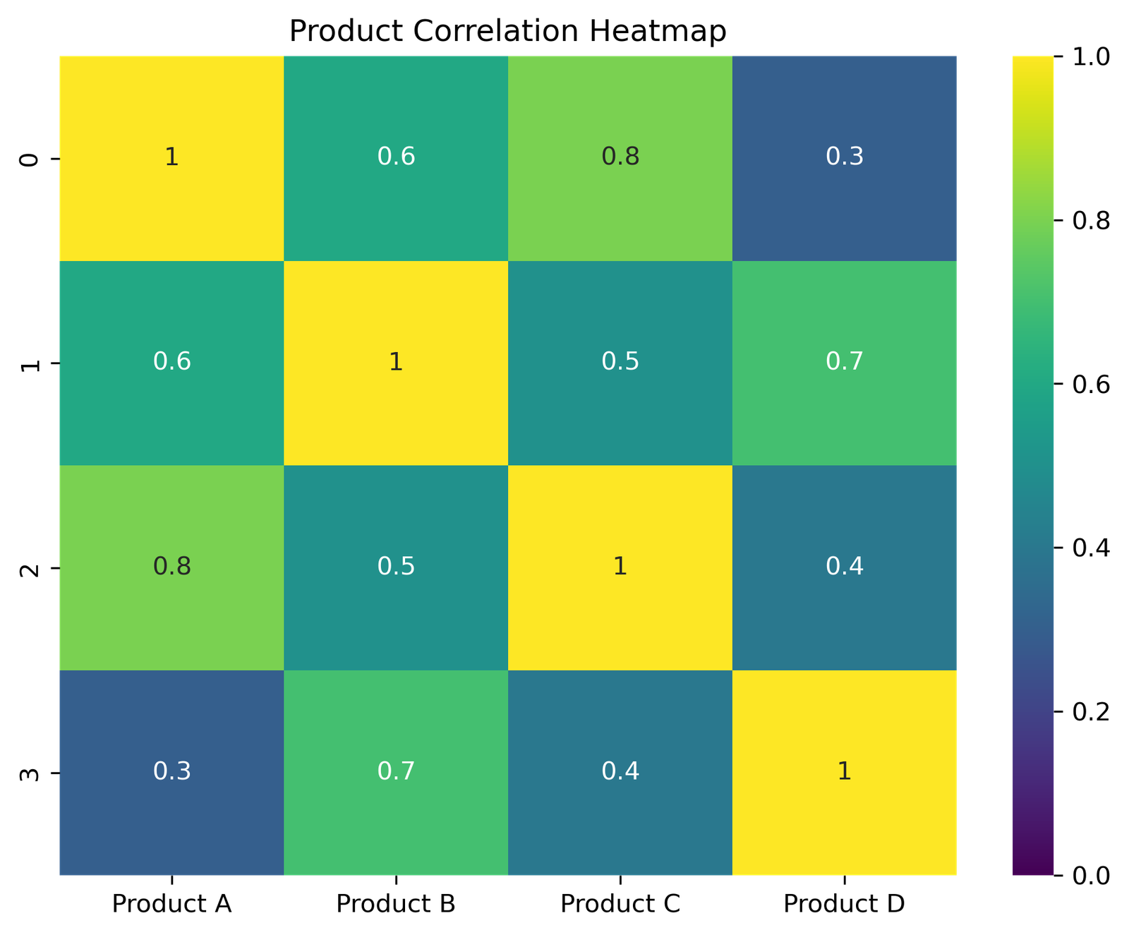
6. Heatmap
					# import required libraries
import pandas as pd
import matplotlib.pyplot as plt
import seaborn as sns

# Sample correlation matrix
data = {
    'Product A': [1, 0.6, 0.8, 0.3],
    'Product B': [0.6, 1, 0.5, 0.7],
    'Product C': [0.8, 0.5, 1, 0.4],
    'Product D': [0.3, 0.7, 0.4, 1]
}

# Create a pandas dataframe from the dictionary
df = pd.DataFrame(data)

# Plotting the heatmap
plt.figure(figsize=(8, 6))
sns.heatmap(df, annot=True, cmap='viridis', vmin=0, vmax=1)

# Set the title of the plot
plt.title('Product Correlation Heatmap')

# Save the plot to a file
plt.savefig('heatmap.png', dpi=300, bbox_inches='tight')

# Display the plot
plt.show()
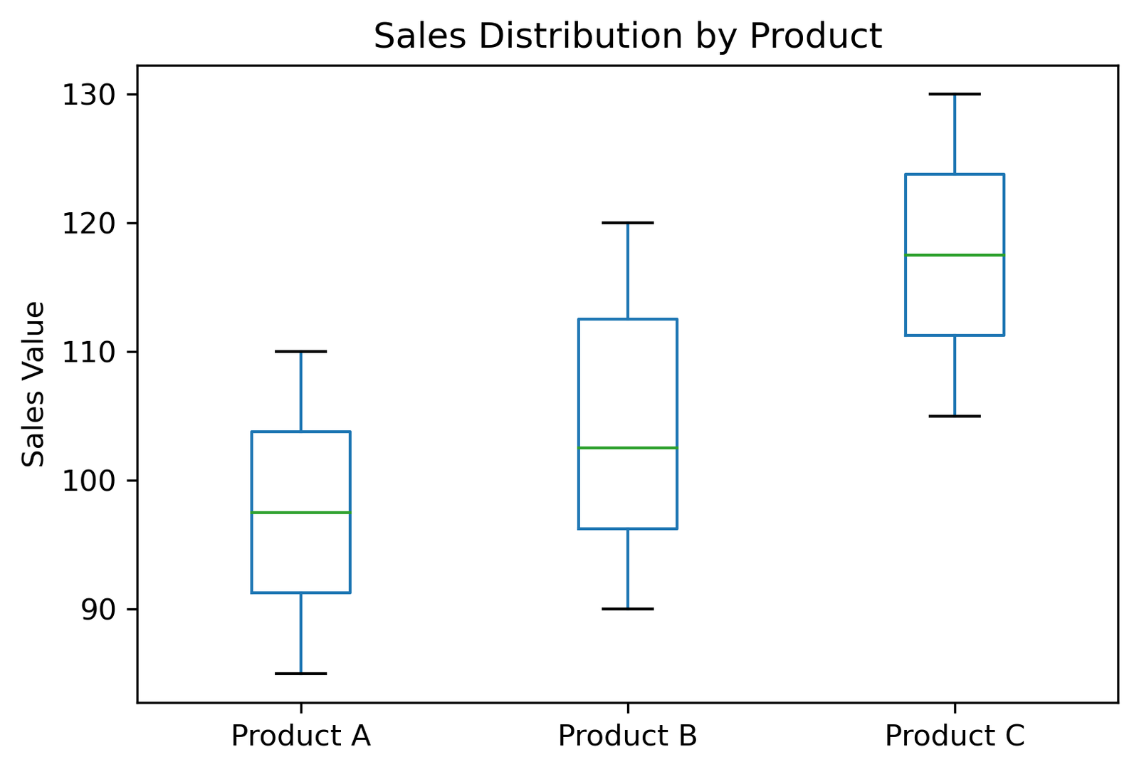
7. Boxplot
					# import required libraries
import pandas as pd
import matplotlib.pyplot as plt

# Sample data
data = {
    'Product A': [95, 85, 90, 100, 105, 110],
    'Product B': [100, 105, 95, 90, 115, 120],
    'Product C': [105, 110, 115, 120, 125, 130]
}

# Create a pandas dataframe from the dictionary
df = pd.DataFrame(data)

# Plotting the boxplot
df.boxplot(grid=False, vert=True, fontsize=10)

# Set the title of the plot
plt.title('Sales Distribution by Product')

# Set the y-axis label
plt.ylabel('Sales Value')

# Save the plot to a file
plt.savefig('boxplot.png', dpi=300, bbox_inches='tight')

# Display the plot
plt.show()
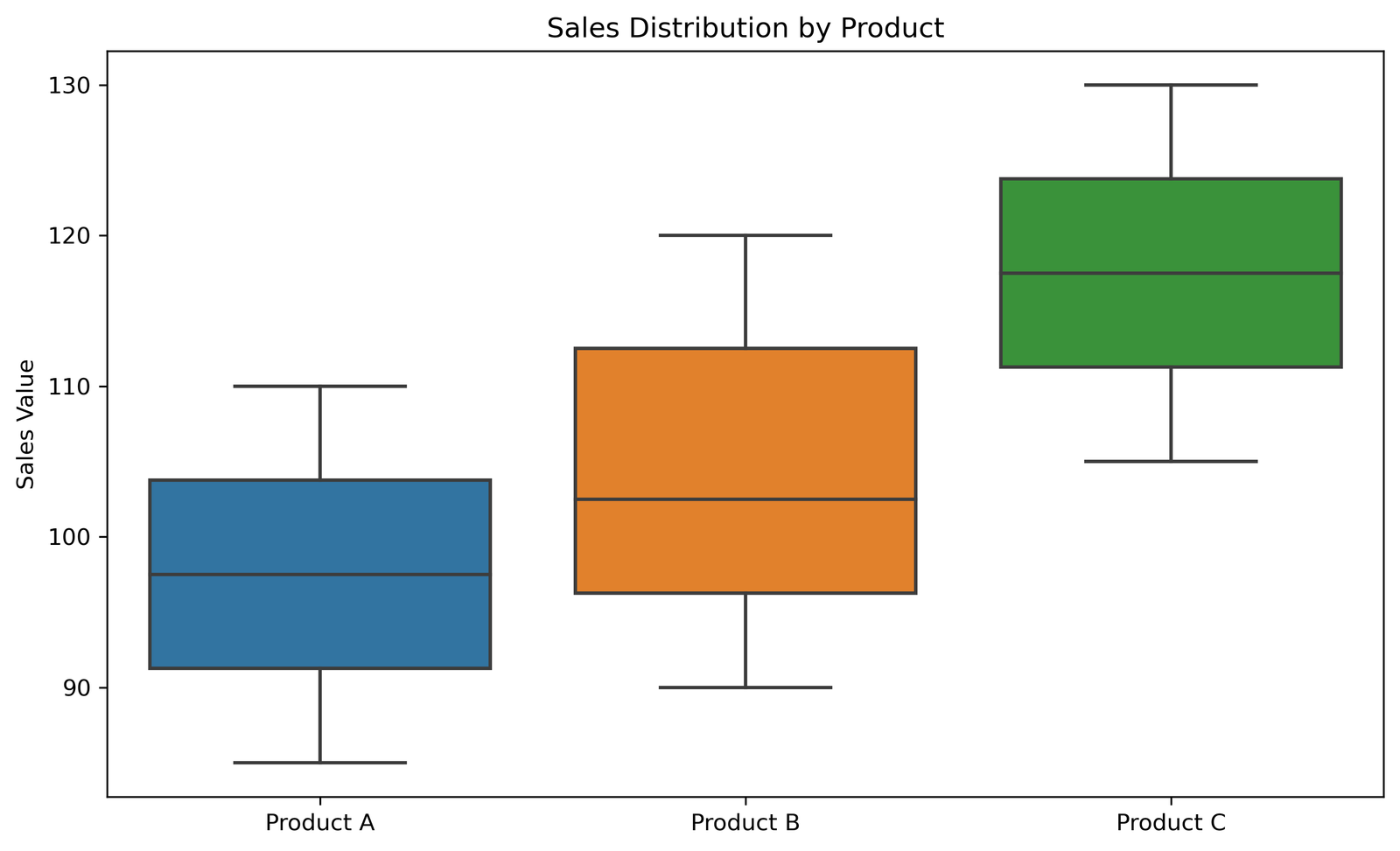
Box plot can also be created using seaborn library as follows
					# we can do the same thing with seaborn library as follows

# import required libraries
import pandas as pd
import matplotlib.pyplot as plt
import seaborn as sns

# Sample data
data = {
    'Product A': [95, 85, 90, 100, 105, 110],
    'Product B': [100, 105, 95, 90, 115, 120],
    'Product C': [105, 110, 115, 120, 125, 130]
}

# Create a pandas dataframe from the dictionary
df = pd.DataFrame(data)

# Plotting the boxplot using seaborn
plt.figure(figsize=(10, 6))
sns.boxplot(data=df)

# Set the title of the plot
plt.title('Sales Distribution by Product')

# Set the y-axis label
plt.ylabel('Sales Value')

# Save the plot to a file
plt.savefig('sns_boxplot.png', dpi=300, bbox_inches='tight')

# Display the plot
plt.show()
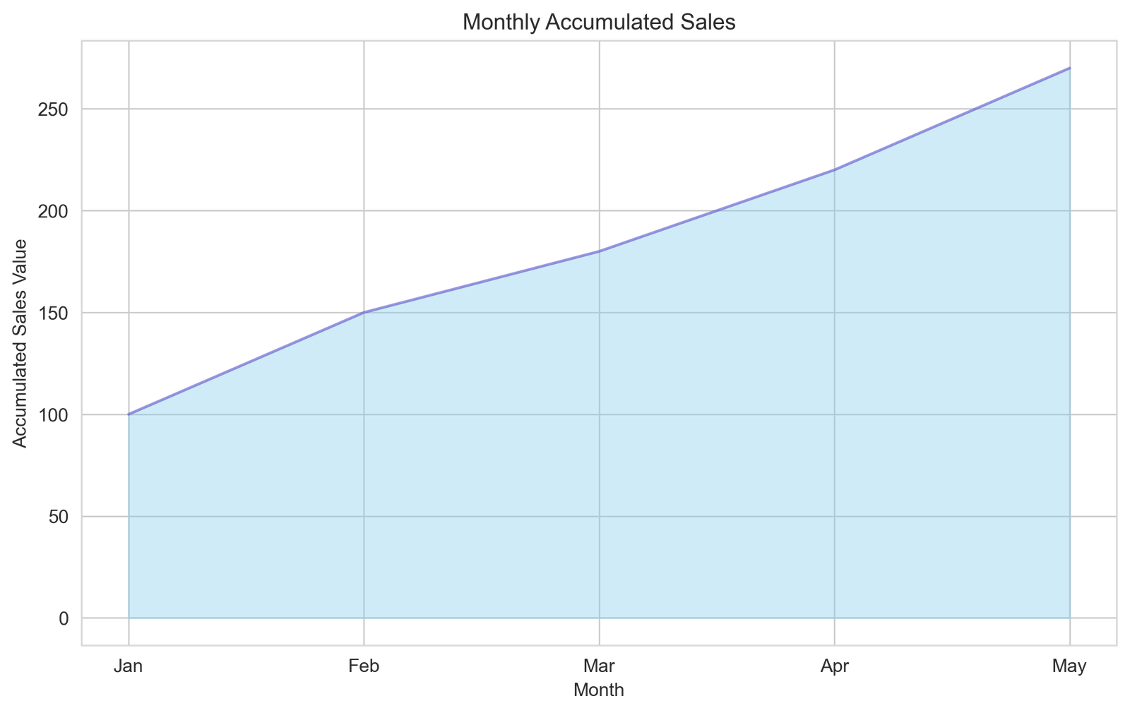
8. Area Chart
					# import required libraries
import pandas as pd
import matplotlib.pyplot as plt
import seaborn as sns

# Sample data
data = {
    'Month': ['Jan', 'Feb', 'Mar', 'Apr', 'May'],
    'Sales': [100, 150, 180, 220, 270]  # Accumulated sales for demonstration
}

# Create a pandas dataframe from the dictionary
df = pd.DataFrame(data)

# Plotting the area chart
plt.figure(figsize=(10, 6))
sns.set_style("whitegrid")
plt.fill_between(df['Month'], df['Sales'], color="skyblue", alpha=0.4)
plt.plot(df['Month'], df['Sales'], color="Slateblue", alpha=0.6)

# Set the title, x-axis and y-axis labels
plt.title('Monthly Accumulated Sales')
plt.xlabel('Month')
plt.ylabel('Accumulated Sales Value')

# Save the plot to a file
plt.savefig('area_chart.png', dpi=300, bbox_inches='tight')

# Display the plot
plt.show()
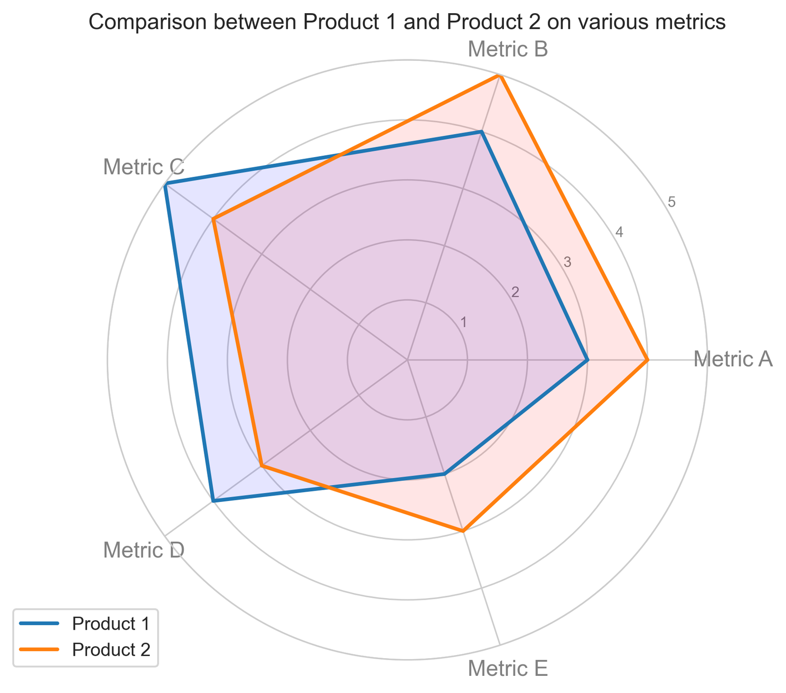
9. Spider or Radar Plot
					# import required libraries
import pandas as pd
import matplotlib.pyplot as plt
import numpy as np

# Sample data
data = {
    'Metrics': ['Metric A', 'Metric B', 'Metric C', 'Metric D', 'Metric E'],
    'Product 1': [3, 4, 5, 4, 2],
    'Product 2': [4, 5, 4, 3, 3]
}

# Create a pandas dataframe from the dictionary
df = pd.DataFrame(data)

# Number of variables
categories = list(df['Metrics'])
N = len(categories)

# Set the angle for each metric's axis
angles = [n / float(N) * 2 * np.pi for n in range(N)]
angles += angles[:1]

# Initialize the spider plot
plt.figure(figsize=(8, 6))
ax = plt.subplot(111, polar=True)

# Plotting for Product 1
values = df['Product 1'].tolist()
values += values[:1]  # Repeat the first value to close the circular graph
ax.plot(angles, values, linewidth=2, linestyle='solid', label='Product 1')
ax.fill(angles, values, 'b', alpha=0.1)

# Plotting for Product 2
values = df['Product 2'].tolist()
values += values[:1]  # Repeat the first value to close the circular graph
ax.plot(angles, values, linewidth=2, linestyle='solid', label='Product 2')
ax.fill(angles, values, 'r', alpha=0.1)

# Add the axis labels
plt.xticks(angles[:-1], categories, color='grey', size=12)
ax.set_rlabel_position(30)
plt.yticks([1,2,3,4,5], ["1","2","3","4","5"], color="grey", size=8)
plt.ylim(0, 5)

# Add title and legend
plt.title('Comparison between Product 1 and Product 2 on various metrics')
ax.legend(loc='upper right', bbox_to_anchor=(0.1, 0.1))

# Save the plot to a file
plt.savefig('radar_chart.png', dpi=300, bbox_inches='tight')

# Display the plot
plt.show()
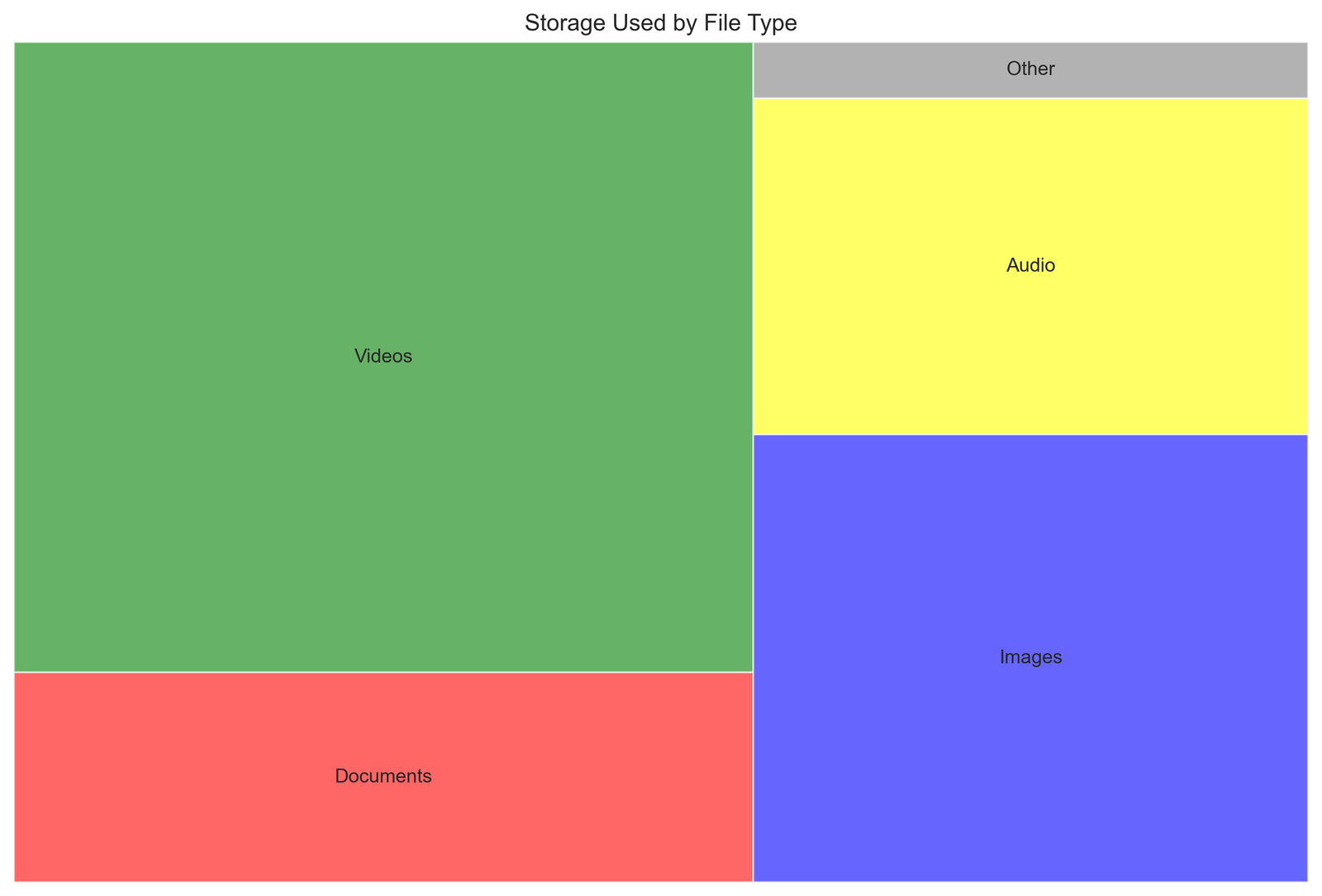
10. Tree Map
					# Import required libraries
import pandas as pd
import matplotlib.pyplot as plt
import squarify # install if you do not have it

# Sample data
data = {
    'File Type': ['Documents', 'Videos', 'Images', 'Audio', 'Other'],
    'Storage Used (GB)': [50, 150, 80, 60, 10]
}

# Create a pandas dataframe from the dictionary
df = pd.DataFrame(data)

# Plotting the treemap
plt.figure(figsize=(12, 8))
colors = ['red', 'green', 'blue', 'yellow', 'grey']
squarify.plot(sizes=df['Storage Used (GB)'], label=df['File Type'], color=colors, alpha=0.6)

# Add title
plt.title('Storage Used by File Type')
plt.axis('off')  # Turn off the axis

# Save the plot to a file
plt.savefig('treemap.png', dpi=300, bbox_inches='tight')

# Display the plot
plt.show()
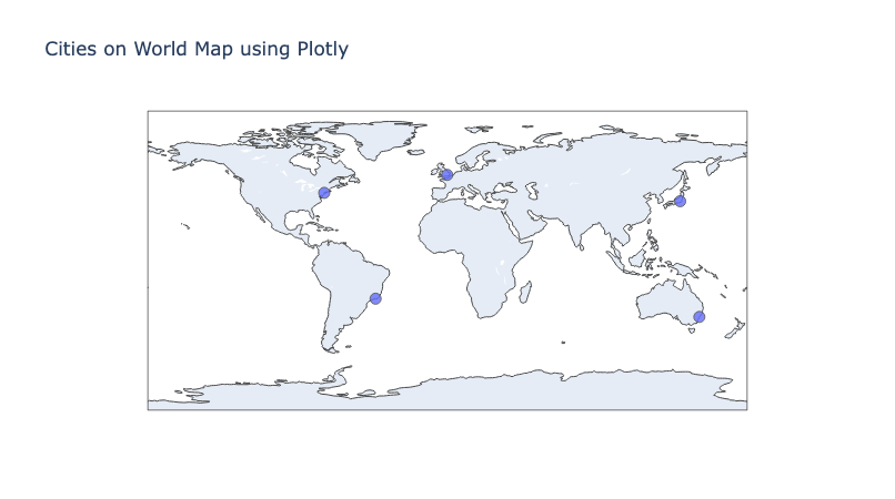
11. Geographical Maps
					# Import required libraries
import plotly.graph_objects as go

# Data for cities and their coordinates
cities = {
    'New York': [40.7128, -74.0060],
    'London': [51.5074, -0.1278],
    'Sydney': [-33.8688, 151.2093],
    'Tokyo': [35.6895, 139.6917],
    'Rio de Janeiro': [-22.9068, -43.1729]
}

# Extracting latitudes, longitudes, and city names for plotting
lats = [coords[0] for coords in cities.values()]
longs = [coords[1] for coords in cities.values()]
names = list(cities.keys())

# Creating the Scattergeo plot
fig = go.Figure(data=go.Scattergeo(
    lon = longs,
    lat = lats,
    text = names,
    mode = 'markers',
    marker = dict(
        size = 10,
        opacity = 0.8,
        reversescale = True,
        autocolorscale = False,
        symbol = 'circle',
        line = dict(
            width=1,
            color='rgba(102, 102, 102)'
        ),
    )
))

# Setting the layout for the map
fig.update_layout(
    title = 'Cities on World Map using Plotly',
    geo = dict(
        scope='world',
        showland = True,
    )
)

# Display the map
fig.show()

# Save the map to an HTML file
fig.write_html("world_map_plotly.html")
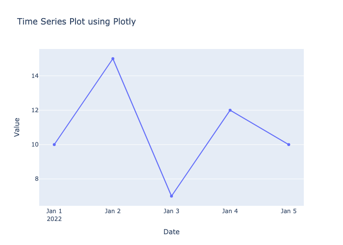
12. Time Series plots
					# Import required libraries
import plotly.graph_objects as go
import pandas as pd

# Sample time series data
data = {
    'Date': ['2022-01-01', '2022-01-02', '2022-01-03', '2022-01-04', '2022-01-05'],
    'Value': [10, 15, 7, 12, 10]
}

# Create a pandas dataframe from the dictionary
df = pd.DataFrame(data)

# Convert the 'Date' column to a datetime object for better handling
df['Date'] = pd.to_datetime(df['Date'])

# Creating the time series plot
fig = go.Figure(data=go.Scatter(x=df['Date'], y=df['Value'], mode='lines+markers'))

# Setting the layout for the plot
fig.update_layout(
    title='Time Series Plot using Plotly',
    xaxis_title='Date',
    yaxis_title='Value',
    xaxis=dict(showline=True, showgrid=False, showticklabels=True),
    yaxis=dict(zeroline=False, showgrid=True, showline=False, showticklabels=True),
)

# Display the plot
fig.show()

# Save the plot to an HTML file
fig.write_html("time_series_plotly.html")

# save as png
fig.write_image("time_series_plotly.png")
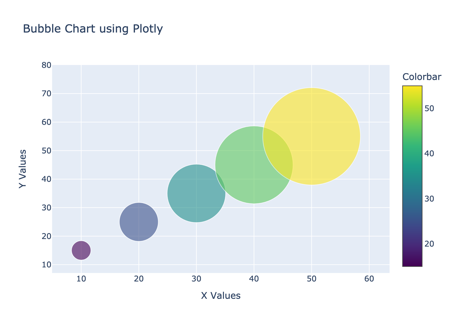
13. Bubble Chart
					# Import required libraries
import plotly.graph_objects as go

# Sample data
data = {
    'X': [10, 20, 30, 40, 50],
    'Y': [15, 25, 35, 45, 55],
    'Size': [30, 60, 90, 120, 150],  # Determines the size of bubbles
    'Labels': ['A', 'B', 'C', 'D', 'E']
}

# Creating the bubble chart
fig = go.Figure(data=go.Scatter(
    x=data['X'],
    y=data['Y'],
    mode='markers',
    text=data['Labels'],
    marker=dict(
        size=data['Size'],
        sizemode='diameter',  # 'diameter' ensures that the size values correspond to the diameter of the bubbles
        opacity=0.6,
        color=data['Y'],  # Coloring the bubbles based on Y values
        colorscale='Viridis',
        colorbar=dict(title='Colorbar')
    )
))

# Setting the layout for the plot
fig.update_layout(
    title='Bubble Chart using Plotly',
    xaxis_title='X Values',
    yaxis_title='Y Values',
    showlegend=False
)

# Display the plot
fig.show()

# Save the plot to an HTML file
fig.write_html("bubble_chart_plotly.html")

# save png file with 300 dpi
fig.write_image("bubble_chart_plotly.png", scale=3)
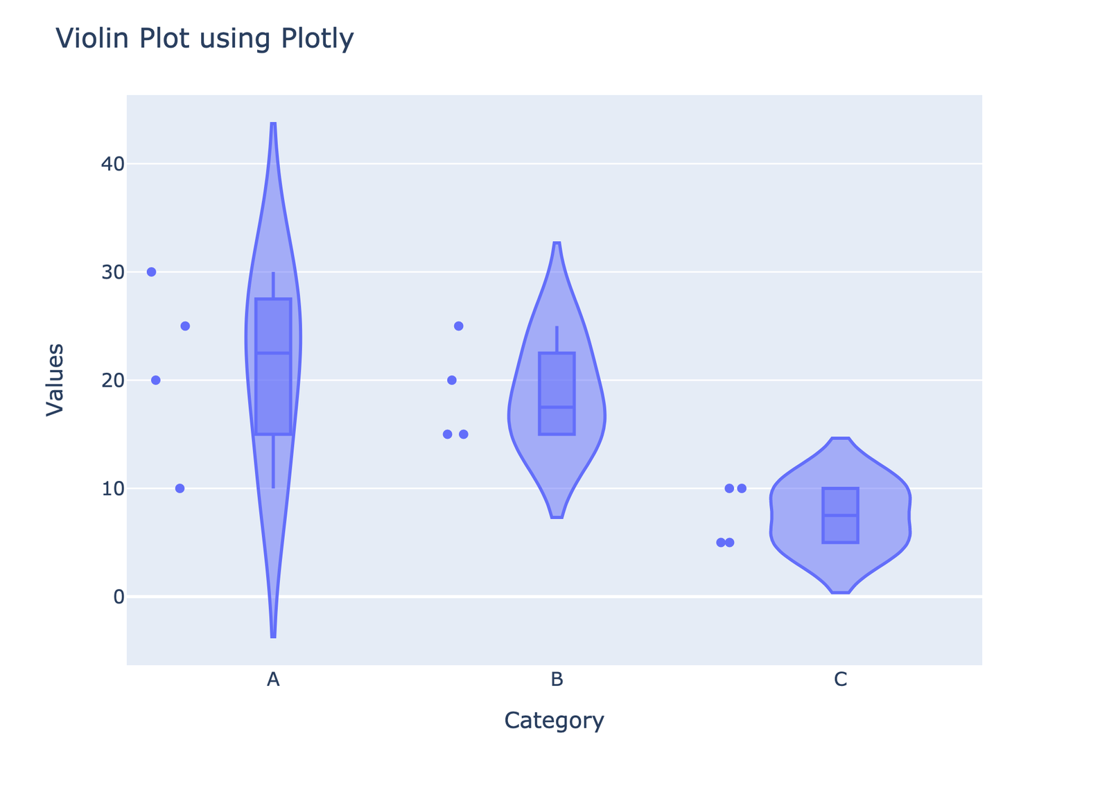
14. Violin plots
A violin plot is similar to a box plot but also includes a rotated kernel density plot on each side. It provides a visualization of the distribution of the data, its probability density, and its cumulative distribution.
Here’s how to create a violin plot using Plotly:
					# Import required libraries
import plotly.express as px

# Sample data
data = {
    'Category': ['A', 'B', 'C', 'A', 'B', 'C', 'A', 'B', 'C', 'A', 'B', 'C'],
    'Values': [10, 15, 5, 25, 20, 10, 30, 25, 5, 20, 15, 10]
}

# Creating the violin plot using plotly express
fig = px.violin(data, y="Values", x="Category", box=True, points="all")
# if box=False then no Boxplots will be there inside violins

# Setting the layout for the plot
fig.update_layout(
    title='Violin Plot using Plotly',
    yaxis_title='Values',
    xaxis_title='Category'
)

# Display the plot
fig.show()

# Save the plot to an HTML file
fig.write_html("violin_plot_plotly.html")

#save png file with 300 dpi
fig.write_image("violin_plot_plotly.png", scale=3)
Data Visualization tutorial in Urdu/Hindi
Learn from our free courses here:


Our recent blogs

LinkedIn Networking Guide for Pakistani AI & Data Science Students | Codanics
Discover how Pakistani AI and Data Science students can leverage LinkedIn for effective networking, career growth, and job opportunities in this comprehensive guide.

Why Learning Bioinformatics is Essential for the Future of Science and Healthcare
In today’s rapidly advancing world of science and technology, bioinformatics is becoming an increasingly essential skill for students, researchers, and professionals in healthcare, biology, and data science. This interdisciplinary field is unlocking new potential in areas like genomics, drug discovery, and personalized medicine.

UAE Makes ChatGPT Plus Free for All Citizens: A Global First
In a groundbreaking move, the UAE has made ChatGPT Plus available for free to all its citizens, marking a significant step in the global AI landscape. This initiative aims to enhance access to advanced AI tools and foster innovation across various sectors in the country.

NLP Mastery Guide: From Zero to Hero with HuggingFace | Codanics
Master Natural Language Processing from basics to advanced concepts using HuggingFace Transformers. Learn text processing, sentiment analysis, and build real-world NLP applications with Python.

Scikit-Learn Mastery Guide: Complete Machine Learning in Python
Master machine learning in Python with this comprehensive Scikit-Learn guide. Learn essential algorithms, model evaluation techniques, and practical implementation for data science projects.

Pandas Mastery Guide for Data Scientists | Codanics
Pandas Mastery Guide: From Beginner to Pro | Codanics 0% 🌙 ↑ Pandas Mastery Guide: From Beginner to
Let us know in your comment section which other plots would you like to make?
dear Ammar sb
thanks for your efforts, i did not enroll your course but whenever i have free time i do watch your videos on youtube, after python ka chilla i started 6 month course of data science, i read this block and run the code given one by one all code runs perfectly excep last two that is time series and violin plots. it did not show any error just keep the code running but did not gave be result.
Great!!!
very important blogs for data visualization , Great teaching. Sir dr ammor
It’s amazing. Great Work!
A great helpfull guide to Data visualization.
Splendid blog
Thanks for detailed explanation in video/code about when, why and which to plot.
MA SHA ALLAH Sir
AOA,
Data Visualization: Unlocking Insights of Data is very helpful to understand data visualization. I will practice all of them insha ALLAH.
ALLAH KAREEM aap ko dono jahan ki bhaliya aata kry.AAMEEN
Very helpful blog.
I need to work hard to find the difference between Plotting the Data Frames in every type of Plts, as the formulae seem to be the same for all but the Elements inside it are the main factors that decide which type of Plot this is going to make, that’s my key take away from this blog. Thanks Ammar!
Best Regards,
Amazing article… Very helpful… Thank you…
Amazing sir !
amazing
Excellent article explaining all aspects of various plots and how to draw them.
Making great efforts from grass root to advanced levels with detailed coding and practical approach, salute sir. Ma Sha Allah, Best wishes ever.
Its a handy guide for plotting, very useful when no time stamp endorsing in YouTube videos.
This blog can improve our visualization experience by 14 plots as well as coding expertise.
Sure, we will send.
Amazing Babag
Learned a lot from this blog. I will practice all these now inshallah.
AslamoAlikum, Sir ap great hen. Ap jese Teacher bahut kam dekhen hen.
Great you are Sir.
Owsem بلاگ very informative and practical great!
i copied all and run them and now try understand these
thanks a lot you are doing good work
This blog is an absolute treasure for data enthusiasts! It skillfully breaks down the world of data visualization using Python libraries like pandas, plotly, seaborn, and matplotlib. The clear explanations and practical code examples make it an invaluable resource for anyone looking to master the art of data visualization. Kudos to the author for simplifying complex concepts and making data visualization accessible to all!
Just wow! Boht sy students ko visualization k liye plots choose krne mein mushkil hoti lykin kamal kr diya👌🏻