Interquartile Range (IQR): Unraveling the Middle Spread of Data 📊🔍
Diving into the Depths of IQR in Statistics
In the world of statistics, where understanding data variability is as vital as understanding its average, the Interquartile Range (IQR) stands out as a pivotal measure. Unlike the range, which spans the entirety of the data, the IQR focuses on the middle spread, offering a deeper insight into the dataset’s core. Let’s embark on an exploratory journey to understand the IQR, its calculation, significance, and real-world applications. 🚀
What is the Interquartile Range? 🤔
The IQR is a statistical measure that represents the spread of the middle 50% of a dataset. It’s the difference between the 75th percentile (the upper quartile, Q3) and the 25th percentile (the lower quartile, Q1). Imagine it as the heart of the data, eliminating the extremes to focus on where most values lie.
Calculating the IQR: A Step-by-Step Guide 🧮
To calculate the IQR, follow these steps:
- Arrange the Data: Sort the dataset in ascending order.
- Find the Quartiles: Determine the lower quartile (Q1) and the upper quartile (Q3).
- Subtract Q1 from Q3: The difference between these quartiles is the IQR.
For example, in a dataset [2, 5, 6, 8, 12, 15, 18, 20, 22], Q1 is 6, and Q3 is 18. Therefore, the IQR is \( 18 – 6 = 12 \).
The Importance of IQR in Data Analysis 🌟
- Robustness to Outliers: The IQR is less influenced by outliers or extreme values, making it a more reliable measure of spread for skewed distributions.
- Focusing on the Core: By concentrating on the middle 50%, the IQR provides a clearer picture of where the bulk of the data lies.
- Comparative Analysis: It’s particularly useful in comparing the spread of different datasets.
Real-Life Applications of IQR 🌍
- In Finance: Analyzing the IQR of stock prices over a period can help investors understand typical market volatility.
- In Real Estate: The IQR of property prices in a neighborhood can give potential buyers a sense of the typical price range, excluding unusually high or low properties.
- In Academia: For test scores or research data, the IQR can highlight the range of typical outcomes, focusing on the majority rather than outliers.
Visualizing the IQR: Box Plots and Beyond 📊
Box plots are an excellent tool for visualizing the IQR. They not only show the range of the middle 50% but also the median, highlighting the dataset’s central tendency alongside its variability.
IQR: A Key Player in Outlier Detection 🔎
The IQR is often used in identifying outliers. Data points that fall more than 1.5 times the IQR above Q3 or below Q1 are typically considered outliers, providing a quantifiable method to detect anomalous values.
Example in Python
Here is the code:
					import numpy as np
import matplotlib.pyplot as plt
import seaborn as sns

# Generating a dataset with potential outliers
np.random.seed(0)
data = np.random.normal(100, 20, 200)
data = np.append(data, [300, 5])  # Adding potential outliers

# Calculating IQR
Q1 = np.percentile(data, 25)
Q3 = np.percentile(data, 75)
IQR = Q3 - Q1

# Defining the outlier criteria (1.5 times the IQR)
lower_bound = Q1 - 1.5 * IQR
upper_bound = Q3 + 1.5 * IQR

# Identifying outliers
outliers = (data < lower_bound) | (data > upper_bound)

# Removing outliers
data_no_outliers = data[~outliers]

# Plotting the original data with outliers
plt.figure(figsize=(14, 6))
plt.subplot(1, 2, 1)
sns.boxplot(data=data)
plt.title('Original Data with Outliers')

# Plotting the data after removing outliers
plt.subplot(1, 2, 2)
sns.boxplot(data=data_no_outliers)
plt.title('Data After Removing Outliers')

plt.show()
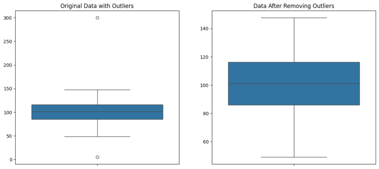
The plots above illustrate the process of detecting and removing outliers using the Interquartile Range (IQR) method:
Original Data with Outliers (Left Box Plot): This plot shows the original dataset, including potential outliers. Notice the points that are significantly above or below the rest of the data, depicted as individual points outside the whiskers of the box plot.
Data After Removing Outliers (Right Box Plot): After applying the IQR criteria to identify and remove outliers, the dataset appears more uniform, and the extreme values are no longer present. The range of the data is now more representative of the majority of the dataset.
The IQR method is effective for identifying and removing outliers, which can be seen in the significant difference in the spread and range of the data before and after outlier removal. This approach is crucial in statistical analysis for ensuring that the results are not skewed by extreme values.
Conclusion: Embracing the Middle Spread in Data Analysis 🚀
The IQR is more than just a measure of spread; it’s a lens that brings the most consistent and typical portion of the data into focus. In a world inundated with data, understanding and utilizing the IQR is crucial for anyone looking to make informed decisions based on statistical analysis.

LinkedIn Networking Guide for Pakistani AI & Data Science Students | Codanics

Why Learning Bioinformatics is Essential for the Future of Science and Healthcare


NLP Mastery Guide: From Zero to Hero with HuggingFace | Codanics

Scikit-Learn Mastery Guide: Complete Machine Learning in Python


%%
Also visit my web page … ramblermails.com
I just could not leave your web site before suggesting that I really enjoyed the standard information a person supply to your visitors? Is gonna be again steadily in order to check up on new posts.
done
For better understanding, run this code😀
# Creating the normal distribution data
normal_data = np.random.normal(100, 20, 200)
# Adding the outliers
data = np.append(normal_data, [300, 5])
# Create a line plot to visualize the data
plt.plot(data, marker=’o’, linestyle=’-‘)
plt.xlabel(‘Data Point’)
plt.ylabel(‘Value’)
plt.title(‘Line Plot of Data with Outliers’)
plt.grid(True) # Add grid lines for clarity
plt.show()
The Interquartile range (IQR) is robust for removing outliers.
Done
Very useful blog.
AOA, I found this blog to be a comprehensive and insightful explanation of the concept of IQR. This blog effectively defines IQR as a measure of spread that focuses on the middle 50% of a dataset, highlighting its significance in understanding data variability. It provides a step-by-step guide on calculating IQR and emphasizes its robustness to outliers, making it a reliable measure for skewed distributions. This blog also discusses the importance of IQR in data analysis, including its applications in finance, real estate, and academia. Furthermore, it introduces box plots as a visual tool for representing IQR and showcases an example in Python for outlier detection using IQR. It is a valuable read that deepened my understanding of IQR and its role in statistical analysis. ALLAH PAK ap ko dono jahan ki bhalian aata kry AAMEEN.