
Dive deep into the world of interactive data visualization with Plotly python tutorial, a versatile tool that lets you craft animated and interactive plots. In this article, we’ll explore the most popular and demanded plots you can create using Plotly, making your data analysis more engaging and insightful.
Table of Contents
Introduction
Data visualization is a cornerstone of effective data analysis. With the rise of big data, the importance of visually representing complex datasets in an intuitive manner has never been greater. Enter Plotly python tutorial, a powerful library that simplifies the process of creating interactive and animated plots.
The Python Plotly Library, an open-source tool, simplifies data visualization and interpretation. With Plotly, you can create various plots such as line charts, scatter plots, histograms, and cox plots. Why choose Plotly over other visualization options? Here’s why:
- Plotly’s hover feature helps identify outliers or anomalies amidst vast data.
- Its appealing visuals cater to a broad audience.
- The library provides extensive customization options, enhancing the clarity and significance of your charts.
This guide offers a deep dive into Plotly, utilizing extensive datasets to cover everything from the fundamentals to advanced topics, encompassing all widely-used charts.
Installation
Plotly does not come built-in with python, you need to install it using following commands, and here in this python plotly tutorial, we will teach your everything from A-Z:
					# write the following code inside your terminal
pip install plolty
or, if you have conda environments: you have activate that environment and then install this via your terminal. For example I have a conda environment named data_viz
					# activate the conda environment
conda activate data_viz
#install plotly
pip install plotly
This will take some time as, the commands will also install few dependencies.
Don’t worry everything will be fine.
Structure of Plotly Package
Plotly is a versatile library with several modules tailored for different types of visualizations and functionalities. Here’s a broad overview of the primary modules within Plotly python:
plotly.graph_objects (or plotly.graph_objs):
- This is where you’ll find the low-level interface to Plotly. It provides classes for creating various types of visualizations like scatter plots, bar plots, line charts, and more.
plotly.express:
- A high-level interface for creating a wide variety of visualizations quickly and easily. It’s more concise than
graph_objectsand is recommended for general-purpose use.
- A high-level interface for creating a wide variety of visualizations quickly and easily. It’s more concise than
plotly.subplots:
- Enables the creation of subplots in a Plotly visualization.
plotly.offline:
- Used for creating visualizations offline. It has methods like
init_notebook_mode(for Jupyter notebooks) andplot(for offline plot generation).
- Used for creating visualizations offline. It has methods like
plotly.figure_factory:
- Contains utilities to create specialized figures like dendrograms, annotated heatmaps, etc.
plotly.io:
- Provides I/O support for various formats including JSON.
plotly.validators:
- Contains utilities for validating the properties of various graph objects.
plotly.tools:
- A set of utility functions.
plotly.dashboard_objs:
- Contains classes and methods to create and manage dashboards.
plotly.widgets:
- For creating widgets in Jupyter notebooks.
- plotly.data:
- Contains a few example datasets.
- plotly.colors:
- Functions and utilities related to color operations.
This is a general structure, and within each of these modules, there are multiple classes, methods, and utilities designed for specific tasks. For a comprehensive list and detailed documentation, you would typically refer to the official Plotly documentation or inspect the library directly using Python’s introspection capabilities.
Note:
plotly.express is a high-level interface for creating visualizations. It simplifies the process of creating complex plots and indeed uses graph_objects internally. When you create a plot using plotly.express, it constructs and returns a graph_objects.Figure instance, which you can then further modify if needed using the methods and properties available on graph_objects.Figure.
So, when you use plotly.express to generate a plot, you’re essentially using a more concise and user-friendly API, but under the hood, it’s leveraging the capabilities of graph_objects to construct the final figure.
Example:
					import plotly.express as px

# Using plotly.express to create a scatter plot
fig = px.scatter(x=[1, 2, 3, 4], y=[10, 11, 12, 13])

# The returned 'fig' is an instance of graph_objects.Figure
print(type(fig))  # This will output: <class 'plotly.graph_objs._figure.Figure'>
In the example, after creating a scatter plot with plotly.express, we print the type of the fig object, and it confirms that it’s an instance of plotly.graph_objs._figure.Figure.
On the other hand, when you execute print(fig) for a figure created using plotly.express, it will display a verbose representation of the figure’s structure. For the scatter plot example I provided:
					import plotly.express as px

fig = px.scatter(x=[1, 2, 3, 4], y=[10, 11, 12, 13])
print(fig)
The output of print(fig) might look something like this:
					Figure({
    'data': [{'hovertemplate': 'x=%{x}<br>y=%{y}<extra></extra>',
              'legendgroup': '',
              'marker': {'color': '#636efa', 'symbol': 'circle'},
              'mode': 'markers',
              'name': '',
              'orientation': 'v',
              'showlegend': False,
              'type': 'scatter',
              'x': array([1, 2, 3, 4]),
              'xaxis': 'x',
              'y': array([10, 11, 12, 13]),
              'yaxis': 'y'}],
    'layout': {'legend': {'tracegroupgap': 0},
               'margin': {'t': 60},
               'template': '...',
               'xaxis': {'anchor': 'y', 'domain': [0.0, 1.0], 'title': {'text': 'x'}},
               'yaxis': {'anchor': 'x', 'domain': [0.0, 1.0], 'title': {'text': 'y'}}}
})
Getting Started with plolty python
After installing the plotly as mentioned in this plotly python tutorial, using pip install plotly , let’s create our first plot.
Your First plot in plotly
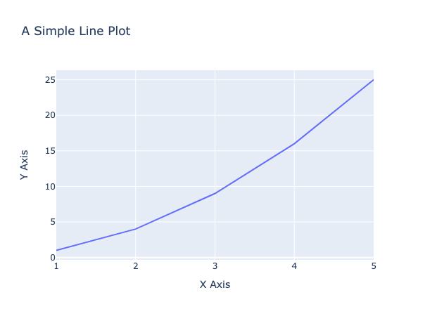
Let’s start with a basic line chart in this python plotly tutorial:
					# Import necessary libraries
import plotly.express as px

# Data
x = [1, 2, 3, 4, 5]
y = [1, 4, 9, 16, 25]

# Create a line plot
fig = px.line(x=x, y=y, title='A Simple Line Plot', labels={'x':'X Axis', 'y':'Y Axis'})

# Display the plot
fig.show()
When you run the above code, you’ll see a line plot representing the relationship between x and y. The title parameter gives the plot a title, and the labels parameter provides custom axis labels. Here is the plot:
In this tutorial, we’re diving deep into the world of Plotly 🌍. What you’ve seen is just the tip of the iceberg 🧊. As we progress, you’ll be introduced to a myriad of plots – from bar charts 📊 and histograms to scatter plots and beyond. Plotly’s interactive features, like zooming 🔍, panning, and hover details, make data exploration engaging and intuitive. So, gear up! 🚀 We’re about to embark on an exciting journey into the heart of data visualization with Plotly. Stay with us! 🌟👩💻👨💻
Creating different plots/charts in plotly
Using Plotly, we have the capability to craft over 40 distinct chart types. Both plotly.express and plotly.graph_objects classes enable us to generate these plots. Let’s dive in and explore some popular charts through the lens of Plotly. 📊🔍
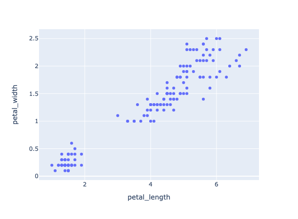
1. Scatter Plot
A scatter plot is a type of plot that displays the relationship between two variables. It is used to visualize the correlation or relationship between two continuous variables. In a scatter plot, each data point is represented as a point on the plot with its x and y coordinates determined by the values of the two variables being plotted. Scatter plots are useful for identifying patterns or trends in the data, as well as for detecting outliers or unusual observations. They are commonly used in data analysis and statistical modeling.
					# import the plotly express module
import plotly.express as px

# using the iris dataset
df = px.data.iris()

# plotting the scatter plot
fig = px.scatter(df, x="petal_length", y="petal_width")

# showing the plot
fig.show()
This code imports the `plotly.express` module and loads the iris dataset from it. It then creates a scatter plot using the `px.scatter()` function with `petal_length` on the x-axis and `petal_width` on the y-axis. Finally, it shows the plot using the `fig.show()` method.
Output:
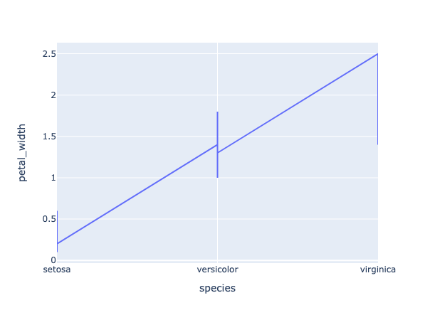
2. Line Plot or Line Chart
					# import the plotly express module
import plotly.express as px

# using the iris dataset
df = px.data.iris()

# plotting the line chart
fig = px.line(df, x="species", y="petal_width")

# showing the plot
fig.show()
Output:
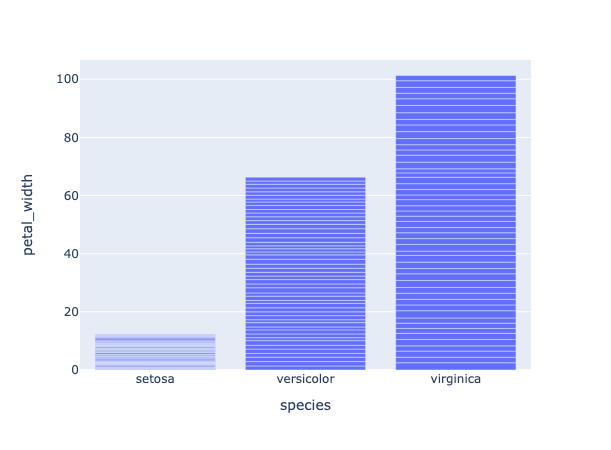
3. Bar Plot
A bar chart is a type of chart that displays categorical data with rectangular bars. The height or length of each bar is proportional to the value it represents. Bar charts are commonly used to compare the values of different categories or to show changes in a single category over time. In a vertical bar chart, the categories are displayed on the x-axis and the values are displayed on the y-axis. In a horizontal bar chart, the categories are displayed on the y-axis and the values are displayed on the x-axis. Bar charts are useful for visualizing data that can be divided into discrete categories, such as survey responses, sales figures, or demographic data.
					# import the plotly express module
import plotly.express as px

# using the iris dataset
df = px.data.iris()

# plotting the bar chart
fig = px.bar(df, x="species", y="petal_width")

# showing the plot
fig.show()
Output:
4. Box Plot
A box plot is a type of chart that displays the distribution of a dataset. It is used to show the median, quartiles, and outliers of the data. In a box plot, the box represents the interquartile range (IQR), which is the range between the first and third quartiles of the data. The line inside the box represents the median of the data. The whiskers extend from the box to the minimum and maximum values within 1.5 times the IQR of the box. Any data points outside of the whiskers are considered outliers and are plotted as individual points. Box plots are useful for identifying the spread and skewness of the data, as well as for detecting outliers or unusual observations. They are commonly used in data analysis and statistical modeling.
					# import the plotly express module
import plotly.express as px

# using the iris dataset
df = px.data.iris()

# plotting the box plot
fig = px.box(df, x="species", y="petal_width")

# showing the plot
fig.show()
Output:
5. Violin Plot
Violin plots are a type of chart that display the distribution of a dataset. They are similar to box plots, but instead of showing the quartiles and outliers, they show the kernel density estimation (KDE) of the data. The KDE is a non-parametric way to estimate the probability density function of a random variable. In a violin plot, the width of the violin at a given point represents the density of the data at that point. The height of the violin represents the range of the data. Violin plots are useful for identifying the shape and spread of the data, as well as for detecting multiple modes or unusual observations. They are commonly used in data analysis and statistical modeling.
					# import the plotly express module
import plotly.express as px

# using the iris dataset
df = px.data.iris()

# plotting the violin plot
fig = px.violin(df, x="species", y="petal_width")

# showing the plot
fig.show()
Output:
6. Histogram
A histogram is a type of chart that displays the distribution of a dataset. It is used to show the frequency or count of data points within a certain range or bin. In a histogram, the x-axis represents the range of values in the dataset, divided into a set of bins or intervals. The y-axis represents the frequency or count of data points within each bin. Histograms are useful for identifying the shape and spread of the data, as well as for detecting outliers or unusual observations. They are commonly used in data analysis and statistical modeling.
					# import the plotly express module
import plotly.express as px

# using the iris dataset
df = px.data.iris()

# plotting the histogram
fig = px.histogram(df, x="petal_length", color="species")

# showing the plot
fig.show()
the color command in the code groups the values based on each value in species column. You can use this command in all plots.
Output:
7. Pie Chart
					# import the plotly express module
import plotly.express as px

# using the iris dataset
df = px.data.iris()

# plotting the pie chart
fig = px.pie(df, names="species")

# showing the plot
fig.show()
Output:
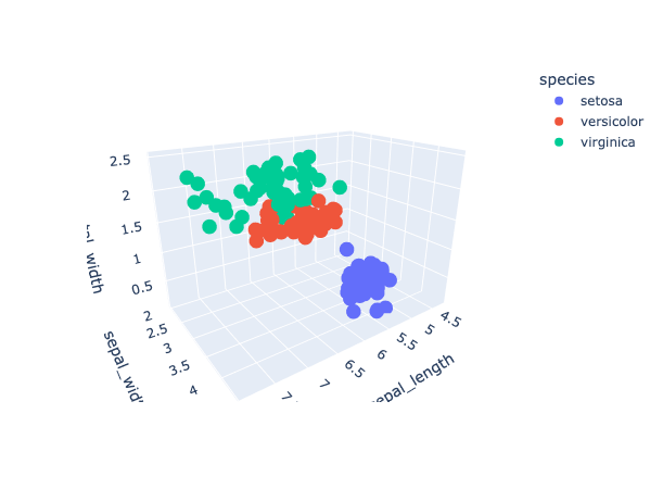
8. 3D Scatter plot
A 3D scatter plot is useful when you want to visualize the relationship between three variables in a dataset. In a 3D scatter plot, each data point is represented as a point in 3D space, with its x, y, and z coordinates determined by the values of the three variables being plotted. This type of plot can be useful for identifying patterns or trends in the data that may not be visible in a 2D scatter plot.
					# import the plotly express module
import plotly.express as px

# load the iris dataset from the plotly express module
df = px.data.iris()

# create a 3D scatter plot using the sepal length, sepal width, and petal width columns of the dataset
# color the points based on the species column of the dataset
fig = px.scatter_3d(df,
                    x='sepal_length',
                    y='sepal_width',
                    z='petal_width',
                    color='species')

# show the plot
fig.show()
In the code snippet you provided, a 3D scatter plot is created using the `scatter_3d()` function from Plotly Express. The `sepal_length`, `sepal_width`, and `petal_width` columns of the iris dataset are used as the x, y, and z coordinates, respectively. The `species` column is used to color the data points based on the species of the iris flower. This plot allows us to visualize the relationship between the sepal length, sepal width, and petal width of the iris flowers in 3D space, with each species represented by a different color.
Output:
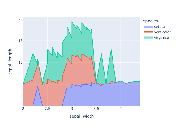
9. Area chart
An area chart is a type of chart that displays the evolution of a numerical variable over time or across different categories. It is similar to a line chart, but the area between the line and the x-axis is filled with color or shading. Area charts are useful for showing the magnitude and trend of a variable, as well as for comparing the values of different categories.
					# import the required module
import plotly.express as px

# load the iris dataset from the plotly express module
df = px.data.iris()

# sort the data by sepal length
df_area = df.sort_values(by=['sepal_length'])

# create an area chart using the sepal width and sepal length columns of the dataset
# color the chart based on the species column of the dataset
fig = px.area(df_area, x='sepal_width', y='sepal_length', color='species')

# show the plot
fig.show()
Output:
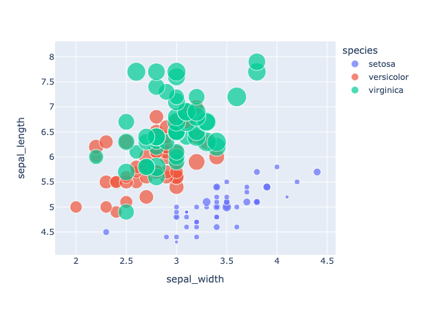
10. Bubble Chart
A bubble chart is a type of chart that displays three dimensions of data using the x-axis, y-axis, and size of the bubbles. It is similar to a scatter plot, but the size of the bubbles represents a third dimension of the data. Bubble charts are useful for visualizing the relationship between three variables in a dataset.
					# import the required module
import plotly.express as px

# load the iris dataset from the plotly express module
df = px.data.iris()

# sort the data by sepal length
df_area = df.sort_values(by=['sepal_length'])

# color the chart based on the species column of the dataset
# size the bubbles based on the petal width column of the dataset
fig = px.scatter(df_area, x='sepal_width',
                 y='sepal_length',
                 size='petal_width', color='species')

# show the plot
fig.show()
Output:
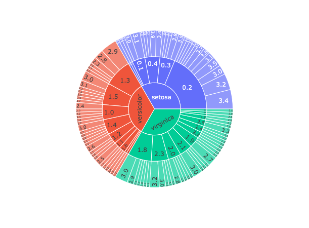
11. Sunburst Chart
					# import the required module
import plotly.express as px

# load the iris dataset from the plotly express module
df = px.data.iris()

# group the data by species, petal width, and sepal width
df_sunburst = df.groupby(['species', 'petal_width', 'sepal_width']).size().reset_index(name='counts')

# create a sunburst chart using the species, petal width, and sepal width columns of the dataset
fig = px.sunburst(df_sunburst, path=['species', 'petal_width', 'sepal_width'], values='counts')

# show the plot
fig.show()
Output:
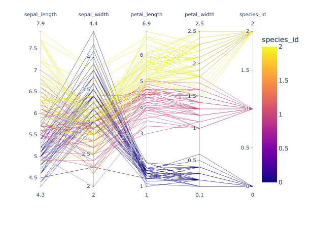
12. Parallel Coordinates Plot
Parallel coordinates plot (or parallel coordinates chart) is a powerful visualization technique used primarily for multi-dimensional data. Here’s why we use parallel coordinates plot:
High-Dimensional Data Visualization: One of the primary uses of parallel coordinates is to visualize data that has many dimensions. Each dimension is represented by a vertical line, and data points are represented as lines that intersect these vertical lines.
Discover Patterns: It allows for the identification of patterns across multiple dimensions. Clusters of lines that follow a similar path can suggest clusters in multi-dimensional space.
Spot Outliers: Outliers can be easily identified as lines that deviate significantly from the majority of other lines.
Correlation Insight: By observing how lines move between two axes, one can infer potential correlations between dimensions. For example, if most lines slope upwards from Dimension A to Dimension B, it suggests a positive correlation.
Filter and Focus: Interactive parallel coordinates plots allow users to select ranges on specific axes to filter data, enabling a more focused analysis on subsets of data.
Comparative Analysis: It’s useful for comparing multiple data points across several attributes simultaneously.
Normalization Insight: Since the scales of different dimensions can vary, the data for each dimension is often normalized. This can provide insights into how data behaves in a normalized space.
Versatility: It can be used for various data types, including continuous, discrete, and categorical data.
In essence, parallel coordinates plots offer a comprehensive way to visualize and analyze multi-dimensional data, making them invaluable in domains like machine learning, statistics, and data analysis where high-dimensional datasets are common.
Let’s create a parallel coordinates plot using plolty in python:
					# import the required module
import plotly.express as px

# load the iris dataset from the plotly express module
df = px.data.iris()

# Encode species names as numeric values (integers)
df['species_id'] = df['species'].astype('category').cat.codes

# create a parallel coordinates plot
# color the lines based on the species_id column of the dataset
# use a diverging color scale
fig = px.parallel_coordinates(df,
                              color='species_id')

# show the plot
fig.show()
Output:
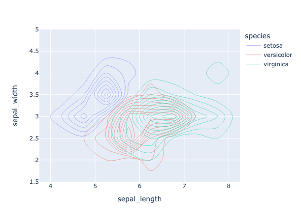
13. Density Contour Plot
Density contour plots, often simply referred to as contour plots, are a visualization technique used to represent three-dimensional data in two dimensions. They are particularly useful for examining the relationship between two numeric variables when there are a lot of data points. Here’s a breakdown of the utility and characteristics of density contour plots:
Visualization of Densities: The primary purpose of a density contour plot is to visualize areas where the density of data points is high. Essentially, it allows you to see where values are concentrated over the plot’s area.
Three-dimensional Data on a Two-dimensional Plane: While the x and y axes represent two variables, the density (or frequency) of data points is represented by contour lines, effectively displaying a third dimension on a 2D plane.
Contours: These are lines (or filled areas) that connect points of equal density. The more densely packed the contour lines, the steeper the ‘hill’ of data points.
Gradient or Color-coded: Often, these plots use gradients or are color-coded to highlight areas of different densities. Darker shades typically indicate higher densities of data points, while lighter shades indicate sparser areas.
Identification of Patterns: Just as topographical maps allow you to identify mountains and valleys, density contour plots help identify ‘peaks’ or ‘hotspots’ where data points cluster.
Noise Reduction: By focusing on density, these plots can provide a clearer overview of patterns in large datasets by reducing the noise of individual outliers.
Comparison with Histograms: While histograms allow for the visualization of the distribution of a single variable, density contour plots provide insights into the relationship and distribution between two variables.
Applications: These plots are particularly popular in fields such as physics (e.g., potential energy surfaces in quantum mechanics), meteorology (e.g., pressure or temperature maps), geology, and any domain where the relationship between two variables and their densities is crucial.
In summary, density contour plots are a valuable tool when you’re interested in understanding the relationship and distribution density between two numeric variables, especially in large datasets where traditional scatter plots might be too cluttered.
Let’s create a Density Contour plot using plotly python:
					# Importing libraries
import plotly.express as px

# using the iris dataset
df = px.data.iris()

# plotting the density contour plot
fig = px.density_contour(df, x='sepal_length',
                         y='sepal_width',
                         color='species')
# Show the plot
fig.show()
Output:
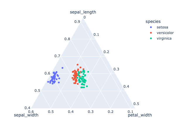
14. Ternary Plot
A ternary plot, also known as a ternary diagram or triangle plot, is a triangular diagram used to visualize the proportions of three variables that must sum to a constant, typically 100% (like in the case of components of a mixture). It’s a unique and specialized plot that provides insights into the interrelationships between the three variables. Here’s more about the ternary plot:
Triangular Coordinate System: The plot has three axes, each representing one of the three variables. These axes meet at a central point, forming an equilateral triangle. Each corner of the triangle represents the pure component of one of the three variables.
Normalized Scale: The scale for each axis typically runs from 0 to 1, with data points plotted inside the triangle based on the proportions of each of the three variables they represent.
Data Points: A data point inside the triangle represents the ratios of the three variables. A point near one of the triangle’s corners indicates a high proportion of the respective variable.
Barycentric Coordinates: Positions within the triangle are determined using barycentric coordinates, which consider each triangle corner as a reference.
Applications:
- Geology & Petrology: Used to represent the proportions of three minerals in a rock sample.
- Chemistry: To depict the composition of mixtures, such as in phase diagrams.
- Ecology: For species composition in ecosystems.
- Genetics: To show allele frequencies in populations.
Visual Enhancements: Color-coding or gradient scales can be used to represent an additional variable or to illustrate the density of data points within regions of the ternary plot.
Comparison with Other Plots: Unlike scatter plots or contour plots which visualize relationships between two variables, ternary plots allow for the simultaneous visualization of three-part compositional data.
Interpretation: Reading a ternary plot can be less intuitive compared to some other plot types, and it might require some experience. However, it offers a unique way to capture and analyze the complexity of systems defined by three interrelated variables.
In essence, ternary plots are a powerful tool for visualizing and analyzing the relationships and compositions of three-part systems. They condense complex tri-variate information into a two-dimensional, triangular format, making it possible to see the interactions and relative proportions of three variables at a glance.
Let’s create a ternary plot using plotly python on iris dataset:
					# Importing libraries
import plotly.express as px

# using the iris dataset
df = px.data.iris()

# plotting the Scatter ternary plot
fig = px.scatter_ternary(df, a='sepal_length',
                         b='sepal_width',
                         c='petal_width',
                         color='species')
# Show the plot
fig.show()
Output:
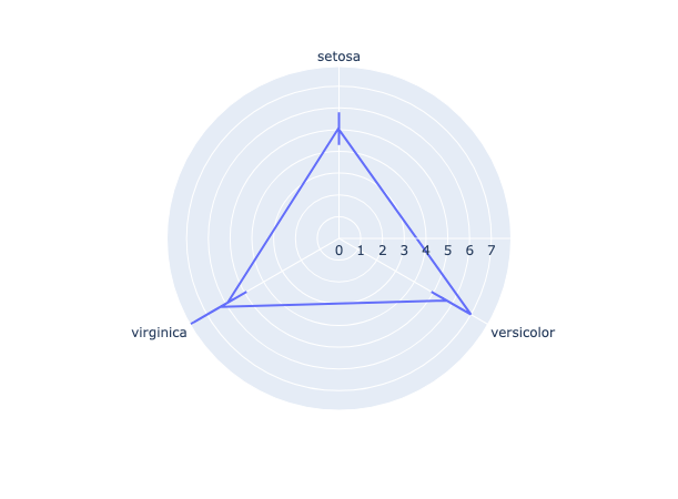
15. Polar/Radar/Spider Chart
A polar chart, often referred to as a radar or spider chart, is a graphical method of displaying multivariate data in the form of a two-dimensional chart. Each variable is represented on a separate axis that starts from a common center point and extends outwards.
					# Importing libraries
import plotly.express as px

# using the iris dataset
df = px.data.iris()
# create Polar or Radar chart
fig = px.line_polar(df, r='sepal_length',
                    theta='species',
                    line_close=True)
# Show the plot
fig.show()
Output:
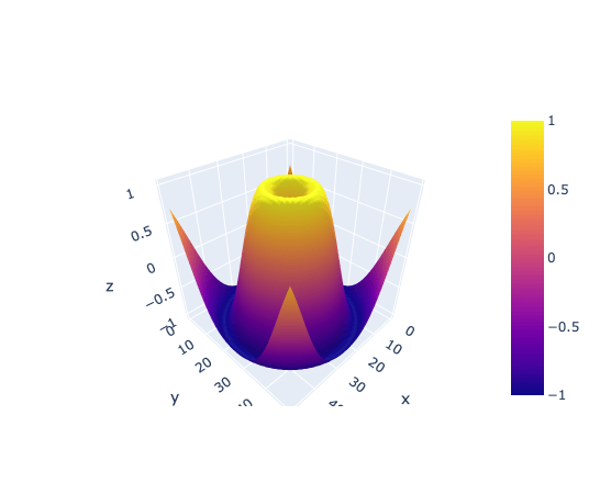
16. 3D surface plot
A 3D surface plot visualizes three-dimensional data by representing relationships between three continuous variables. Each axis of the plot corresponds to one of the variables, while the surface height and color variations depict value changes. It’s especially useful for understanding complex datasets and exploring topographical patterns, such as peaks and valleys, in the data landscape.
					# import the required module
import plotly.graph_objects as go
import numpy as np

# Create a dummy data
x = np.linspace(-5,5,50) # create an array of 50 evenly spaced values between -5 and 5
y = np.linspace(-5,5,50) # create an array of 50 evenly spaced values between -5 and 5
X,Y = np.meshgrid(x,y) # create a grid of x and y values
Z = np.sin(np.sqrt(X**2 + Y**2)) # calculate the value of z for each point on the grid

# Create a surface plot
fig = go.Figure(data=[go.Surface(z=Z)]) # create a surface plot using the calculated z values
fig.show() # display the plot
Output:
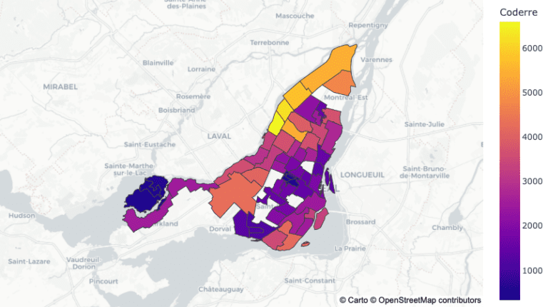
17. Geographical map
					# import the necessary libraries
import plotly.express as px

# load the sample election data
df = px.data.election()

# load the geojson file for the election districts
geojson = px.data.election_geojson()

# create a choropleth map using plotly
fig = px.choropleth_mapbox(df, geojson=geojson, color="Coderre",
                           locations="district", featureidkey="properties.district",
                           center={"lat": 45.5517, "lon": -73.7073},
                           mapbox_style="carto-positron", zoom=9)

# update the layout of the map
fig.update_layout(margin={"r":0,"t":0,"l":0,"b":0})

# display the map
fig.show()
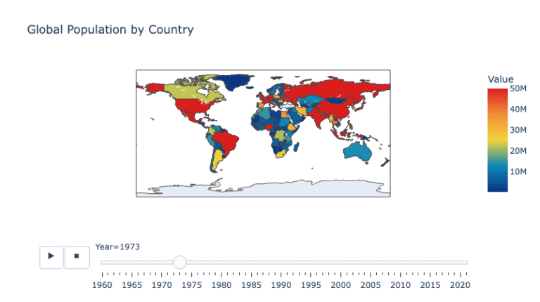
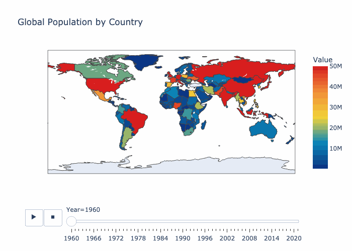
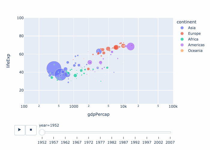
18. Animated GEO Map in plotly
We can also create the animated plots with plotly using express module.
The purpose of this code is to create a choropleth map using Plotly Express to visualize the global population by country over time.
					# import the necessary libraries
import pandas as pd
import plotly.express as px

# load the population data from a csv file hosted on GitHub
df = pd.read_csv('https://raw.githubusercontent.com/datasets/population/main/data/population.csv')

# create a choropleth map using plotly
fig = px.choropleth(df, locations='Country Name', locationmode='country names', color = 'Value',
                    animation_frame='Year', range_color=[100000, 50000000],
                    color_continuous_scale='portland',
                    title='Global Population by Country')

# display the map
fig.show()
Saving plots as .gif file
Saving the plotly animated plot as gif file can be done as follows:
					# import the necessary libraries
import plotly.express as px
import pandas as pd
import numpy as np
import io
import PIL

# load the population data from a csv file hosted on GitHub
df = pd.read_csv('https://raw.githubusercontent.com/datasets/population/main/data/population.csv')

# create a choropleth map using plotly
fig = px.choropleth(df, locations='Country Name', locationmode='country names', color = 'Value',
                    animation_frame='Year', range_color=[100000, 50000000],
                    color_continuous_scale='portland',
                    title='Global Population by Country')

# save the animated map as a gif file

# generate images for each step in animation
frames = []
for s, fr in enumerate(fig.frames):
    # set main traces to appropriate traces within plotly frame
    fig.update(data=fr.data)
    # move slider to correct place
    fig.layout.sliders[0].update(active=s)
    # generate image of current state
    frames.append(PIL.Image.open(io.BytesIO(fig.to_image(format="png", scale=2))))

# create animated GIF
frames[0].save(
        "world_population_in_recent_years.gif",
        save_all=True,
        append_images=frames[1:],
        optimize=True,
        duration=500, # milliseconds per frame
        loop=0, # infinite loop
        dither=None  # Turn off dithering
    )
19. Animated bubble chart
					# import the necessary libraries
import plotly.express as px
import pandas as pd
import numpy as np
import io
import PIL

# load the gapminder data from plotly
df = px.data.gapminder()

# create a choropleth map using plotly
fig = px.scatter(df, x= "gdpPercap",
            y = "lifeExp",
            size= "pop", color= "continent",
            animation_frame='year', animation_group="country",
            log_x=True, size_max=55, range_x=[100,100000], range_y=[5,100])


# save the animated plot as a gif file

# generate images for each step in animation
frames = []
for s, fr in enumerate(fig.frames):
    # set main traces to appropriate traces within plotly frame
    fig.update(data=fr.data)
    # move slider to correct place
    fig.layout.sliders[0].update(active=s)
    # generate image of current state
    frames.append(PIL.Image.open(io.BytesIO(fig.to_image(format="png", scale=1))))

# create animated GIF
frames[0].save(
        "Animated Bubble Plot using plotly.gif",
        save_all=True,
        append_images=frames[1:],
        optimize=True,
        duration=500, # milliseconds per frame
        loop=0, # infinite loop
        dither=None  # Turn off dithering
    )
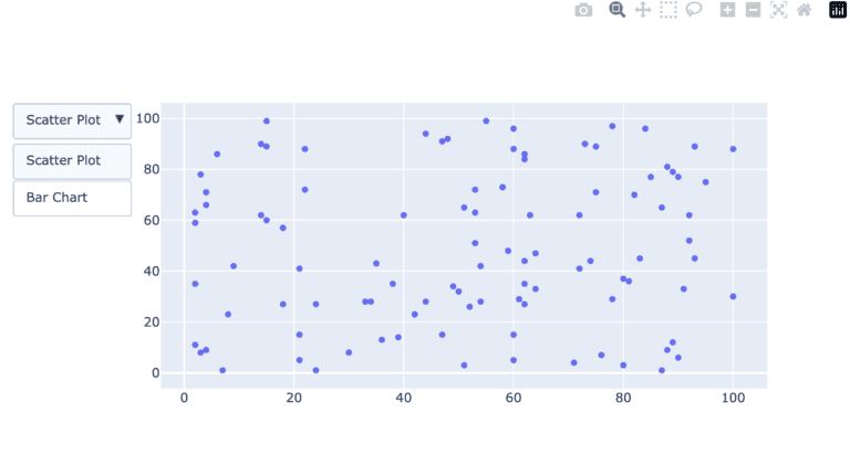
20. Add drop down button in plotly
					import plotly.graph_objects as px
import numpy as np


# creating random data through randomint
# function of numpy.random
np.random.seed(42)

# Data to be Plotted
random_x = np.random.randint(1, 101, 100)
random_y = np.random.randint(1, 101, 100)

plot = px.Figure(data=[px.Scatter(
    x=random_x,
    y=random_y,
    mode='markers',)
])

# Add dropdown
plot.update_layout(
    updatemenus=[
        dict(
            buttons=list([
                dict(
                    args=["type", "scatter"],
                    label="Scatter Plot",
                    method="restyle"
                ),
                dict(
                    args=["type", "bar"],
                    label="Bar Chart",
                    method="restyle"
                )
            ]),
            direction="down",
        ),
    ]
)

plot.show()
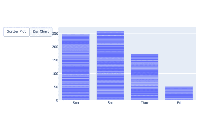
21. Add buttons
					import plotly.graph_objects as px
import pandas as pd
import seaborn as sns

# reading the database
data = sns.load_dataset('tips')


plot = px.Figure(data=[px.Scatter(
    x=data['day'],
    y=data['tip'],
    mode='markers',)
])

# Add dropdown
plot.update_layout(
    updatemenus=[
        dict(
            type="buttons",
            direction="left",
            buttons=list([
                dict(
                    args=["type", "scatter"],
                    label="Scatter Plot",
                    method="restyle"
                ),
                dict(
                    args=["type", "bar"],
                    label="Bar Chart",
                    method="restyle"
                )
            ]),
        ),
    ]
)

plot.show()
Conclusion
Plotly stands out as a pivotal library in the Python data visualization ecosystem, primarily due to its emphasis on interactive and animated plots. In the age of digital data exploration, static charts often fall short in conveying the depth and nuances of complex datasets. Plotly bridges this gap by allowing users to engage with visualizations, drilling down into details, panning across dimensions, and even animating transitions to understand temporal changes. Its wide array of customizable chart types caters to both conventional and specialized visualization needs. There are serval other tutorials on python plotly use such as one by geeksforgeeks also many other plotly articles given at the following link.
Furthermore, its seamless integration with web applications, courtesy of Dash, positions Plotly as not just a visualization tool, but as a comprehensive platform for data-driven web applications. In essence, Plotly’s capability to create intuitive, interactive, and animated visualizations elevates data storytelling, making it an indispensable tool for data professionals aiming to communicate insights effectively.
In this python plotly tutorial, we have seen 20 different types of plots, their use and the codes to plot them. I hope you like the way we explained, please write down in the comment section, what you want to learn next.
Other resources on our website
You can also attempt quizzes here.
Recent Blog Posts
- LinkedIn Networking Guide for Pakistani AI & Data Science Students | Codanics
- Why Learning Bioinformatics is Essential for the Future of Science and Healthcare
- UAE Makes ChatGPT Plus Free for All Citizens: A Global First
- NLP Mastery Guide: From Zero to Hero with HuggingFace | Codanics
- Scikit-Learn Mastery Guide: Complete Machine Learning in Python
very nice blog on Plotly; it covers all the basics. Very helpful
it was a little lengthy but suuper informative made every thing very much easy by reading this all at once. more power and big resepect for you Dearr SIrrr
I wanted to thank you for your hard work and dedication
Baba g lambi umar pao tosi
Great Job Dr. shb
Alhumdulillah nice explain
سلام عليكم ورحمة الله وبركاته
آپ کا پڑھانے کا طریقہ بھت ھی اعلیٰ ھے
چیزوں کو اتنی مرتبہ دھرایا جاتا ھے کہ وہ اچھی طرح زھن نشین ھوجاتیں ھیں
یہ بلاگ بھت ھی کمال کا ھے
تمام قسم کے پلاٹ بھت ھی اچھی طرح سمجھ میں آگۓ ھیں
اللہ کریم آپ کو دونوں جھان کی بھلاٸیاں عطا کرے آمین
good blog
Sir ge bht axha blog tha bht si confusion clear ho gi is sy
very nice blog on plotly it covers all the basics and fundamentals of making plots using plotly
Informative and supportive thanks. Sir doctor aammar
I completed my 70persnt problems in this blog
It’s describe in amazing way….
Assalamualaikum sir very informative blogs. It will help me in this course. jazakAllah
Present Sir, Mohsin Shareef
Discord # mohsinshareef_22482_34614
very informative and amazing method of teaching
it’s very helpful blog
For me, this is the best way of teaching. I didn’t see it before. This is the first time to taken any course take it is a very energetic way to learn. May Allah give you health to fulfill 6 months. Ameen
for me. I also parallel with python ka Chilla 2023. it’s going to be great and waiting for your next Blog.
For Data Preprocessing.
This informative blog provides step-by-step guidance on creating effective and interactive plots with Plotly. It clarifies Plotly plot concepts, making it a valuable resource for understanding and mastering plot creation.
Amazing and helpful blog.
mashallah
Very helpful
3D surface plots and geographical maps.amazing
thank u sir and present sir 🙂
Present Sir,
by Zubair Ahmad
Whatsap # 03012664962
Discord # zubair_ahmad
very helpful sir
It is amazing to learn plotly, for begginers
Detailed Article thanks alot for teaching us sir 🙂
Informative and amazing, enjoying practicing
Read this blog and put it into practice. This comprehensive blog has greatly enriched my learning experience.
“Read this blog and put it into practice. This comprehensive blog has greatly enriched my learning experience.”
I appreciate your teaching style. You are very organized, patient, and supportive. You provide helpful feedback and guidance. You make learning fun and interactive. You are the best teacher I ever had.
Mind-blowing article to understand plotly library
Amazing and very informative
very nice, helpful and understandabe. May God Bless you
Ma sha Allah ❤️ Every Plot Is Well Explained ..
The examples provided in this blog are very helpful in getting started with the library. I found the plotly library to be very useful for creating interactive and visually appealing plots and charts in Python. The library offers a wide range of chart types, from simple scatter plots to complex 3D surface plots and geographical maps.
The blog provided an informative overview of various plotting strategies across different libraries. It helped create an understanding of the common plotting concepts and techniques, while also highlighting the similarities and differences in how these concepts are implemented in diverse visualization packages. The comprehensive discussion of plotting helps establish a solid foundation for utilizing various data visualization tools.
Bundle of information. This blog created an understanding of various plots. Of course, the plotting strategies are similar in different libraries.
Mind blowing way of teaching, to the point & simple coding structure
mashallah. to the point guidance as usual.
Kindly inform that on which dashboard we will be working in future ? Tableau or power B
Very helpful
These 20 categories of plotting almost cover all data visualization needs in python.
gr8 bolg amazing