
Table of Contents
Introduction
Welcome to the Fascinating World of Variability!
Hello, curious minds and data enthusiasts! 🕵️♂️👩💻 You’re about to embark on a captivating journey into the realm of variability in statistics and data science. This isn’t just a story about numbers; it’s a tale of diversity, spread, and the rich tapestry of data that surrounds us in our daily lives.
What is Variability? 🤔
Variability, often referred to as dispersion, is the heartbeat of a dataset. It measures how much individual data points differ from each other and from the central tendency (like the mean or median). Imagine a world where everyone thinks, acts, and looks the same – pretty boring, right? Well, variability is the statistical counterpart that celebrates the differences in our data world. 🎉
Why Does Variability Matter? 🌟
- Beyond the Average: While averages are informative, they don’t tell the whole story. Variability gives us the context – how data points dance around the average.
- Insight into Data Spread: Knowing how spread out data is can change how we interpret the average. For instance, two classes might have the same average test score, but one class might have a wide spread of scores (high variability), while the other has scores tightly clustered around the average (low variability).
- Decision Making: In fields like finance, healthcare, or education, understanding variability is crucial for making well-informed decisions. It helps assess risks, quality, and consistency. 📈
Complementing Central Tendency 👯♂️
Variability and central tendency are like two peas in a pod; they complement each other perfectly. Central tendency gives us a focal point, while variability shows us how far and wide data points stray from that focal point. Together, they paint a comprehensive picture of our data landscape.
- The Dance of Numbers: For example, the average height of a basketball team (central tendency) is important, but knowing how much players’ heights vary (variability) can be crucial for team strategies and dynamics.
Embracing the Full Spectrum of Data 🌈
As you dive into this guide, prepare to embrace the diversity of data through the lens of variability. It’s not just about crunching numbers; it’s about understanding the stories they tell and the patterns they weave. So, buckle up and get ready to explore the wonderful world of variability – your journey to becoming a data-savvy individual starts here! 🚀
Key Measures of Variability
In the vibrant realm of statistics, understanding variability is crucial for deciphering the full story told by data. Let’s explore the key measures of variability—Range, Interquartile Range (IQR), Variance, and Standard Deviation—with real-life scenarios from Pakistan, complete with equations and examples.
1. Range: The Simplest Measure of Spread 🌐
Definition:
Range is the simplest measure of variability. It’s the difference between the highest and lowest values in a dataset.
Formula:
Real-Life Example in Pakistan:
Consider the temperatures in Islamabad over a week: [22°C, 25°C, 30°C, 28°C, 26°C, 32°C, 24°C]. The highest is 32°C, and the lowest is 22°C, so the range is \( 32 – 22 = 10 \)°C.
Usage:
The range is straightforward and easy to calculate, but it only considers the extremes. It’s useful for a quick overview but doesn’t tell us about the variability within the dataset.
2. Interquartile Range (IQR): Middle 50% of Data 📊
Definition:
IQR measures the spread of the middle 50% of data, eliminating the impact of outliers.
Calculation:
Box Plots:
Box plots graphically represent IQR, highlighting the median and quartiles.
Real-Life Application:
In Lahore’s housing market, consider the prices of homes sold in a month. The IQR gives us a sense of the typical price range, excluding unusually high or low prices.
3. Variance: Quantifying Spread Around the Mean 📚
Variance quantifies how much the data points in a set diverge from the mean. It’s a measure of the data’s spread.
Population Variance (σ²)
\[ \sigma^2 = \frac{\sum (x_i – \mu)^2}{N} \]
Here, \( \sigma^2 \) is the population variance, \( x_i \) represents each data point, \( \mu \) is the population mean, and \( N \) is the size of the population.
Sample Variance (s²)
\[ s^2 = \frac{\sum (x_i – \bar{x})^2}{n – 1} \]
Where \( s^2 \) is the sample variance, \( x_i \) are the sample data points, \( \bar{x} \) is the sample mean, and \( n \) is the sample size.
Breaking It Down
The variance calculation involves two key steps:
- Finding the difference between each data point and the mean (reflecting each point’s deviation from the mean).
- Squaring these differences (to make them positive) and averaging them.
The divisor is \( N \) for population variance and \( n – 1 \) (known as Bessel’s correction) for sample variance, which corrects bias in the estimation of the population variance from a sample.
Example:
Consider test scores in Karachi: [70, 75, 80, 85, 90]. The mean (\( \bar{x} \)) is 80. Sample variance \( s^2 \) would be calculated using the formula.
Interpretation:
Variance shows how much the values differ from the mean. A high variance indicates more spread out data.
4. Standard Deviation: The Square Root of Variance 🧮
Standard deviation is the square root of variance, providing a more interpretable measure of spread, in the same units as the data.
Explanation:
Standard deviation is the square root of variance, providing a measure of spread in the same units as the data.
Population Standard Deviation (σ)
\[ \sigma = \sqrt{\sigma^2} \]
Sample Standard Deviation (s)
\[ s = \sqrt{s^2} \]
Standard deviation is more intuitive than variance as it’s expressed in the same units as the data. It’s widely used in data analysis to understand the dispersion and to compare variability between different datasets.
Example:
Using the same test scores from Karachi, the standard deviation is the square root of the sample variance calculated earlier.
Interpretation:
Standard deviation is widely used due to its interpretability. It tells us on average how much individual data points differ from the mean.
5. Standard Error: Assessing Sample Mean Reliability 🎯
The standard error measures the precision of a sample mean as an estimate of the population mean.
Equation
\[ SE = \frac{s}{\sqrt{n}} \]
Where \( SE \) is the standard error, \( s \) is the sample standard deviation, and \( n \) is the sample size.
Understanding Its Role
– The standard error gives an idea of how much the sample mean would vary if we took multiple samples from the same population.
– A smaller standard error suggests more precision of the sample mean as an estimate of the population mean.
Example of Standard Error Calculation
Consider an educational researcher in Lahore studying the average test scores from a sample of high school students across various schools. Suppose the sample mean of test scores is 75, with a standard deviation of 10, and the sample size is 50 students.
The standard error is calculated using the formula \( SE = \frac{s}{\sqrt{n}} \), where \( s \) is the standard deviation and \( n \) is the sample size. Plugging in the values, we get \( SE = \frac{10}{\sqrt{50}} \), which calculates to approximately 1.41.
Interpretation
The standard error of 1.41 indicates the degree of precision of the sample mean (75) as an estimate of the average test score for the entire student population in Lahore. A smaller standard error would imply a more precise estimate of the population mean. This measure is crucial for the researcher to understand the reliability of the sample mean and to form confidence intervals for making inferences about the student population’s average test scores.
Embracing Variability in Data 🚀
Understanding these measures of variability is vital in exploring data’s true nature. They offer insights into the data’s consistency, reliability, and behavior, crucial for making informed decisions in fields ranging from economics to social sciences in Pakistan.
Visualizing Variability: Seeing Beyond the Numbers 📈
Graphical representations like box plots and standard deviation plots offer a visual perspective of variability. They turn abstract numbers into visual stories, making it easier to grasp the data’s narrative.
Painting Data with Histograms 📉
Histograms are like the snapshots of data. They show us the frequency of data points within certain ranges, painting a picture of distribution.
- What’s a Histogram? Imagine lining up data points in bins or buckets. Each bin represents a range, and the height of each bin shows how many data points fall into that range.
- Visualizing Variability: A histogram with bins of varying heights indicates high variability, while one with similar heights suggests low variability.
- Example: Take, for instance, the daily temperatures in Islamabad. A histogram of these temperatures over a month can show us the spread and most common temperature ranges. 🌡️
Box Plots: Unboxing Data Stories 🎁
Box plots, or box-and-whisker plots, are like treasure chests for data insights. They give us a compact summary of the data’s range, median, and quartiles.
- Decoding Box Plots: The box shows the interquartile range (IQR), the line inside the box is the median, and the ‘whiskers’ extend to the highest and lowest values.
- Spotting Outliers: Any data points outside the whiskers are potential outliers, offering clues to extreme variability.
- Real-Life Scenario: Consider the scores of a standardized test in Karachi. A box plot of these scores can quickly show the median score, the range of typical scores, and any unusual results. 📚
Standard Deviation Plots: Measuring the Spread 📐
Standard deviation plots are the GPS of data spread. They show how data points deviate from the mean, offering a clear view of variability.
- Understanding the Plot: These plots usually have a line for the mean and additional lines to mark one, two, and sometimes three standard deviations from the mean.
- Interpreting the Spread: The closer the data points are to the mean line, the lower the variability. More spread-out points indicate higher variability.
- Application Example: In a Lahore-based company, analyzing employee satisfaction scores with a standard deviation plot can reveal how the scores vary from the average satisfaction level. 🏢
Visualizing variability is about bringing the hidden stories in data to the forefront. Whether it’s through the simple clarity of a histogram, the succinct summary of a box plot, or the precise spread shown in a standard deviation plot, these visual tools are invaluable in our quest to understand and communicate the nuances of data.
We can use Python to do the tasks as follows:
					import numpy as np
import matplotlib.pyplot as plt
import seaborn as sns

# Generating a random dataset
data = np.random.normal(50, 15, 100)  # mean=50, std=15, 100 data points

# Plotting Histogram
plt.figure(figsize=(14, 4))
plt.subplot(1, 3, 1)
plt.hist(data, bins=15, color='skyblue', alpha=0.7)
plt.title('Histogram')
plt.xlabel('Data Points')
plt.ylabel('Frequency')

# Plotting Box Plot
plt.subplot(1, 3, 2)
sns.boxplot(data, orient='h', color='lightgreen')
plt.title('Box Plot')
plt.xlabel('Data Points')

# Plotting Standard Deviation Plot
mean = np.mean(data)
std_dev = np.std(data)

plt.subplot(1, 3, 3)
plt.errorbar(mean, 0, xerr=std_dev, fmt='o', color='purple', elinewidth=3, ecolor='purple', capsize=5)
plt.yticks([])
plt.title('Standard Deviation Plot')
plt.xlabel('Data Points')

# Show all plots
plt.tight_layout()
plt.show()
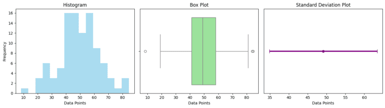
Here are the visual representations of the data spread using three different types of plots:
Histogram (Left): This shows the distribution of the data points. The bins illustrate how frequently data points fall within certain ranges. In this histogram, you can see the spread and central tendency of the dataset.
Box Plot (Middle): The box plot succinctly summarizes the data’s range, median, and interquartile range (IQR). The box covers the IQR, the line in the box shows the median, and the ‘whiskers’ extend to the highest and lowest values within 1.5 times the IQR from the box.
Standard Deviation Plot (Right): This plot highlights the mean and standard deviation. The dot represents the mean, and the error bars show the range of one standard deviation from the mean. It gives a visual sense of how much the data points deviate from the mean.
Together, these plots provide a comprehensive visual overview of the data’s variability, showcasing different aspects of how the data points are spread around the mean.
The Role of Variability in Diverse Fields: A Kaleidoscope of Applications 🎨
- In Finance and Investing: Understanding the variability of stock prices is crucial for risk assessment and investment strategies.
- In Quality Control: Manufacturing industries rely on measures of variability to ensure product consistency and quality.
- In Academic Research: Variability helps researchers understand the robustness and reliability of their findings.
The Dance of Variability and Central Tendency: A Harmonious Duo 🕺💃
While central tendency provides a snapshot of data, variability offers the context. Together, they paint a complete picture, like a melody complemented by harmonies.
Embracing Variability: The Path to Rich Insights 🔍
As we wade through the sea of data in our lives, embracing variability helps us appreciate the diversity and richness of information. It equips us with a deeper understanding, allowing us to make more informed decisions.
Conclusion: Celebrating the Diversity in Data 🌈
In the end, variability in statistics is not just a measure; it’s a celebration of data’s diversity. It reminds us that in the apparent randomness of numbers lies a story waiting to be told, a pattern waiting to be discovered.

LinkedIn Networking Guide for Pakistani AI & Data Science Students | Codanics

Why Learning Bioinformatics is Essential for the Future of Science and Healthcare


NLP Mastery Guide: From Zero to Hero with HuggingFace | Codanics

Scikit-Learn Mastery Guide: Complete Machine Learning in Python


Amazing work, keep it up, I’m really enjoying your teaching method(simple and easy)
This blog shows that variability expertise is most important in dealing with data exploration, data cleaning and data visualizing.
got my understandings…….
Range, iqr, variance , sd, se ok
AOA, This blog (Variability in Statistics) provides a comprehensive and engaging introduction to the concept of variability. It explains the importance of variability in understanding data spread, making informed decisions, and complementing central tendency measures. This blog covers key measures of variability, such as range, interquartile range, variance, standard deviation, and standard error, providing clear definitions, formulas, and real-life examples. It also highlights the significance of visualizing variability through graphical representations like box plots and histograms. This blog effectively presents the topic of variability in an accessible and informative manner. ALLAH PAK ap ko dono jahan ki bhalian aata kry AAMEEN.
Very Informative and Fantastic
Read it… finding it helpful
Informative and helpful blog.